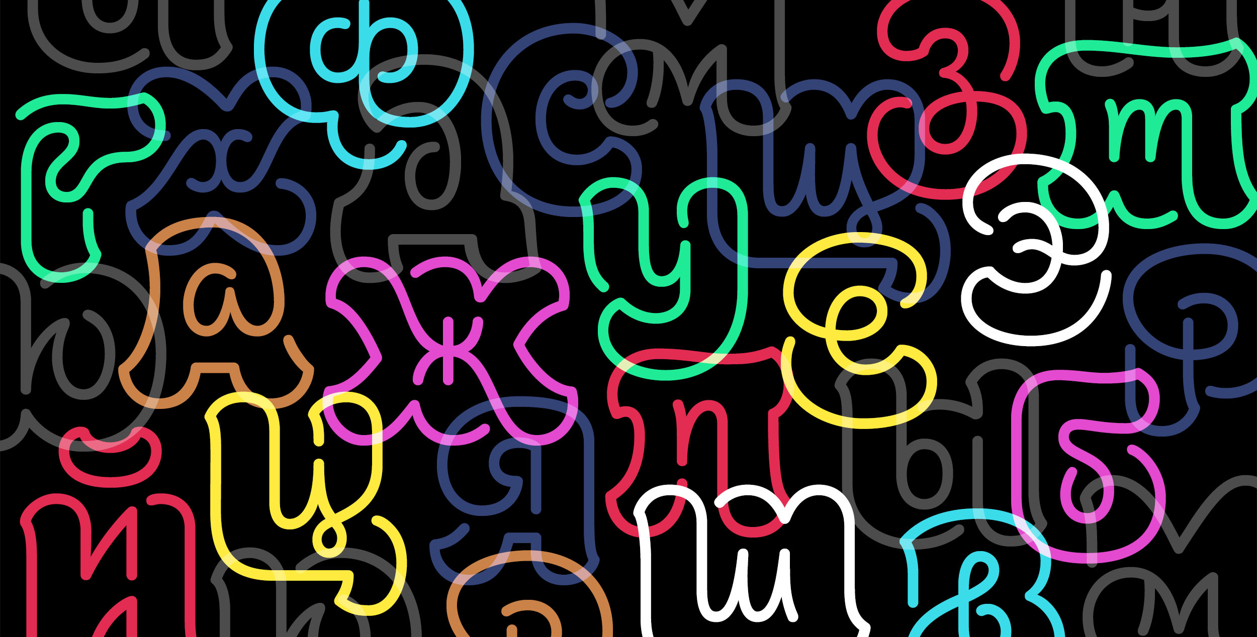
New fonts from Victoria Rushton, Julius Hui, Verena Gerlach, Shiva Nallapermura and more. Here’s the first of TYPE’s regular updates on new retail typeface releases, corporate rebrands, and other typographical events.

All by Editors
New fonts from Victoria Rushton, Julius Hui, Verena Gerlach, Shiva Nallapermura and more. Here’s the first of TYPE’s regular updates on new retail typeface releases, corporate rebrands, and other typographical events.

Kazakhstan has decided to rewrite the Kazakh language in Latin, will all-new spellings due by the end of the year.

Treasure, indeed. With the help of type designer Paul Barnes, we gained access to hidden gems in the basement of St. Bride Library. Here are sharp photographs of some of the most important punches and matrices at the time of the Industrial Revolution. They were saved from extinction by long-time Librarian, James Mosely. Take a look at the business-end of the first slabs and sans serif typefaces.

A new web app might mark the first step towards a new, mathematical way to sort and search our fonts.

ebay's new visual identity marks the end of the online auction giant's quirkiness.

With a bow to the WPA art program, two poster series celebrate U.S. National Parks.
Covergirl goes in a new direction—a no contrast, geometric direction—with its first major rebranding effort in roughly 60 years.

A unique set of fifty postcards are being published, with art taken from Tobias Frere-Jones's personal collection of type specimens.

Vincent Winter, a typographer and photographer in Paris, went to St. Bride Library in London and was bowled over. He shows in text and pictures what its collection is like—an amazing mass of type, books on type, publications and printing materials. Its sweet spot is the British foundries that rapidly changed the design of type in the 19th century. There is not enough room to display all of it, but if you’re nice to the very knowledgeable librarians, you can get a peek.

John D. Berry tells the secret history of Microsoft type. Well, maybe not secret, but the impact of the company's on typography, on the desktop and online, is taken for granted. Here's how it happened, and the people behind it, including the late Robert Norton (in this image).


After using a new logo each year for its first 33 years, the VMAs say the latest logo, designed by OCD, is here to stay.

Mirror Mirror delivered flashy and satirical branding for the very stylish 2017 Creative Belgium Awards.

CATHERINE SCHMIDT takes a trip on Mumbai transit and learns what it takes to make fonts for Indic scripts
What started as an experiment turned into a multi-lingual display face with a twist.

Stephen Coles profiles four type designers who represent an amazing wave of talent issuing from the great 21st century schools of type design—including KABK in Holland, Reading University in Britain, ESAD in France, and Cooper Union in the United States.
These newcomers are producing great new typefaces very soon in their career. If you think about it, even the best and most successful type designers of the past (Adrian Frutiger, for example) were hard pressed to release their first font by the time they were 30. But now these schools and several others are sending out accomplished new type designers into a market that seems quite ready to absorb them.
This piece is not so much about education, as about four graduates, and how each is moving into the profession of type design.

The idea of of tapered stems in fonts, so popular in the 1950s, is making a big comeback. Not since Optima have we seen the style so often used—for all kinds of typography.

Euclid's Elements of Geometry, one of the most important books on mathematics, is getting a crowdfunded, minimalist refresh.