
New and improved
This fine design, adding to a rich typographic palette, that makes you ask basic questions about visual branding.
As a serial re-designer of newspapers and magazines, I always enjoy when a big title makes a change, particularly when I am in the role of reader, not designer. This week it’s The Guardian.

With the new Guardian, designed by Alex Breuer, many readers were startled to see their newspaper, or site, or app had changed, and they complained. I posted a comment on Facebook (“But, why?”) and about half of my friends jumped on the redesign, and the other half defended it. My friends have strong opinions, but no stronger than typical Guardian readers.
The new headline typeface has greater contrast, intended as a companion face in the type family they’ve been using since 2005, when Mark Porter had the temerity to throw out David Hillman’s landmark 1988 design, which set the paper apart from the other English broadsheets and created a landmark brand.
The Guardian front pages from the last 50 years: 1962, the last day of the blackletter logo. 1964, Perpetua on full-sized broadsheet. 1984, a straighter Windsor. 1988, David Hillman. 2005, Mark Porter’s “Berliner.” 2018, Alex Breuer’s tabloid. (Not necessarily in scale.)
Porter brought in Paul Barnes and Christian Schwartz, and sometime you’ve got to hear them tell the story of the development of The Guardian custom fonts and their long march from the Gerard Unger 20th century Dutch style (i.e. Gulliver) through Paul’s home base of 19th century English type, and back again.


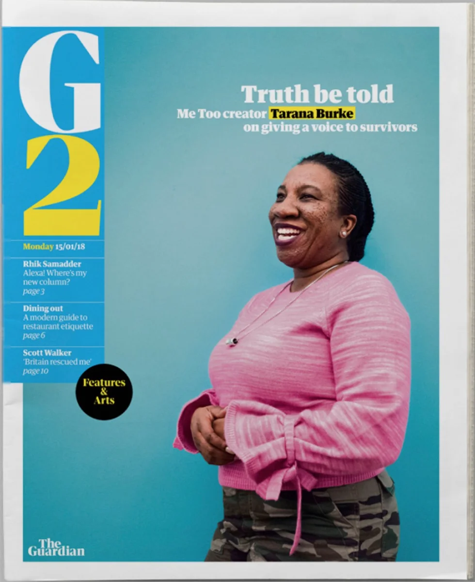

Print pages from the first day of the redesign, January 15, 2018.
We all got used to the Porter style, and just last week I was saying how the buoyant, diverse, insanely colorful pages of the iPhone app must have inspired Jeff Bezos to demand an app for the Washington Post. The result: Story-oriented design, with some template variations that made the app very swipeable, like turning the pages in a good magazine.


The iPhone app: A little smoother, a little straighter. The previous design (left in each pair), had more obvious template variations for features and opinion pieces.
And then, BAM, all different. The new design adds a more “modern,” higher contrast headline font. Did Paul Barnes get his way in the end? And the iOS app is a smoother experience, if less fun. If you were looking at it all for the first time, you would have say it’s great typography.
It all still looks like The Guardian, except . . . The logo and the printed front page.
In the tabloid, inside section “fronts” suggest a better front page layout than what they’ve done. Sadly, the new design has that tabloidal connotation they tried to avoid when they spent $110 million USD on a new press room so they could drop the broadsheet, go to Berliner size, and and still be not-a-tabloid. A more elegant front page would make The Guardian stand out from the pack.

Three logos: David Hillman, 1988. Mark Porter, 2005. Alex Breuer, 2018.

The new logo.
And the logo? Many readers have said that the all lowercase blue banner meant Guardian to them. And it felt progressive.

An uninvited fix of the letter spacing.
I may just be an old designer, but for me the best branding is the brand that lasts. The New York Times. The New Yorker. Rolling Stone. Why not work with the Porter logo?
Of course, if you ask me, the Hillman logo still looks the best.


