
Weekly Roundup: January 6 and December 30
Here are the seventh and eighth weeks of TYPE’s regular updates on new retail typeface releases, corporate rebrands, and other typographical events.

Apoc
Adele Type released At Apoc, a three-style typeface based on the cover lettering of an old book on the biblical Revelations. The typeface “brings up the page’s lightness[,]” and is meant for “covers and text layouts.” Its three styles—Revelations, Dark, and Light—each with an accompanying italic, are available at Adele Type.

Extraordinaire
David Jonathan Ross’s latest Font of the Month Club typeface, Extraordinaire, is an “adjustable hairline sans inspired by single-stroke lettering of the Art Deco period[.]” Designed after a visit to São Paulo, Brazil, the typeface features variable axes for weight and shade distance along with a persistent “breezy, informal feel.” Extraordinaire is available through a Font of the Month Club membership.

Hesse Antiqua
On Gudrun Zapf von Hesse’s 100th birthday, Monotype published her first alphabet design, Hesse Antiqua. . . which she originally created seventy years ago. The typeface, which Zapf von Hesse designed during her time at Bauer in the 1940s for stamping titles on book covers, was recently digitized by Ferdinand Ulrich and includes only one, original style, with no lowercase letters. Hesse Antiqua is available on FontShop.
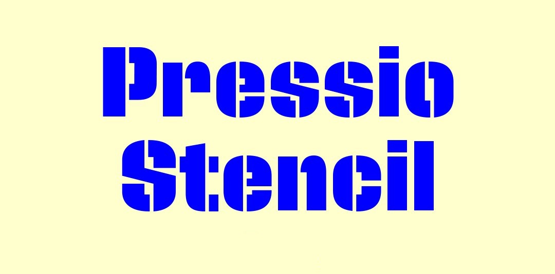
Pressio Stencil
Signal Type Foundry’s Max Phillips released his Pressio Stencil, a “Mid-century Modern with a touch of packing crate.” The face, an addition to the Pressio family, includes four widths and five weights, making it “far more versatile than most stencil faces.” Notably, Phillips designed the typeface to function legibly even at text sizes. Pressio Stencil is available on Fonstand.

Beckett Round
A2-Type released Beckett Round, a typeface that “originates from machine-cut era wood type.” An addition to the Beckett typefamily—which A2 developed for the covers of Faber & Faber’s Samuel Beckett Complete Works—Beckett Round uses the same spacing and character width as Beckett, allowing seamless swaps between the two. You can find Beckett Round on A2-Type’s website.

Vesterbro Italics
Black[Foundry]’s Didot-inspired Vesterbro received its Italic counterpart last week. The typeface features “Viking horn terminals” and “Scotch roman serifs,” characteristic of its “Scottish/Garalde mashup.” Vesterbro also includes a variable font, which comes free with the purchase of all 12 other weights and styles. Vesterbro is available on the Black[Foundry] website.
Send your announcements and tips to TYPE’s digital editor, Lucas Czarnecki.


