THE TREASURE OF ST. BRIDE—PART II
PHOTOGRAPHS: ST. BRIDE LIBRARY
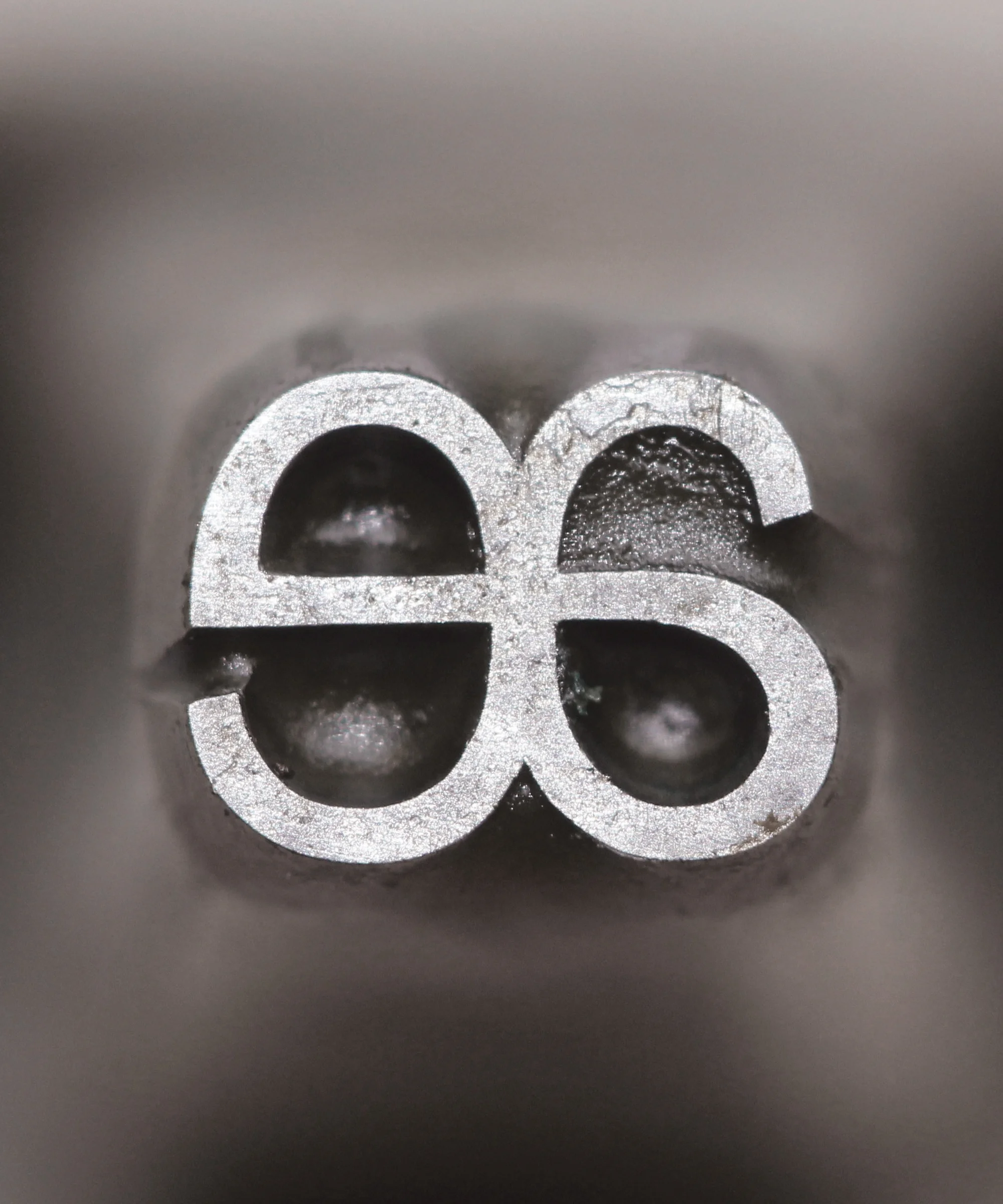
CASLON 5 LINE PICA ROUNDED: A punch for the ampersand. The rounding of corners was a particular favorite of the Caslon foundry, appearing first in 1836. A bold sans design, it now seems far ahead of its time.
TWO OF THE GIANTS in type founding were the Caslon and Figgins foundries. Based in London, both operated in various guises from the 18th to the 20th century. What remains of these enormous ventures can be found at St. Bride Library in Fleet Street, the historical neighborhood of printers and newspapers. Since opening in 1895, St. Bride has become a leading collection of printing and graphic design material, much of it collected under its past librarian James Mosley, now at Reading University.
Mosley acquired the punches of the Caslon foundry In the 1970s. There were over one thousand boxes, weighing more than three tons. He also brought to St. Bride the matrices of Steven Shanks, successors to Figgins.
The machine tools of the great English type design innovations of the 19th century are: Sans, Egyptians, Italians, Tuscans and Clarendons. Full of character and vigor, these typefaces were made by skilled engravers—by hand. Here we see the punches that the foundries used to make the matrices, the molds, from which the type was cast.—PAUL BARNES
Caslon Double Pica Roman No. 2: In the late 1700s the Caslon foundry realized that the famed old style pioneered by William Caslon I was going out of style, while the “modern” style, with its vertical stress and extreme contrast, was sweeping the Continent and Britain. In 1796 Caslon’s widow, Elizabeth, commissioned John Isaac Drury to cut a series of moderns. These capture the innovations of masters from Italy and France, but retain British qualities of Baskerville, Fry, and Wilson. Drury’s types are the inspiration behind Brunel, one of the typeface used in the print No. 1 of TYPE. (Double pica was the size we now call 24 point)
CASLON CANON ANTIQUE COMPRESSED: The 1830s saw the innovations of the previous three decades consolidated. New fonts were often extensions of successful designs. An important variation was “condensed”—a simple idea which quickly became popular since it allowed longer and bigger words on the page. Antiques (Egyptians) were particularly suited to narrow widths. This case of punches show how the cutter creates sculptural forms from a block of steel. Each would take a skilled craftsman most of a day to make. Heated and hardened, the punch was then driven into a copper bank to make a matrix from what the type was cast in a hand mold.
CASLON 2 LINE ENGLISH DORIC No. 4: The first sans serif typefaces were all-capitals affairs. It was in the 1830s that Thorowgood introduced a lower case to his condensed forms. In the 1870s the Caslon foundry introduced a regular-width sans with lower case in multiple sizes, naming it Doric after the simplest of the classical architectural orders. Design by Martin (1876), and G. Hammond (1879).
CASLON ROUNDED ORNAMENTED AND CASLON 5 LINE PICA ROUNDED. The rounding of corners was a particular favorite of the Caslon foundry, first appearing in 1836 (opposite). A bold sans design, it now seems far ahead of its time. The foundry introduced an inline, and then in the 1840s an ornamented (this page) with a quirky charm. The punchcutter: F. Boileau (1846).
FIGGINS 42 POINT TITLING. Vincent Figgins, who began his career as apprentice to Joseph Jackson, started his own foundry in 1793, but really came into his own with his display typefaces in the 19th century. His 1815 specimen is the first showing anywhere of the Antique, or Egyptian, or Slab Serif style. Shown here are the matrices for a titling face, including Greek capitals.
FIGGINS FIVE LINE PICAS SANS SERIF: Caslon’s Egyptian, the first sans typeface, appeared in 1816, but found little if any popularity. Figgins foundry was the first to revive the sans idea. With startling simplicity, the design has boldness and vigor that appears modern even now. After 14 years, Caslon reintroduced a sans, and this time there were sales. This is a so-called sans pareil matrice, an innovation of William Caslon IV around 1810, where the letterform was cut out of a brass plate, which was then riveted to a back.
[The avatar for “Editors” in the footer below is actually this O.—Editors]
PAUL BARNES
Paul Barnes is a partner in Commercial Type, and a trustee of St. Bride Library. His work includes a number of type families inspired by the rush of designs in 19th-century England, such as Brunel (used for display in the print edition of TYPE No. 1), Austin, and Chiswick. A more complete bio is on the foundry’s site.
THE TREASURE, PART I
Vincent Winter, a typographer and designer in Paris, visited St. Bride for TYPE, and takes us through the Library—its books, specimen sheets, trade publications, printed ephemera, as well as type, punches and matrices. See “The treasure of St. Bride: Part I.”
ST. BRIDE LIBRARY
Maintaining this collection and surrounding it with programs, is a massive and costly effort. Most of the work is done by volunteers. You can support their cause—the sustainability of St. Bride Library—by contributing on their site.


