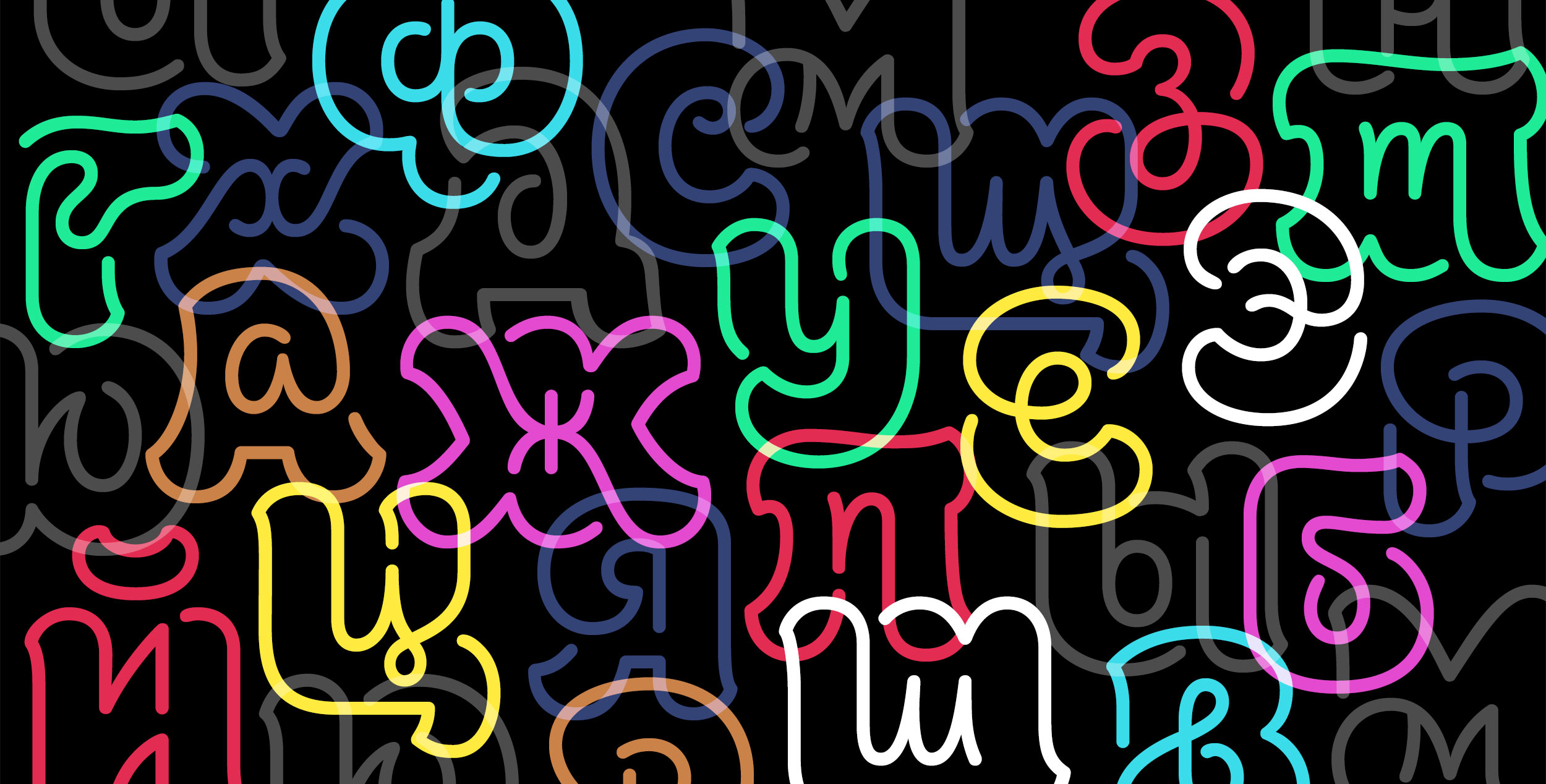
A NEWGENERATIONOF TYPE DESIGNERS
. . . IS BEGINNING TO MAKE ITS MARK

Mohamad Dakak, Roxane Gataud, Cristian Vargas, and Minjoo Ham—clockwise from upper left.
By STEPHEN COLES
With illustrations by JEFFREY SMITH
Over the years, many design and art schools have offered both introductory and reasonably intermediate type design classes, some with celebrated leaders in the field. But until relatively recently, there were no year-long post-grad courses dedicated specifically to type design. This changed just after 2000, when Reading University in the U.K. launched their Master of Arts in Typeface Design, soon followed by the Type and Media MA at the Royal Academy of Art (KABK) at The Hague. Within ten years, similar specialized degrees sprouted up at schools in Argentina, Brazil, Czech Republic, France, Germany, Mexico, Switzerland, and the United States.
To take the pulse of this new generation of type makers, this is the story of four promising recent graduates from five schools: Reading, KABK, Cooper Union in New York, and École Supérieure d’Art et de Design (ESAD) in Amiens.
ARABIC—THE LANGUAGE
IN WHICH WE DREAM AND LAUGH
MOHAMAD DAKAK is one of many young type designers poised to address the shortage of typefaces supporting the Arabic script. Backed by practical experience as a resident of four Middle Eastern countries and studying in Britain, he’s drawing from a multicultural perspective.
Dakak’s undergraduate studies in Syria centered on fine art and graphic design, where he developed a keen interest in Arabic calligraphy. Different projects—in fields as diverse as animation and filmmaking—pulled him to jobs in UAE, Saudi Arabia and Qatar. He eventually landed at the Doha branch of Fitch, a London-based branding firm. It was there, while working on projects that crossed borders and languages, that he experienced, firsthand, the lack of suitable Arabic typefaces, especially those that could be paired with Latin counterparts without abandoning the roots of Arabic writing.
So Dakak took his talents and passion to Reading, U.K., where the MATD course emphasizes multi-script type design. To program director Gerry Leonidas, each student’s own cultural perspective is core to their studies. “Our regional identity is deeply personal,” Leonidas wrote in a 2013 article for Typographica.org. “It is the language in which we dream and laugh, the language of our exasperations and tears. For most of us, this language is not English, and quite likely, it is not written with the Latin script.”
At Reading, Dakak found a way to apply his calligraphic skills to type design. He relished an environment where his interests were supplemented by typographic expertise. “When I studied fine arts in Syria, I always had an appreciation from calligraaphy mentors, but I wasn’t sure what I could do further with it, no one there directed me toward type design” he said. After Dakak joined the course in Reading, his route to type design was a long, gradual process. “I needed more experience and a better eye, learning consistency, spacing and voice among many other aspects I wasn’t aware of at the time.” The MATD course, according to Dakak, was an ideal opportunity where he could benefit from many experienced mentors. Gerry Leonidas and Gerard Unger were his main mentors for the design of the Latin while Fiona Ross directed his work on Arabic.

Jali specimen by Mohmad Dakak
Designing an original typeface family is a part of each MATD student’s assignment, and Dakak recalled his years living and traveling throughout the Middle East to guide his project, noting that “a city’s signage adds a lot to its character.” More specifically, he observed that bilingual signs often used Latin type designed specifically for the purpose, while the Arabic wasn’t nearly as suitable.
“A new direction [in Arabic way finding design] is to use a modern Latin typeface—DIN, Helvetica, or Frutiger, for example—but its Arabic counterpart is actually less functional.” When Arabic type is designed to mimic the modularity of Latin letter shapes, it can seriously affect legibility. “A lot of letters start to look too similar,” he added. “The priority is often given to a similarity of style between the scripts, but not to the functionality in Arabic.” You can end up with signs that are visually cohesive, but their core purpose is defeated.
Dakak’s typeface, Jali, is a typeface system that responds directly to that worrisome trend. He drew the Arabic and Latin at the same time, letting each script be true to itself rather than forcing one to mimic the other. For a way finding typeface, clarity and legibility are obviously the main priorities, but Dakak made design decisions that were best for each script and its respective readers.
The Arabic follows the Naskh calligraphic model, which he found to be the most familiar and readable for Arabic readers—a subject of his MATD dissertation—while the Latin has the moderate contrast and open, distinguishable shapes of typefaces tried and tested in Western way finding. Jali attracted the attention of URW, the Hamburg foundry that made the first digital type design tool, Ikarus, which dominated type design in the ’80s. URW commissioned Dakak to finish Jali in a multitude of styles. Dakak is staying in the the UK to start his PhD. Later he hopes to bring ideas like Jali back to his war-torn homeland.
“My years that I spent in Syria were the best for me. I am definitely waiting for the day I can go back and make a difference in some way.
After traveling a lot and trying to find yourself, the more you experience the more you appreciate what home means.”
INSPIRED
BY BIRDS OF PARADISE

CRISTIAN VARGAS’ passion for type also began with writing. But his tools were not pen and paper—they were markers, spray paint and walls. As a young student, he spent his extracurricular hours in the streets of Bogotá writing graffiti. “I was listening to hip hop and reading Rap Page magazine. The back page had a full grid of the most interesting graffiti in Los Angeles and New York, so every month I was poring over that.” Vargas recalled. “Later, I met some guys who lived in New York who brought their styles to Bogotá in the early 1990s. They taught me the basics.”
Studying graphic design at the Universidad de Bogotá Jorge Tadeo Lozano, Vargas found every subject that captured his attention had something to do with letters. In one assignment, while redrawing Garamond, he started to see connections between graffiti and typography. Despite their superficial differences, he knew there were some basic mark-making truths that linked French type founders with his graf buddies. Vargas then faced a challenge that is familiar to anyone working with type: explaining his newfound passion to his parents. “Art doesn’t run in my family at all,” Vargas said. “Mom and Dad are both lawyers. At the beginning, when I went to college for design, it was hard for them to understand. Over time they started to get it . . . except anything related to typography. ‘But aren’t fonts free?’ they ask.”
Undeterred, but without an obvious outlet for his interest, he kept type design in the back of his mind while working and teaching in graphic design. Years later, while drawing his first typeface, a fellow teacher told him about Type@Cooper Condensed, a summer intensive at Manhattan’s famed Cooper Union.
There were type design programs sprouting in Mexico and Argentina at the time, but New York was an enduring siren for Vargas. What’s more, he saw the impressive roster of instructors, Just van Rossum and Hannes Famira, with visiting critiques from Cyrus Highsmith and Andy Clymer. He respected all these names. “But when I saw Just would be teaching, I knew it would be great. He was famous to me for his crazy, experimental ’90s stuff. Though once class began, he taught us that before you get crazy, you need to understand the fundamentals.”
For Vargas, Type@Cooper “opened a big world” of possibilities, but the five-week experience was only a window on type design, and he wanted to see the whole landscape. One option was Type@Cooper Extended, but Vargas had his eyes on the Type and Media MA at KABK. For one, Van Rossum was a regular instructor there, but it was another Dutch master of type that pulled Vargas to The Hague: Gerrit Noordzij. The writer, designer, and “godfather” of the KABK teaching methods championed theories of type design that are linked directly to writing. This spoke directly to Vargas.

Salvaje specimen by Cristian Vargas
His striking graduation project is a type family with two personalities: a fairly tame and readable roman and italic for text, and a wild display set with dramatic contrast and twisted shapes. The name Salvaje means literally “of the woods” and its inspiration comes from the audacious plumage of Birds of Paradise, a group of fowl that evolved in ways that specifically attract attention. Vargas is fascinated with natural forms that can change in shape depending on context, just as the alphabet can retain its meaning while its shapes are altered dramatically depending on the writing tool.
Graduates of these type design programs all concur that they learned as much from their fellow students as their instructors. Despite being about ten years older than most of his classmates, Vargas was no exception. “They had more type design experience than me. I knew typography, but they knew way more about the technical side of making fonts,” Vargas said, adding that it is also valuable that the students “come from different areas of the world, with different skill sets.”
After The Hague, Vargas moved Typozon, his studio, to New York, where he’s focusing on typography, branding and type design. “While I’m not doing type design full time, the things I learned at Cooper and KABK do inform my identity work,” he said.
CALLIGRAPHY, DIGITAL TECHNOLOGY,
AND STONE CARVING

ROXANE GATAUD knows how necessity can be the mother of invention. Her penchant for literature and drawing led her from Bélâbre—a tiny town of 800 in the middle of France—to multiple schools of art, fashion and advertising. While studying editorial design at ESAAB (Ecole Supérieure des Arts Appliqués de Bourgogne), she couldn’t quite find the fonts she needed for her graduation project, so she made her own. Making type turned out to be a lot more work than she anticipated. “I was fairly naive,” she said. “But that was a good thing, because if I had the right typefaces, I might not have designed my own.”
That experience led her to seek out a specialized program where she could really dig into the craft. But she was broke. “As a student I always had a job just to pay my rent,” Gataud recalled. Tuition was out of the question. “I knew about Reading and KABK, but they were too expensive for me.” Fortunately, there was an option in her native France, where higher education is subsidized.
She applied to the École Supérieure d’Art et de Design (ESAD) in Amiens. ESAD’s Typography and Language course is a 16-month post-graduate program that is now in its sixth year under a well-defined type-design curriculum. Like Reading’s MATD, type history and research are essential aspects of the ESAD course, and many students explore issues relating to language, which leads to multi-script type design.
Despite being one of the more well-established programs with a long list of accomplished alumni, ESAD is sometimes hidden in the shadow of The Hague and Reading—especially to observers outside France. Gataud agrees, but feels strongly it deserves as much consideration as its two forebears.
“I had an amazing experience there,” she said. “I learned so much in a year and a half. When I started I really knew nothing—no history or contemporary practice. We absorbed everything from calligraphy to digital technology to stone carving, which we practiced on polystyrene blocks; everyone looked like snowmen at the end of the day! For me, it’s as good as studying anywhere else in terms of what you know by the time you leave. At ESAD you get truly professional training.”

Bely specimen by Roxanne Gataud
The product of Gataud’s crash course is a typeface that could have been the work of a seasoned pro. Bely has a serif family featuring a dazzling display style with high contrast and an unusually jaunty stress angle. While it gets less attention, Bely’s core text style is just as remarkable. It is a graceful roman, inspired by 17th-century type founder Jean Jannon, but closer inspection reveals triangular terminals and rectangular serifs that are starkly geometric.
Gataud credits those deceptively simple shapes to her learning process. “As a beginner, being completely new to drawing Bezier curves, I chose to start with simple shapes: The square and the triangle. Then I asked, ‘could this actually work as a basis for my design?’ So it started as an experiment, as an answer to my own questions. And it happened to work.”
Still, Gataud wasn’t sure Bely was really done, and she kept noodling on it after graduation. Meanwhile, she attracted a steady stream of freelance contracts from French foundries like Bureau 205, Production Type, Typofonderie—her keen eye and newfound skills were regularly called upon to help finish the work of other type designers. But Bely didn’t have to wait long to be recognized beyond her classroom: In 2014, the international label TypeTogether selected it for their inaugural Typeface Publishing Incentive Program scholarship. She was grateful to give Bely a home, citing that proverbial torment that most type designers endure: letting go of their work. As she put it, “You are never finished with a typeface until someone takes it off your hands.”
Gataud continues to do type design and production, working from her own studio in Paris, and with a part-time contract with Veronika Burian and José Scaglione at Type Together. She’s off to a great start, but she has a backup plan:
“I’d travel with only a backpack for couple of years and then come back to France to open a coffee shop with my sister (who is an amazing cook). It would be called Maison Gataud.” Along with making fonts, baking pastries could be her other calling: In French, Gataud means ‘cake.’
FLEXING
THE SCRIPT

WHILE MANY STUDENTS enter post-graduate type design programs with minimal practical or educational experience under their belts, others are already seasoned professionals who are looking to broaden their skills. Case in point: Minjoo Ham (함민주), a name that’s unfamiliar to most of the Western type world, but one that has established currency in South Korea, which has benefited from her award-winning Hangul typefaces for over a decade.
Ham’s life in type began at age 20, when she took a course at Seoul Women’s University with the well-respected type designer Yongje Lee. This led to an internship at Lee’s firm, Type-space, which is responsible for dozens of custom typefaces for private companies and governmental agencies in South Korea, as well as Hangul fonts and consulting for tech manufacturers abroad. She worked part-time with Lee while finishing schools, and delved ever deeper into the craft and winning multiple Hangul design competitions. She also met teachers like Jawjun Han and Byunggeol Min, who inspired her to keep drawing type.
Her skill and accomplishments earned her a job at S-Core, one of Korea’s most prominent foundries. Ham’s six years at S-Core introduced her to creating multi-script fonts in Hangul and Latin, many of which are available today worldwide on platforms like Fontspring and MyFonts. Still, she felt like she needed more insight from an environment where Latin is the native script. “After six years of work in Korea as a type designer, I wanted to recharge myself and seriously rethink my role as a type designer,” Ham said. “Koreans use Latin a lot, but I felt that most type designers did not put enough effort on improving Latin fonts. I wanted to be a person who could deal with both of scripts. Even though I had drawn many Latin faces already, I needed a better understanding of the origin and theory of the shapes.” For Ham, it was clear that she would find those answers at Type and Media. She took the leap to The Hague in 2014.

Koppla specimen by Minjoo Ham
For her thesis project, Ham created Koppla, a family in both Latin and Hangul. The Latin is a text serif, based on what the KABK school calls a “translation” model—it’s akin to what is more traditionally termed Humanist, in which shapes and angles generally follow the strokes of a broad-nib pen. It’s a practical, straightforward design without gimmickry. She wanted to keep it simple to learn the fundamentals of Latin type. The experimental Hangul, on the other hand, shows Ham flexing her native-script muscles, with an italic that has the opposite contrast one would expect from that writing system.
As Dhakka did with his multi-script family, Ham didn’t force Koppla’s two character sets into structural homogeneity, but they have a natural aesthetic relationship based on the same tool used in a similar way. This was more of a provocation for the Hangul because it’s traditionally written with a brush, not a pen. “I did a lot of testing to make the alignment and weight harmonious for both scripts, and used a customized space width for the Hangul,” Ham said.
It was a tough project, but Ham believes that the KABK environment was ideally suited to tackle her challenges and help her grow. One aspect that many Type and Media students consistently report is the wide range of approaches and opinions of the instructors in the program. You might hear one thing from one teacher and the opposite from another. For some, this could be confusing, but Ham appreciated the conflict.
More importantly, she recognized that “the instructors all have different interests. For Latin script, I learned a lot from Peter Verheul, Paul van der Laan, and Fred Smeijers. On the other hand, Erik van Blokland and Peter Bilak were very curious and interested in Hangul script design.” Of course, none of the regular faculty are Korean speakers or Hangul writers, so Ham supplemented her Latin-native instruction with help from Korean tutors Eunyou Noh and Yanghee Rue.
Ham’s story shows how traveling across the world to learn type design can be transformative in unpredictable ways. After KABK, Ham remained in Europe to continue expanding her exposure to Western typography. She moved to Berlin, where she works as a freelancer, designing Hangul companions to existing Latin designs. She worked with the design researcher and writer Jan Middendorp. And, as a contractor, she is designing Korean fonts for Monotype.
Ham relishes being part of a city that boasts more font makers than any in the Western world.
“I found that Berlin is an attractive place to live as a type designer. I like to be around type people.”
The city is an extension of the geekish camaraderie she enjoyed at KABK—a band of misfits at peace with their eccentricities. She joked, “At KABK, everybody thought they were the most normal person in the class, yet no one agreed about that.”
BIOS
Stephen Coles is an editor and typographer in Oakland. He started Fonts In Use and Typographica and is now associate curator and editorial director at Letterform Archive.
Jeffrey Smith is a well-known illustrator based in Los Angeles. He teaches at Art Center in Pasadena, where TYPE’s editor met him as a student in 1979. (He’s represented by Gerald & Cullen Rapp.)
LINKS
Type Media, KABK (Royal Academy of ART), The Hague, The Netherlands
Type@Cooper, Cooper Union, New York, USA
Typeface Design, Reading University, Reading, UK
Typografie & Langage, École Supérieure d’Art et de Design d’Amiens (ESAD), Amiens, France
THE GRADUATES
Mohamad Dakak
Jali: Reading Typeface
Jali: YouTube
[Correction: Dakak’s quote about his learning experience has been corrected in the online version of this story. And the specimen of Jali has been updated. A default Arabic font was substituted for Jali in printed edition. It’s fixed here. Apologies—Editor.]
Cristian Vargas
Salvaje: Type Media
Studio
Roxane Gataud
Bely: Type Together
Minjoo Ham
Koppla: Type Media
JOIN
If you like this story and others posted here from our first issue, join us! TYPE is non-profit, supported by members, sponsors . . . and advertisers. Charter Membership is now only $29 in the US ($59 outside). Your contribution makes it possible to distribute the quarterly magazine, build a new web site, and plan events all over the world.