THE FACES OF MICROSOFT
THE PEOPLE AND THE STORY OF TYPE
AT THE FIRST BIG TECH COMPANY
BY JOHN D. BERRY
PHOTOGRAPHS BY BRIAN SMALE
“Why do we need more fonts?” asked Bill Gates. “We’ve got a serif, a sans, and a mono-space font. Why do we need more?”
Gates was having an informal meeting with Steve Shaiman, a cheerful gnome of a man with a head of frizzy hair who was general manager of Microsoft’s hardware group, and with Raleigh Roark, one of the two people who started the group. They were talking about fonts and applications, especially Word.
Roark gave Gates his answer: For printers, basically. This was the era of desktop publishing and proliferating office applications, and users needed more than just the bitmapped system fonts on their computers to get their work done. Courier, Tms Rmn, and Helv were not going to be enough.
Bill Gates is known for asking hard questions, but also for accepting hard answers and acting on them. As soon as he got his answer, he pointed at Steve and told him: “Now you run type!”
That’s the way things worked at Microsoft in those days, says Shaiman: Whoever knew the most about a subject tended to end up in charge of it. So he ended up starting Microsoft’s first fonts group. It was Spring, 1989.
THE CONQUEST OF TRUETYPE
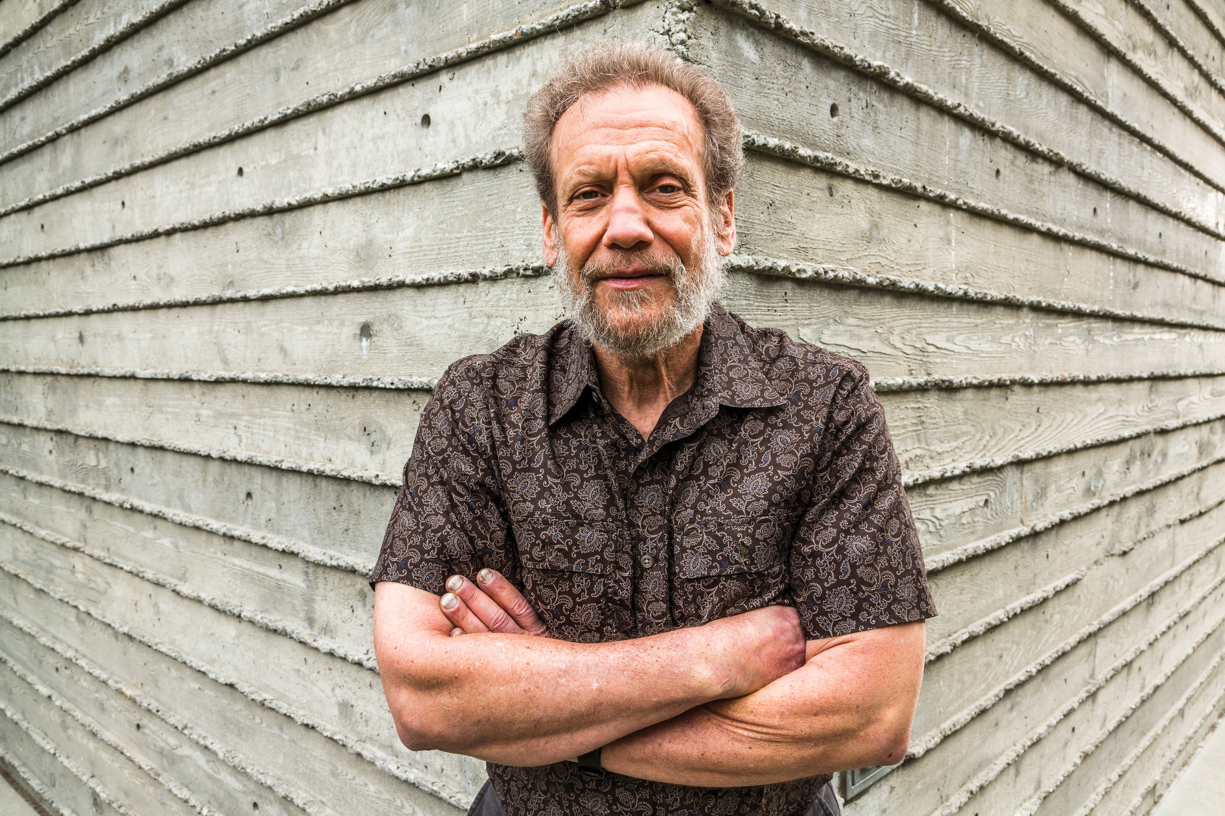
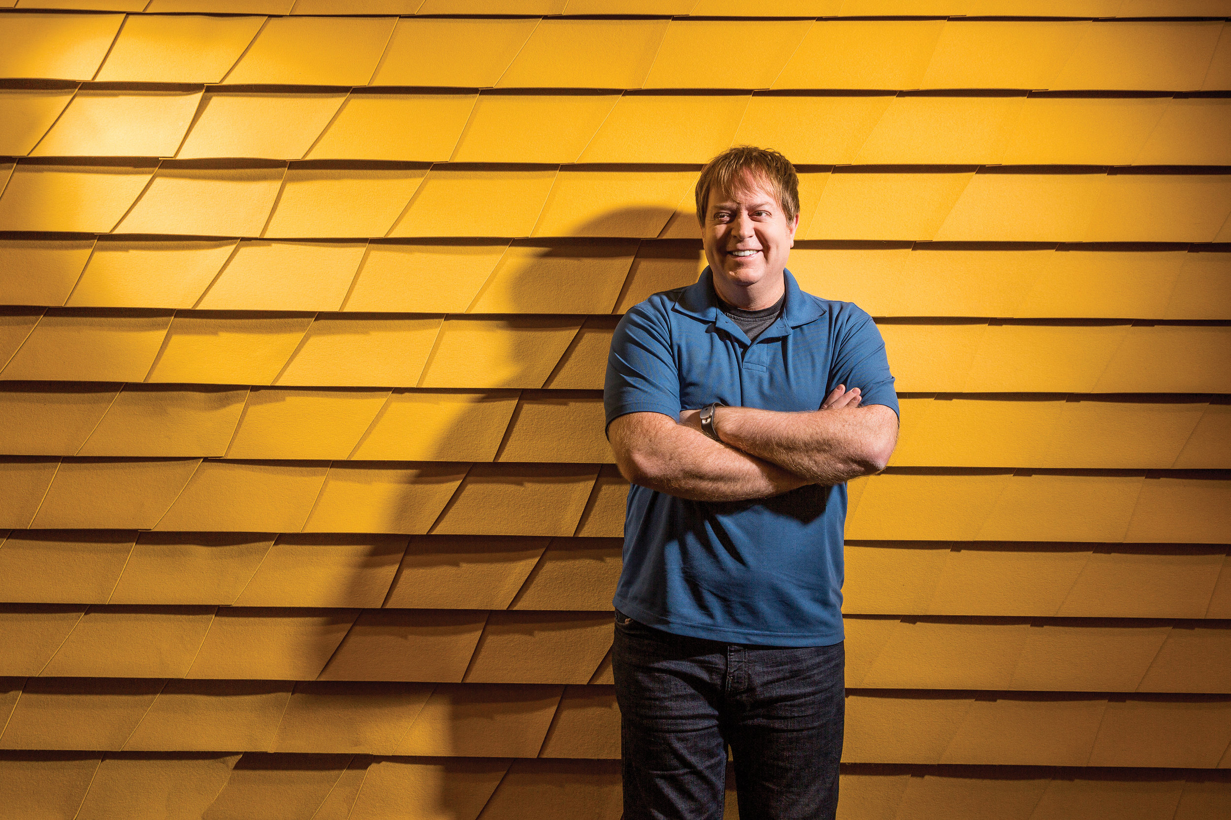
Steven Shaiman, the first program manager for type at Microsoft. He’s been on his own since 2010, living in the Pacific Northwest and working on family enterprises with his wife and five children.
STEVE SHAIMAN was on a business trip to Atlanta with Nathan Myhrvold, Microsoft’s celebrated head of advanced technology, when they got an unexpected phone call. Myhrvold had with him a satellite phone—an early mobile phone, “which in those days,” as Shaiman put it, “meant something you’d carry in a suitcase.” The unexpected call was from Apple.
At that time, Adobe Systems dominated the digital font market, with its PostScript technology built into Apple’s LaserWriter printers, and with PostScript firmly established as the preferred format for high-quality fonts. Microsoft needed to find its own format and its own fonts if it didn’t want to be dependent on Adobe.
Like Microsoft, Apple was trying to find ways to license the PostScript language from Adobe, or to find an alternative. The Apple call was about font technology: Apple was developing its own font format, TrueType, as an alternative to PostScript, while Microsoft acquired a program called TrueImage, a potential PostScript clone, which Apple was interested in. How about a trade?
Shaiman says that his and Nathan Myhrvold’s reaction was immediate: “Sure!”
Ironically, once Microsoft got hold of TrueType, they loved the concept but didn’t like the way it was implemented. Although they ended up only making slight modifications to the version that shipped with Windows 3.1, when it came time for the next version of Windows, they ended up “throwing out Apple’s code and rewriting it from scratch.”
When Microsoft and Apple publicly announced their collaboration on TrueType at the Seybold conference in September 1989, the announcement was handled in a contentious and aggressive manner that antagonized Adobe and famously brought Adobe’s John Warnock to tears of frustration. Steve Shaiman feels now that it was a poor way to do it: “We couldn’t have done worse.” Although they were demonstrating what they felt was better technology, they made the mistake of shoving it in Adobe’s face. “What we really needed,” he says, “was a good PR person who could have helped us come up with a less aggressive approach.” But the deed was done. The “font wars” were in full swing.
The key developer of Microsoft’s new code was Eliyezer Kohen, whom Myhrvold met at a conference in Switzerland. Eliyezer was, as Steve Shaiman put it, “really, really smart.” He had a PhD from ETH Zurich, where he studied with Hans Eduard Meyer, the designer of the font Syntax, and Niklaus Wirth, designer of the Pascal language; and he developed his own technology for creating scalable fonts. Eliyezer, according to Shaiman, was “a Turkish Jew with a German wife, who wanted to move to the United States, as one or the other of them wasn’t welcome in any country in Europe where they might find decent working conditions.” Microsoft happily brought him in.
EVEN A DOS SCREEN NEEDS A FONT
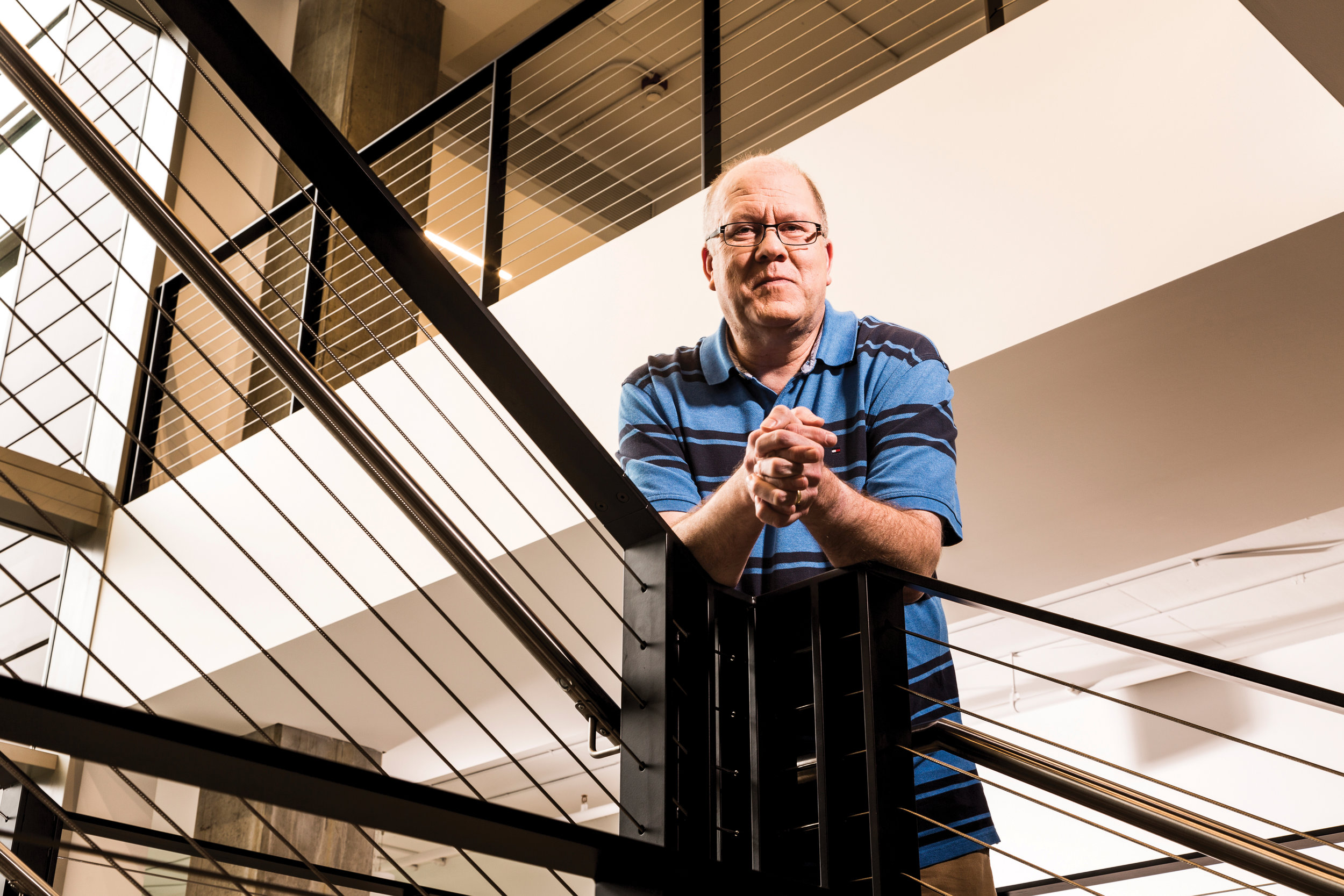
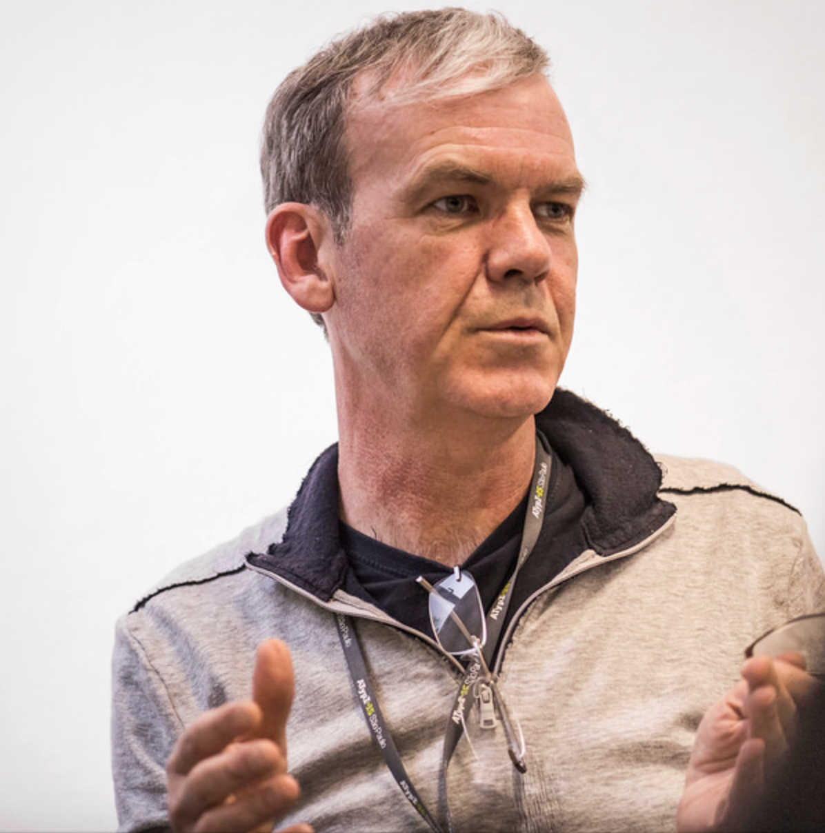
Greg Hitchcock’s journey to Microsoft was a bit circuitous —he studied geography with a focus on computer cartography, and immersed himself in computer science.
GREG HITCHCOCK was one of the early members of what he calls the “virtual team” that Shaiman and Dennis Adler put together in early 1990 to deal with fonts. Hitchcock is tall, blond, and slow-spoken; he doesn’t fit the image of the high-energy Microsoft employee, and he may seem unassertive, almost tentative, if you see him only in a neutral context. But when you see his attention snap to the subjects he knows and cares about, he is forceful and precise, and very, very knowledgeable. His memory is encyclopedic, and he has been at the heart of Microsoft’s typographic development for more than a quarter century. Today he manages Microsoft’s Advanced Reading Technologies (ART) team.
Although Microsoft had been dealing with fonts in one way or another from the very beginning (even a DOS screen needs a font to display its text), Hitchcock feels that the story of typography at Microsoft really begins here: When the first outline fonts were created for Windows 3.1, in 1990.
It was all brand-new technology. All fonts up until then had been bitmap fonts, crude forms made up of coarse screen pixels in a vague approximation of what real letters looked like. Although Microsoft’s new effort was driven by purely practical needs—mapping the screen fonts on a computer system to the fonts available on a printer—Hitchcock feels that it was also the beginning of thinking about screen fonts as something useful and readable in themselves.
The members of the virtual team came from all over Microsoft: Dennis Adler (Fonts), Jean-François Peyroux (OS/2, and later Windows), Michel Suignard (Windows International), Greg Hitchcock (OS/2), Eliyezer Kohen (Fonts), David Weise (Windows), Tim McCaffery (Windows), Raleigh Roark (Hardware), Gabe Newell (Printing), and later Ben Bauermeister, an outside consultant, whose “PANOSE system” for classifying typefaces by their visual characteristics (rather than their historical roots) might provide a roadmap between screen and print.
MONOTYPE SENDS OUT S.O.S.
STEVE SHAIMAN hired Dennis Adler to manage the fonts groups. Together, they talked with several potential sources of font libraries and font technologies, including most of the big guns in the field. Linotype, the venerable manufacturer of hot-metal typesetting equipment, which owned the rights to, among others, the very popular typeface Helvetica, was being hard-nosed. “Fonts were seen as incredibly valuable at the time,” says Shaiman, “and Linotype’s attitude was, ‘What’s Microsoft going to do for us?’” So they were asking an enormous price for licensing the fonts. And Microsoft didn’t want to license the fonts; it wanted to own the rights. (When Shaiman told me this, he laughed and proclaimed: “Microsoft doesn’t rent things!”)
Monotype, on the other hand, was much more receptive. Monotype was Linotype’s great rival; between them, the two companies had essentially created the business of mechanical typesetting in the late 19th century, with their competing hot-metal composition machines. But the Monotype Corporation had fallen on hard times. The typography division, the only part of the company working on digital fonts, was making money, but the larger machinery business was hemorrhaging cash, and the parent company was about to declare bankruptcy.
Out of that debacle rose a new type-only company, Monotype Typography Ltd, which was essentially the old typography division reconstituted as an independent business.
The new company, with its focus on digital fonts and information technology, was headed by a German, Rene Kerfante, who had joined Monotype in 1987 to head up the typography division, and an American, Ira Mirochnik, who had been Monotype’s chief financial officer. They were both quite ready to negotiate a deal with Microsoft.
So it was Monotype that began developing a set of “core fonts” for Microsoft: Scalable TrueType fonts that could be shipped with Windows and used freely by every Windows customer. The new fonts had to mimic the established core set of PostScript fonts, which included Times Roman and Helvetica. Since Monotype had originally developed the Times fonts back in the hot-metal days, that part was easy. To compete with Helvetica, though, they chose to adapt an earlier Monotype design with similar characteristics, called Arial.
Designing the outlines for these typefaces was the kind of task that the Monotype drawing office excelled at. The hard part was the hinting, the software instructions that control the rendering on various devices. That was what would make the fonts look good on screen.
Monotype had a team in the UK working on font hinting, but they were running into trouble. Although they had an auto-hinting program, called TypeMan, developed by Apple’s principal TrueType developer, Sampo Kaasila, the process was proving to be long, slow, and laborious. As Greg Hitchcock describes it, in desperation Monotype “sent out the bat signal.” In response, in September 1990, he and Eliyezer made the first of many trips to the UK to provide hands-on help and supervision. This was the start of a back-and-forth pattern for Greg—three weeks in the UK, one week in Redmond—that lasted for the next nine months. Their main job was hinting type, working in little rooms in archaic buildings at the old Monotype works. “One or the other of us was there pretty much constantly,” he said, “to monitor the process.”
As part of their response to the font-hinting problems, Monotype issued a call to many people in the type business to get training in TrueType hinting and help out at Salfords. One of them was me. I got a call out of the blue from Rene Kerfante, while I was doing on-site work at Aldus Corporation in Seattle. As a result, I flew to San Jose for a TrueType-hinting training session, though in the end I did not join the Monotype team or become a font-hinter. One of the people who took the training and did go to Salfords was Steve Matteson, who ended up many years later as Monotype’s director of custom type development, and who eventually designed Microsoft’s 21st-century system font, Segoe.
PIXELS AREN’T SQUARE
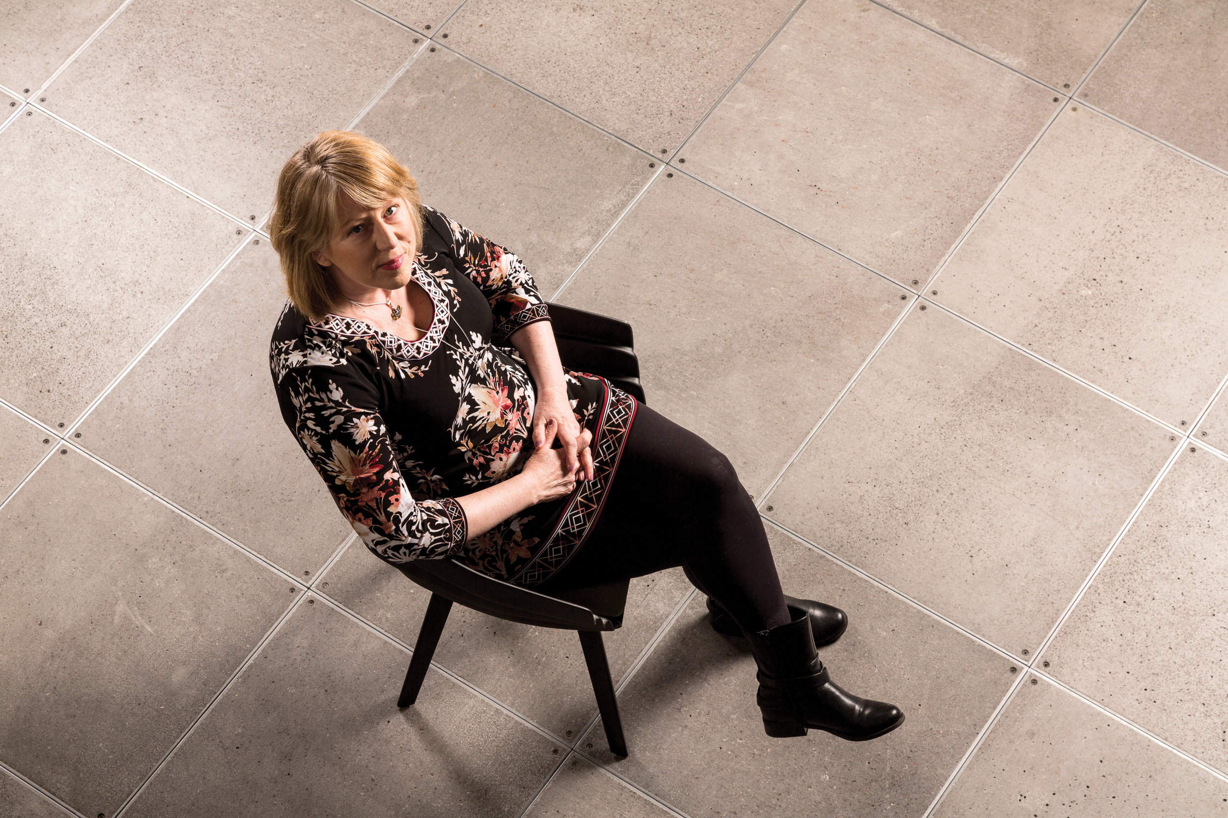
Geraldine Banes received her Masters degree from the Central School of Art & Design in London. Her work on the tyepface Sylfaen included the Greek, Armenian, and Ethiopic glyphs.
ALL THE TRAVELING was taking its toll on Greg and Eliyezer. At the end of June 1991, they brought the production work from Salfords to Redmond, bringing four Monotype employees with them: Mike Duggan, Geraldine Wade, Ian Patterson, and Sue Lightfoot. “Mike,” says Greg Hitchcock, “was Mr. Pixel. Geraldine focused on maintaining the beauty of the typeface design. Sue could handle all the monotonous projects with precision. Ian was the technical hinting guy.”
Mike and Geraldine eventually became Microsoft employees, while Ian and Sue went back to the UK, where to this day they work on updates and maintain the continuity and quality of the core fonts from a cottage on the edge of the New Forest.
Quality, and pride: Those were what the fonts team concentrated on. Their painstaking work was intended to make the fonts look good no matter what the output system might be.
This was when they began to realize that the screen could be the destination, not just a station on the way to print. Screens then had very coarse resolution. “Raw gray scale” did not give good results, so the screen fonts were effectively just black and white. And different monitors had different pixel ratios; unlike pixels today, pixels in those days were not necessarily square.
“More than anyone else,” says Hitchcock, “the person responsible for making all this happen was Eliyezer. Dennis [Adler] handled the business side, and Robert [Norton] rode herd on the quality.”
THE QUALITY QUEST
THE OFFICIAL “coming out” of the core fonts took place at the Monotype conference in New York City in May 1991.
Robert Norton was a huge Englishman, six-foot-six and “broad to match” (as typographic historian Nicolas Barker has described him), with a large head and a shambling gait. He loved sailing, food, and drink; he once started a factory in Jamaica; and in the Swinging Sixties, when he owned one of the hot typesetting shops in London, he was known to drive around town in a lavender Bentley. He hosted parties on an old German river ferry that was called Belwe, after a revived German typeface. He had a self-deprecating sense of humor, a keen eye for technical detail, and many years of experience in putting new typesetting technologies to profitable use.
“Robert Norton changed the world on us,” says Greg Hitchcock in retrospect. “He’d look at what we were doing and say, ‘You can do better than that.’”
Steve Shaiman says that Norton flew over for the interview “on a lark,” figuring to get a trip and a few good meals out of it. When they showed him a sheet of proofs, he went through it in detail, pointing out everything that ought to be changed: “This pixel here needs to be over there.” He “totally zonked it,” says Shaiman, and they offered him the job on the spot.
That was the beginning of a new level of emphasis on quality in Microsoft type. “He challenged us,” says Hitchcock, “and pushed us to do something very hard. When we did, we found ourselves with something better than we’d ever expected.”
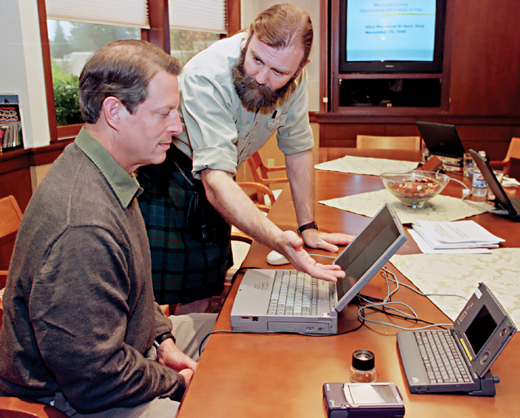
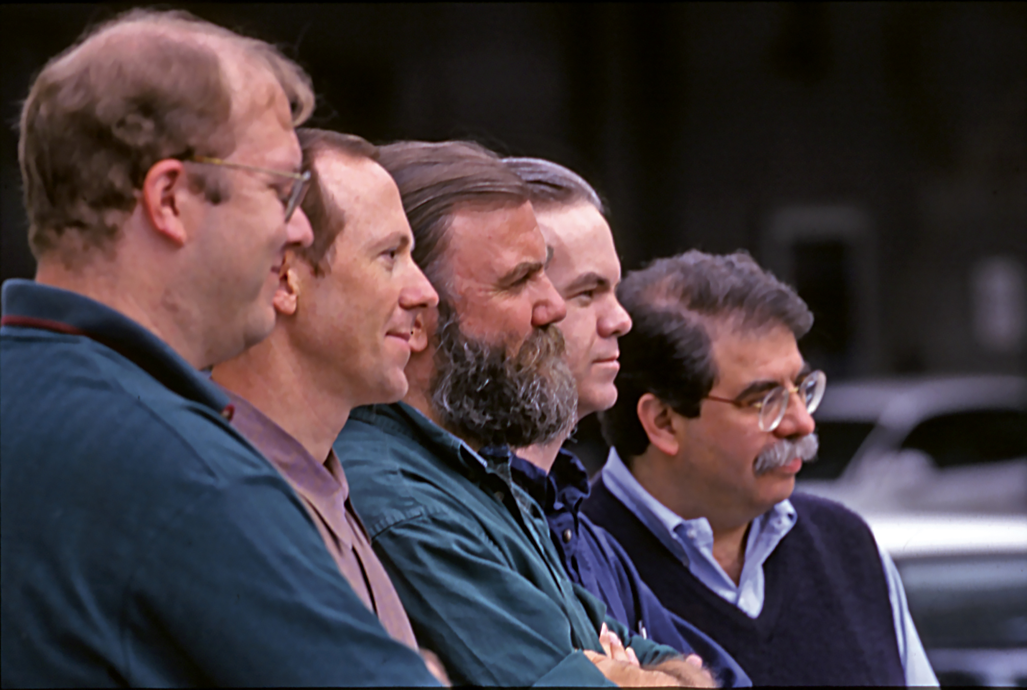
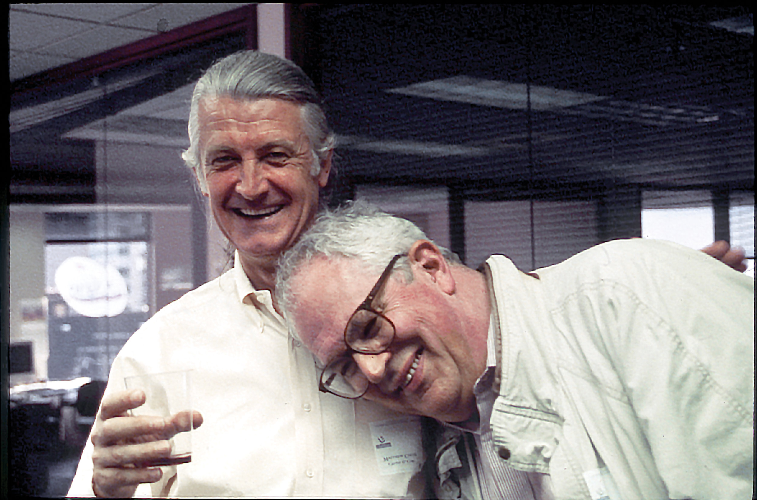
Bill Hill, in his kilt, shows early-adopter Al Gore the difference type can make in on-screen readability. . . . The ClearType team, 1999: Greg Hitchock, Bert Keely (co-inventor), Bill Hill, Mike Duggan, and Dick Brass (VP, Microsoft Reader). . . . Robert Norton and his old friend, Matthew Carter. [Photos: Microsoft Archive]
THE MAN IN THE KILT
BILL GATES became so impressed with the talent that Steve Shaiman had acquired for his team, that he wanted to use them elsewhere in the company. Eliyezer Kohen got moved to the Microsoft Word team developing line layout, or the way type gets set in lines and paragraphs (“which is why line layout works so well,” Shaiman asserts), and others were assigned to other teams. Peter Pathé, who was managing the fonts team while Shaiman concentrated on research, moved on to manage the Word team, so Steve had to find a new leader to handle fonts.
“We advertised the job,” says Shaiman, “and this Scottish guy answered the ad.” The “Scottish guy” was Bill Hill, a former newspaperman who had been working for Aldus Corporation, originators of the desktop-publishing program, PageMaker. Hill had a ponytail, a bushy beard, and a forceful personality; you could always spot him, because no matter what the weather was, he’d be wearing either shorts or a kilt. As it turned out, he also cared deeply about reading and digital publishing.
Hill brought a new vision to the fonts team. He was an evangelist for on-screen reading, and for the power of new technology to make fonts and the way they’re presented on the screen better. He pushed for research on readability of the fonts to prove what they were learning.
And he could be flamboyant: Steve Shaiman describes how at one Seybold conference, “Bill Hill got up in full Scottish regalia, gave a high-level talk about the importance of type in reading on-screen and Microsoft’s work in that area, and received a rousing round of applause—something unheard of for any Microsoft talk at a Seybold conference.”
THE DEFAULT TYPE OF THE WEB
EVEN BEFORE Bill Hill came on board, the typography team had begun working on a pair of revolutionary new fonts for on-screen reading: Verdana and Georgia. In April 1994, as Windows 95 was being developed, Steve Balmer saw a demo of the available fonts, and he balked: “It looks too much like OS/2!” he said. “We should change the fonts!”
Recognizing that fonts can give a system its visual personality, Balmer asked the team to come up with a new set of fonts—by June 1. Even by Microsoft’s round-the-clock workaholic standards, that schedule was too aggressive to be practical.
But they got the go-ahead to create new fonts for the next release, and when they thought about who to get to design them, Matthew Carter’s name immediately came up. Carter had already worked with Microsoft—his Elephant (a fat face similar to his Big Figgins) was done for a Fontpack. And he had unique stature as a designer who had worked in virtually every technology, from hand-cut metal punches to the latest digital tech. His typefaces can be found all over the internet, thanks to his work with Microsoft in the 1990s.
The two new typefaces that came out of this project were Verdana and Georgia. Although not conceived at first as a matching pair, the two font families—one sans-serif, the other serif—came to be used extensively for on-screen reading. They became, in effect, the default fonts of the web.
In designing Verdana, Carter worked backwards: Rather than coming up with the ideal outlines first, then having the fonts hinted so that the way they looked right on screen at every size, Carter drew each of the target sizes as a bitmap, then drew outlines around them. There was careful collaboration between Carter as type designer and Monotype’s Tom Rickner as the TrueType hinter. (On the Microsoft side, two others played significant roles: Virginia Howlett and Dave Ohara.)
Verdana’s letters are wide and generously spaced, simple in structure but clearly differentiated from each other, with open counters and apertures, in the “humanist sans” style that has become de rigueur for readable screen fonts. It’s more or less the opposite of its sans-serif competitor, Helvetica, and even of the Monotype/Microsoft equivalent, Arial.
Carter also designed a more compact version (Tahoma), which could be used in user interfaces, and a condensed version (Nina) for hand-held devices.
FONT WARS
IN 1996, the web was taking off, and there was feverish debate about whether a new font format would be needed for use on the web. Adobe, Apple, and the leading browser maker, Netscape, were all looking at solutions based on PostScript fonts, though without a coordinated strategy. But at the Seybold conference in February, Bill Gates’ keynote speech focused on a TrueType-centric strategy for web fonts. A month later, Microsoft received an unexpected request from Adobe: For the font teams of the two companies to meet and have a discussion. It wasn’t immediately apparent to the people at Microsoft what the discussion would be about.
When the two teams got together in Redmond, the meeting began awkwardly, with everyone talking around the central concerns the two companies had. Although PostScript Type 1 fonts, Adobe’s format since 1985, dominated the print world, the format had problems: It was developed before Unicode (the new standard much larger than the ASCII character set), and it depended on the presence of Adobe’s font-rasterizing utility, ATM (Adobe Type Manager), on every computer, since support for the format wasn’t baked into the system software. In fact, there was a good possibility that Apple’s next OS version might not support ATM at all. (Apple was developing its own proprietary format, TrueType GX, but only for the Mac.)
So Adobe had good reason to be thinking beyond Type 1. Microsoft, meanwhile, had been working on what they called TrueType Open, an extension of the TrueType format that would give it more capabilities for the web.
Bill McCoy and Dan Mills were the two senior Adobe folks at that meeting. Early in the meeting, Dan complained about the output quality of the Type 1 to TrueType font converter that Microsoft was shipping with Windows NT at the time. Microsoft’s Bill Hill already knew Bill McCoy, and at a break in the meeting, Hill invited McCoy to “go walkabout” with him. They left the building and started strolling around the tree-dotted Microsoft corporate campus, talking about how to come up with a mutually acceptable solution. What came out of this walkabout diplomacy was the OpenType font format.
There are conflicting memories who invented the name “OpenType,” but there is no doubt that it was the result of opening up the TrueType Open technology to allow both TrueType and PostScript Type 1 outlines to be contained within OpenType fonts. In April, a letter of intent was drawn up between Microsoft and Adobe. As Greg Hitchcock likes to point out, the announcement that marked the end of the “font wars” came on May 4, or “Star Wars Day.”
MAKING IT CLEAR, PART I
IT WAS E-BOOKS that prompted the development of ClearType. Bill Hill moved from the fonts team to Microsoft’s electronic-books team, which was working on innovative software for reading books on-screen.
Creating a usable e-book reader set the bar even higher than just helping the typography of websites. The goal was to make it comfortable and easy to read a whole book with no impediments. The displays, with their still-low resolution, were not helping, and it seemed likely that there would be no appreciable increase in screen resolution for most devices for at least the next several years. But perhaps there was a way to make type better, more readable, on the screens that we had already?
So they started brainstorming. Bill Hill and Bert Keely, who had designed an LCD monitor for Silicon Graphics and later became the godfather of Microsoft’s Tablet PC, led the effort. Greg Hitchcock volunteered to take a “deep dive” into the technology of LCD displays.
The key to increasing the display quality was in the pixels: On an LCD screen, each pixel is a square, but it is made up of three vertical stripes, one each for red, green, and blue light (RGB). By manipulating each of those stripes separately, the software could, in effect, triple a screen’s horizontal resolution.
It took a lot of trial and error, and the first results were a colorful mess. But as Greg and his team gradually fine-tuned their techniques, they hit a point where suddenly the letter shapes popped out, even at low resolution.
This was the “Aha!” moment. When they showed this to Bill and Bert, it was clear that the effort was going to pay off.
MAKING IT CLEAR, PART II
NOT CONTENT to just come up with a technology that would greatly improve the readability of type on-screen, the team wanted to create new typefaces designed specifically to work with ClearType. The initial suggestion came from Mike Duggan and Geraldine Wade, who persuaded Greg Hitchcock that it was a good idea. Bill Hill had Greg take the proposal to Bill Gates to get budget approval.
Microsoft commissioned new type designs from type designers from around the world.
In January 2003, they brought this team together in Redmond to brainstorm, to learn about ClearType, and to create a game plan for the project. John Hudson, a highly articulate British-Canadian type designer with a lot of experience in multilingual type design, took the lead among the designers; the project overall was was headed up by Mike Duggan and Geraldine Banes.
In the end, they created six new Western type families, to cover different styles and uses of type, and one for Japanese. All of the Western fonts were given names that began with the letter “C”, which led to everyone calling them the “C fonts.”
Constantia (designed by John Hudson) was an elegant serif face intended for use in editorial design, both on-screen and in print. Cambria (Jelle Bosma, Steve Matteson, and Robin Nicholas, of Monotype) was a much sturdier-looking serif face, with a larger x-height, meant for office documents and mathematical setting; along with Calibri (Luc(as) de Groot), a humanist sans-serif with softly rounded ends, it became the new default for Microsoft Office documents.
De Groot also contributed a monospace typeface, Consolas, for programmers and anyone else who wanted their fonts to have typewriter-like spacing. Rounding out the set were Corbel (Jeremy Tankard), a “less cuddly, more assertive” sans-serif, and Candara (Gary Munch), an incised sans-serif whose subtle curving gave the letter shapes a lively sparkle.
The designers worked simultaneously on Latin, Greek, and Cyrillic versions.
The ClearType fonts were eventually shipped with both Windows and Microsoft Office, including Office for the Mac, which meant that designers could use these fonts in on-screen layouts with a reasonable expectation that their designs would be displayed correctly on their readers’ screens.
SIMON SAYS
Si Daniels, who has been with Microsoft since 1997, was hired without ever being interviewed for the job. His first computer was a Sinclair ZX81 he bought when he was 10 years old.
FOR MANY YEARS, Microsoft had two teams working on typography. While the ART team explored new technologies, the Fonts team, under Simon Daniels, served users’ needs by commissioning new typefaces, updating and bug-testing the fonts that shipped with Microsoft products, and helping teams in other parts of the company, from Office to Games, find and license the fonts they needed.
The Fonts team’s work included expanding coverage beyond just English and the Latin alphabet, to the many languages and writing systems used by Microsoft’s customers around the world.
Their work was not always obvious, but it was valuable; program manager Ali Basit, for example, has put great effort into improving the default Arabic fonts so that they will work seamlessly and correctly in all the languages using the Arabic script.
The members of the Fonts team were quite proud that when Windows 7 shipped, it was the first version of Windows that included more non-Latin fonts than Latin fonts.
Over several years, Simon Daniels’ patient, persistent efforts raised the profile of his team within Microsoft, encouraging the rest of the large company to appreciate the in-house typographic knowledge and expertise right at their fingertips.
SHARP EDGES, MORE CONTRAST
Kevin Larson’s paper for Microsoft, “The Science of Word Recognition, or: How I Learned To Stop Worrying and Love the Bouma,” paints an accurate self-portrait, as Greg Hitchcock has pointed out.
THE STRONG interest in readability that has characterized Microsoft’s typographic efforts since at least Windows 3.1 is continuing today. It was the driving force behind the ClearType efforts, and in the decade-plus since then, Microsoft has poured money and energy into research, looking for ways to make on-screen reading better.
Kevin Larson, a psychologist and readability researcher with a PhD in word recognition and reading acquisition, was brought onto the ART team in the middle of the ClearType project, when Bill Gates told the team that he wanted to know whether readability could be measured. Testing and measuring are Kevin’s specialties.
Kevin is an amiable red-haired man with a sharp intellect and an oblique sense of humor. For Microsoft, he has been devising methods of testing things like comprehension and eye-strain: That is, how well and how quickly we pick up the meaning of what we’re reading, and how long it takes our eyes to start feeling uncomfortable while we do it. Kevin’s research has supported an idea that has been fundamental to Microsoft’s treatment of type on-screen since the early days: That the sharper the edges of the letters are, and the greater the contrast between them and the background, the more readable the type will be.
This research led to the development of a new serif text typeface, Sitka, which debuted in 2013 in Windows 8.1 as the default font for Microsoft Edge’s “Reading View.” It was another collaboration between the ART team and Matthew Carter, who worked back and forth with Kevin Larson over several years, testing different letter shapes to see which ones were most recognizable. Besides being an experiment in finding optimally readable letter forms, Sitka was also an exercise in optical scaling, the subtle modification of letters as they get bigger or smaller, to make them appear visually consistent. In Sitka, these optical variations are built into the font itself.
Microsoft’s bet on readability research has recently paid off in a spectacularly useful way. In the course of a single week in 2015, during the company-wide “hackathon” that CEO Satya Nadella initiated to spur innovation, the ART team collaborated with the team that develops OneNote and came up with an add-on for teachers and students that they called “Learning Tools for OneNote.”
For some time, Kevin Larson had been exploring ways to show how words and sentences are structured. What if you could find a subtle way to show how words break themselves into syllables? This seemed especially promising for children who were just learning to read.
WE NEED MORE FONTS
The first beta versions of Learning Tools for OneNote were shipped in January 2016, and the technology is already in use in classrooms helping real people, some of them with reading disabilities, read better. The feedback from teachers has been that students with severe reading problems have finally found a way to make unprecedented progress in reading speed and comprehension.
Few things demonstrate better than this the impact of type of people’s lives. It began with the Gutenberg press and continues today by making reading on-screen easier than reading on paper. And that’s the reason, Mr. Gates, why we need more fonts.
SIDEBAR
Some of the Microsoft fonts on your system
Microsoft fonts are such a part of our visual landscape that we forget who commissioned them.
SIDEBAR
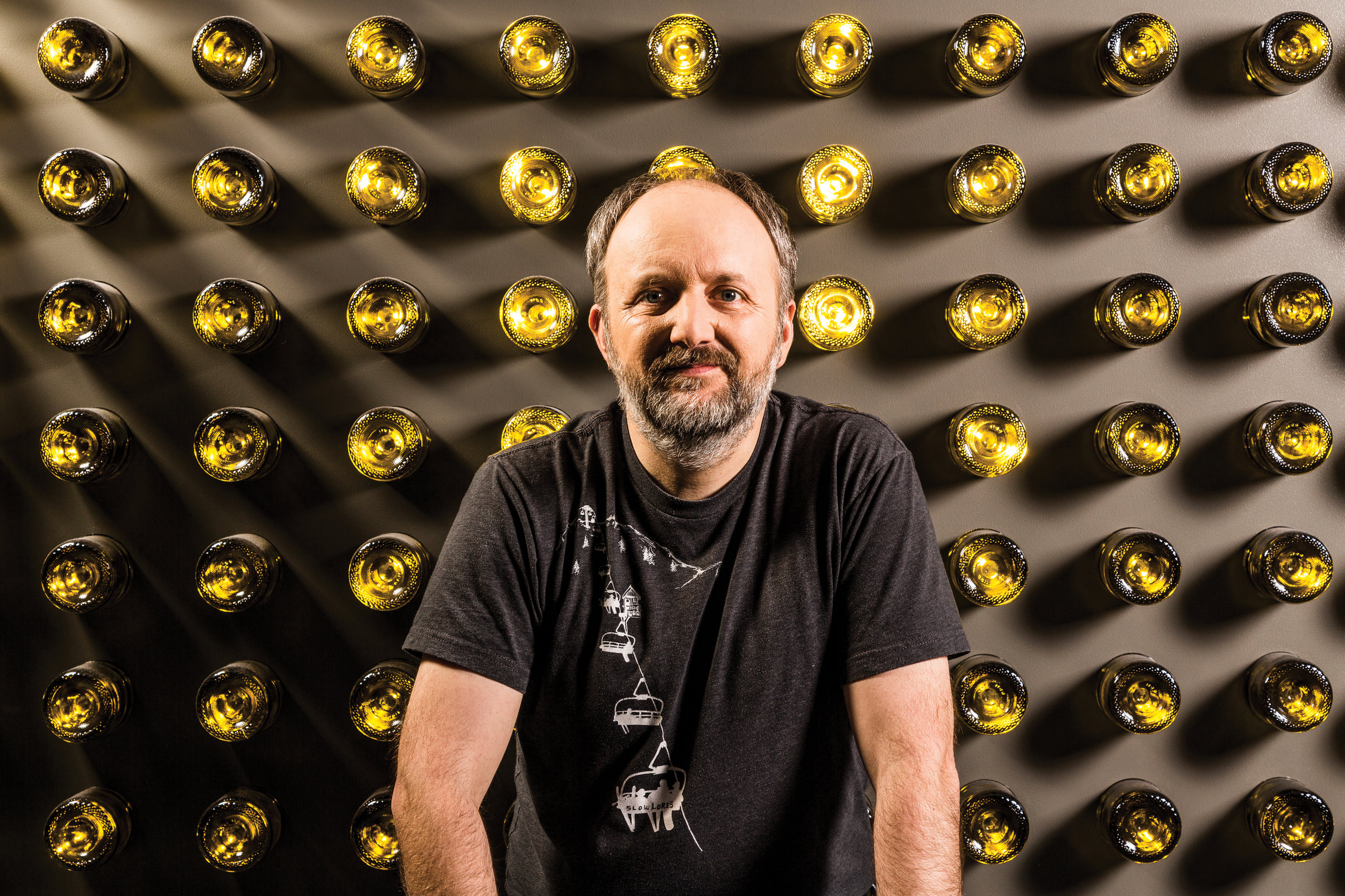
Mike Duggan is a master of the subtle hint
Mike Duggan
Underlying the way every font looks is a set of software instructions that subtly tweak the way it is displayed onscreen. For more than 25 years, Mike Duggan has been doing this under-the-hood tweaking of Microsoft’s fonts, to give them their absolute best appearance in each of the many hardware and software combinations that might display them.
Mike is a lead typographer in the Microsoft Advanced Reading Technologies team, and has a degree in Visual Communications from the National College of Art & Design in Dublin, Ireland. He has played a key role in the development and hinting of the original Core fonts as well as new typefaces targeted for screen legibility. Mike was the typographic technical lead on the ClearType Font Collection project, and the lead program manager on the recent optically scaled Sitka font family, designed by Matthew Carter.
John D. Berry is an editor and typographer in Seattle. He’s past president of ATypI and was editor and publisher of U&lc.
Note: This story has been corrected and updated since the print edition of No. 1