
Can IBM Plex topple Helvetica?
IBM has high hopes for its new typeface, but can Plex honestly challenge the goliath Helvetica? Its lead designer, Mike Abbink, says it can.

Big Blue’s role in the typography history books might pass largely unknown, overshadowed by their computer and artificial intelligence endeavors. But if you look closer, IBM’s design heritage dates back further and stands toe-to-toe with companies like Apple, Google, or Microsoft. IBM commissioned Courier, the most well-known and frequently-used monospace font. IBM also built the Selectric typewriter, introducing homes and businesses to the impactful notion that they can pick their own font. Beyond those obvious contributions, IBM’s Paul Rand-designed logo has fortified its place among the all-time most-recognizable graphics. Most impressive of all: “big” plus one of the three primary colors, “blue,” equals IBM. . . . No other company has earned such a widely known visual nickname. Now, after 109 years in existence, IBM finally created its very own typeface, IBM Plex.

Selectric "gold balls," from Tina Lewis Rowe.
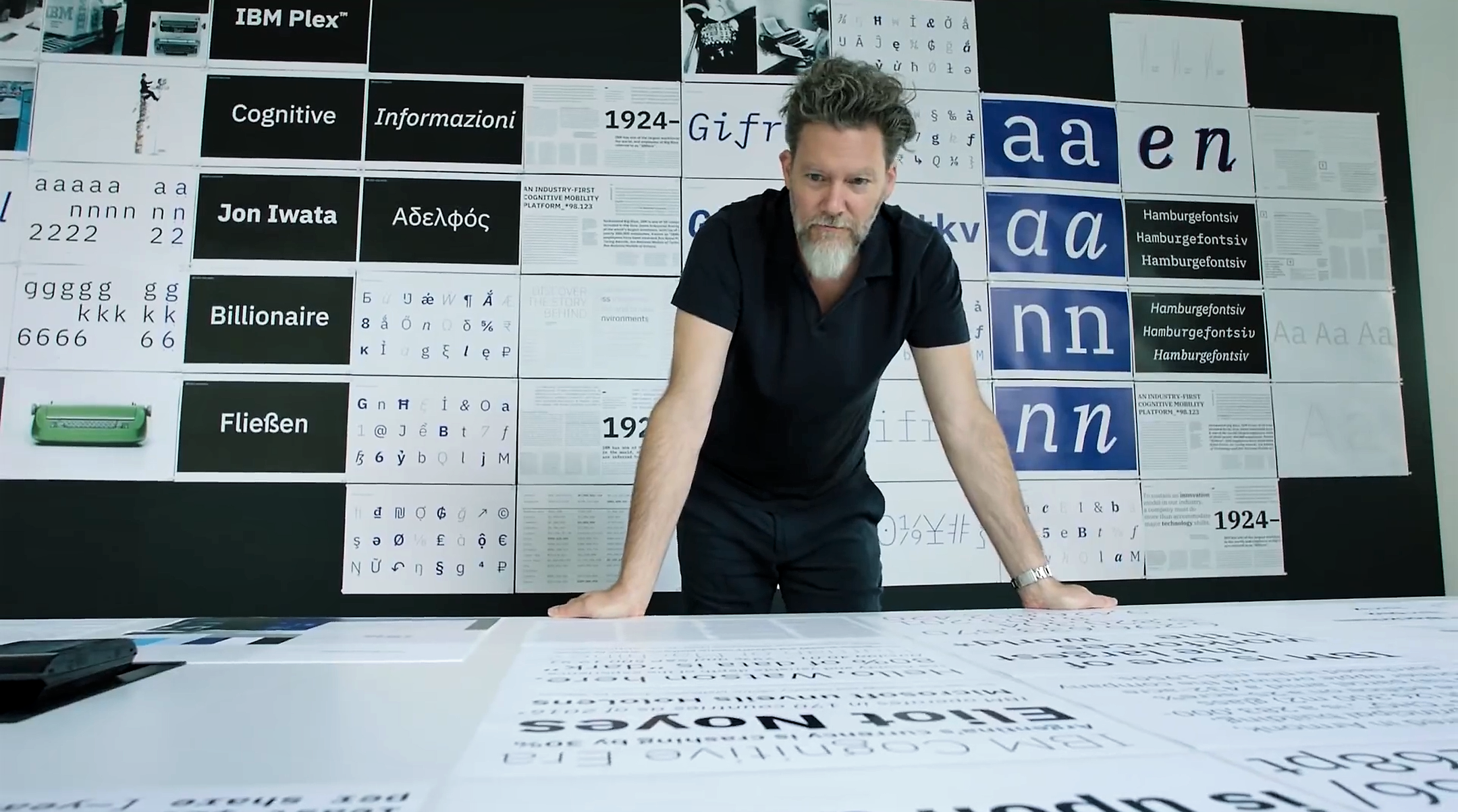
The company has teased us with glimpses of Plex since SxSW, and, though the public won’t be able to get its hands on Plex’s final form until early 2018—it’s to be open source— the typeface’s beta version is already making waves in the type community. According to the company’s announcement video (watchable here), Mike Abbink, IBM’s Executive Creative Director of Brand Experience and Design, led the design of Plex. In fact, IBM seems to have hired Abbink just a few years ago with this specific deliverable in mind: “When I came to IBM, it was a big discussion: Why does IBM not have a bespoke typeface?”
Abbink cut his type-design teeth in 1995 when he began work on FF Kievit; the school project—under the instruction of Leah Hoffmitz—went on to win the ISTD Premiere Award in 2001. Since then, Abbink’s resume includes stretches with MetaDesign and Wolff Olins, producing twelve more typefaces. Several of these faces—which include Inspira for GE and NBCU Rock for NBC Universal—required teamwork between Abbink and Paul van der Laan of Dutch foundry Bold Monday, the foundry chosen by IBM to develop the meat of IBM Plex.

A building wrapped with the yet-to-be-named IBM Plex at this year's SxSW. Photo by Anne Quito at Quartz.
The design process
Not known to shy away from a challenge, IBM is issuing Plex as a huge family. There are a Sans-Serif, a Serif, and Monospace— with support for 110 languages and more on the way. According to Fast Company, it will eventually cover “Hebrew, Greek, Cyrillic, Chinese, Hindi, Thai, and Arabic.”
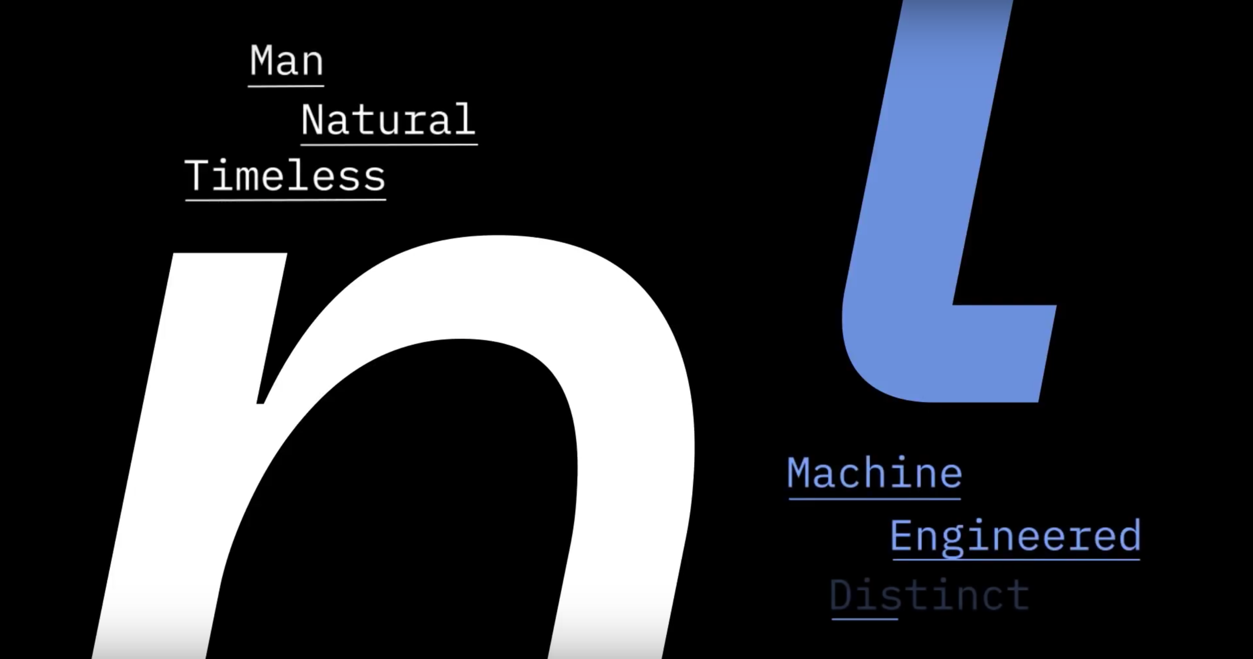
Seeing these complexities on the horizon, Big Blue designed flexibility right into Plex.“We quickly came to this common theme that’s been with IBM since the twenties. This notion of man-and-machine and how does that work in the world. This relationship between us, mankind, and the machines we create.”
The goals was to have a typeface that could adapt to all sorts of users, and to all sorts of use-cases. Says Teresa Yoo, vice president of brand strategy and experience design, “When you look at [Plex], there are very highly-engineered parts of it, and then there are very humanist gestures in it, too.”
Plex graphic by IBM
Will this flexibility be enough for Plex’s suggested hurdle, to supplant Helvetica? IBM is not alone in this ambition. Other fonts have been suggested as Helvetica-killers, whether their designers intended it or not. Gotham, Arial, Roboto, Calibri, Segoe, San Francisco—the list goes on—are rivals to Helvetica’s ubiquity.
The question is whether Plex’s designers have learned from the other contenders’ mistakes. Arial showed that it is enough match Helvetica’s metrics character-for-character to take over the Windows OS, and then the entire web. But the typeface was never loved the way Helvetica was, perhaps because it was forced onstage like an understudy filling in for a star.
Appearing in the same UI role on Google's stage, Roboto was described as a “four-headed Frankenfont” by type pundit Stephen Coles. He pointed out that the font seemed to be stitched together from Helvetica, Myriad, Univers, FF Din, and Ronnia. But the first version of Roboto was a showcase, not the premiere, Google explained, and there have been improvements in the design. Coles has withdrawn his pan. Roboto, free on Google Fonts, would be the big ticket seller in the category, if the tickets weren’t free. Last week it was downloaded 45 billion times.
Gotham surely has won the beauty contest, and has become the brand font for all kinds of concerns, including the Obama Presidential campaigns. HOPE made it even more popular, but have to pay for a license (I mean type designers have to eat to.) And without the inclusion on one of the big libraries (Windows, Mac, Google), it's not going to not take over from Helvetica yet.
In any case, the intention of the Plex design is not obviously to replace Helvetica. That’s more of a line from the press release. It’s an original design. And it is for free. Take that, Gotham!

IBM Plex's sans serif.
There’s more to replacing Helvetica than not copying it, looking good, and being generally available. Abbink explains, “Helvetica is a child of a particular set of modernist thinking,” so it follows that its new rival needs to represent the zeitgeist of our era—one that resonates with graphic designers and laymen alike. It’s the laymen on whom IBM is betting to make the difference.
Helvetica began to become ubiquitous when Xerox put it on their first laser printers, along with Times Roman. Apple put it in the Mac and on its own laser printers, and when Microsoft launched Windows, they wanted it, too. But they didn’t like the terms Mergenthaler Linotype offered, and the old Monotype adapted Arial for them at a more favorable price.
While Plex will not be anyone’s default (other than IBM employees), by offering it for free Abbink says that Plex could become just as popular: “If shoe stores or coffee shops or small businesses are using it for identity—awesome!”
In the end, Plex’s sans serif looks similar to Verdana, perhaps because of the same desire for readability. Bold Monday started with a wide, open Gothic. The Serif looks refreshing for a brand typeface, with ball terminals and other quirky bits that keep it interesting in a world of corporate sans serifs. The monospace, required for any company that produces code, appears very wide, but that may be the result of mixing right angles with soft curves. The man-machine balance does come through in every style, so it appears IBM hit their mark with the design.
Abbink looking over Plex.
The motivation
As for IBM’s zeitgeist—the one meant to have been replaced—it’s a “discussion around mankind and the machines, and how [that is] going to evolve and progress our world for the better,” according to Abbink. Zeitgeists are difficult to describe, but Abbink’s thoughts align broadly with ongoing conversations about artificial intelligence, and specifically, the shared nightmare among designers of being replaced by computers. Yet, even with this discussion in mind, why take on Helvetica in the public arena?
It’s probably more about money than marketing. The Armonk, company reportedly pays more than $1 million per year to Monotype to license Helvetica, and doesn’t cover all their employees and vendors. By designing their own typeface and giving it away for free, IBM ensures that all its staff and subcontractors have easy access to the cornerstone of its visual brand. The savings won’t matter too much on the balance sheet (IBM earned nearly $80 billion last year), but which department head wouldn’t jump to trim a million of its annual budget with one big IP buy-out.

“IBM Plex is the new Helvetica.”
—Mike Abbink
The decision—to replace Helvetica internally—triggers a very unique domino effect. If they’re going to replace Helvetica as their brand typeface, then they need to develop something they can say is better than Helvetica, otherwise it’s a downgrade—or at best a side-step. Other companies have gone through the same thought process when replacing Helvetica, and there are two options: design a “me too!” font, or create a legitimate challenger by building something as thorough and broadly available as Plex. IBM chose the latter
LINKS
- IBM’s typography page, with a link to download the beta version of Plex.
- Eye On video announcing IBM Plex.
- Mike Abbink’s website, with his history and design portfolio.
- Bold Monday’s web page for IBM Plex.

Become a TYPE Member
If you like this story and others posted here, join us!
TYPE is non-profit, supported by members, sponsors… and advertisers. Charter Membership is now only $29 in the US ($59 outside). Your contribution makes it possible to distribute the quarterly magazine, build a new web site, and plan events all over the world.


