Weekly Roundup: December 2
Here is the third regular update by TYPE of font releases, custom type launches, and type-related events.
Riks
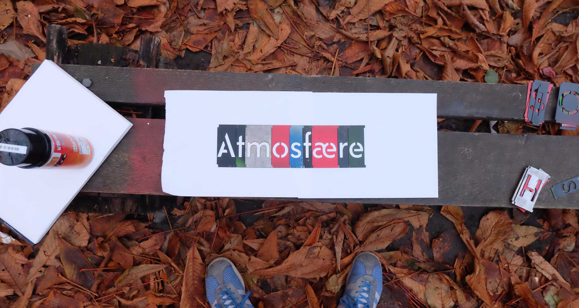
Norwegian foundry Monokrom released the final piece to Sindre Bremnes’s Telefon family, Riks. Using the award-winning Riks telephone booth designed by Georg Fredrik Fasting in 1932 as source material, the stencil typeface comes in two styles: “Normal and Negativ.” While Gratis licenses are available for free, Monokrom hopes users will purchase Desktop licenses and “support the production of stencil cuts in additional characters and sizes.” Learn more about the Riks and its story here.
Ten Oldstyle & Ten Mincho
Adobe released Ryoko Nishizuka’s Ten Mincho and Robert Slimbach’s Ten Oldstyle. The Japanese and Latin duo attempt to “create a pleasing harmony between the two scripts when they are set together in text,” without sacrificing the traditions and expectations inherent in each culture; to accomplish this, Ten Mincho took cues from “the lettering styles used in the tile-block printed Kawaraban newspapers from the Endo period in Japan,” while Ten Oldstyle “looked to the humanist writing tradition of the Italian Renaissance for inspiration.” Both faces are available to sync through Adobe Typekit.
Tolfino
Lost Type published Tofino Pro, an expanded version of Alanna Munro’s “west coast swiss” typeface. The 74-style typeface combines the “Swiss style” with a “more hang loose attitude.” In-keeping with Lost Type’s offbeat and impressive aesthetic, Tofino Pro launched with a radical website, complete with live a “Surf Report” from Cox Bay, Tofino, a downloadable Tofino UI kit, and a digital magic-eight-ball. You can see the specimen webpage and obtain a personal license of Tofino at a pay-what-you-want price here.
Dover Text
Tiny Type, run by Dutch type designer Robin Mientjes, released Dover Text this week. The two-style typeface includes a serif, modeled after Gill Sans, and a serif, modeled after Haas Caslon. The surprising marriage of two quintessentially British typefaces works well, with each style available in regular, italic, and bold. Dover Text is available on Tiny Type’s website.
Oi!
Kostas Bartsokas released Oi!, a “clarendonesque on steroids.” The typeface takes inspiration from Caslon’s 1844 and Fann Street Foundy’s Clarendon. Supporting both Latin and Greek, Oi! features two styles: “Oi! You!, the regular style, and its accompanying Oi! Mate!, a shadowed style.” Free personal licenses of this ultra-thick display face is available on Bartsokas’s website.
Klooster
David Jonathan Ross launched his latest Font of the Month Club typeface, Klooster. The “thick, wide titling face modeled after the uncial script” manages to fit together familiar and foreign shapes to create an intriguing harmony. In DJR’s own words, “Klooster’s harsh angles contrast with its gestural curves.” Learn more about the typeface on the Font of the Month Club website.
Send your announcements and tips to TYPE’s digital editor, Lucas Czarnecki.


