The Typography of “The New Yorker”
With over 90 years of history, “The New Yorker” is showing off its typographic DNA
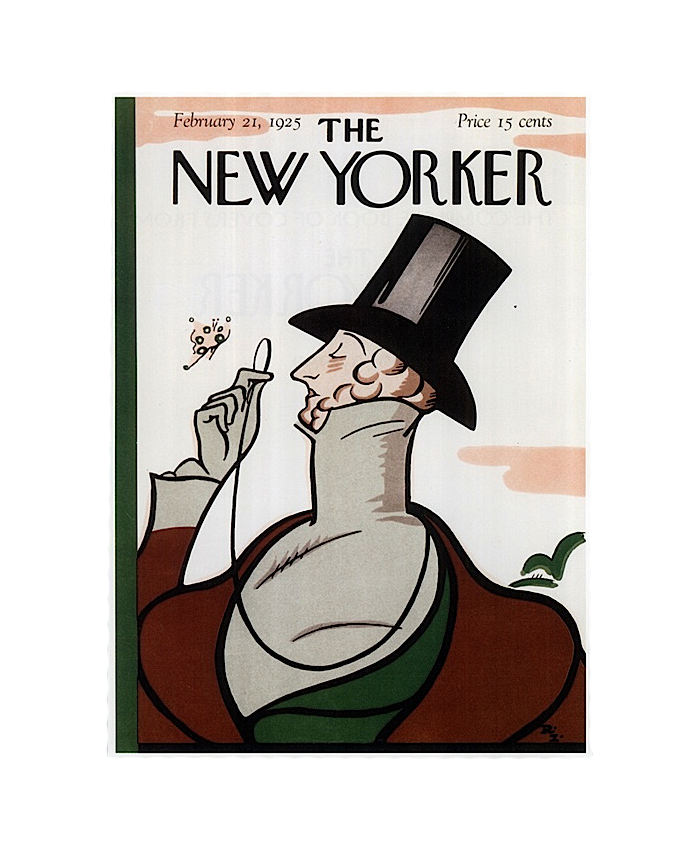
“The New Yorker” has remained a newsstand staple since 1925, focused on bringing the life and matters of the city (and the nation) into the spotlight through quality journalism, satire, and entertaining prose. And through it all the magazine has featured its charming and personable lettered masthead, delighting more than just the typographically-inclined. It’s always been easy to appreciate “The New Yorker’s” steadfast commitment to its own look throughout the decades, but difficult to dive deeper into the mystery of what really makes it so.
“The New Yorker” took to a Facebook live video to briefly clear away the clouds that shroud the magazine’s storied art direction. Amongst New York views and well-stocked book shelves, Creative Director Nicholas Blechman shares insightful stories from the origins of the famous masthead and early design choices made at the magazine, to modern body copy and editorial demands and experiences of working with House Industries to bring the typographic style of “The New Yorker” into the 21st century.
There’s something to be said for “The New Yorker’s” unwavering consistency in print media, considering how much tumultuous change the magazine has weathered over the last 90 years. Editorial trends, economic roller coasters, and revolutions in media technology have given “The New Yorker” more than enough reason to want to quit or change, but their success stands as testament to how valuable a devotion to typographic heritage and adaptability to the changing times can really be.
The First Issue of “The New Yorker,” February 21, 1925
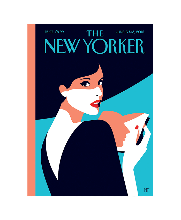
Over 90 years later, “The New Yorker” remains committed to its masthead style. (Cover Illustration: “Page Turner,” by Malika Favre.)


