
The Type Media Class of 2016
Wild personalities are on full display in the work of the recent graduating class from the Hague.

Fresh typographic ideas, hot off the press!
For the uninitiated, Type Media is a full-time, one-year master’s program held at The Royal Academy of Art, in the Hague, Netherlands. Students receive a progressive education in everything from the history of letter-making to the future of it; from stone carving to python scripting.
Every year, the program produces graduates equipped with skills to produce contemporary typography and add new contributions to the field. The 2016 class continues this tradition of pushing-the-typographic-envelope on the new Type Media 2016 specimen site, published this month.
Far from the expected student fare of homages to traditional type tropes, this group of 12 incredibly talented designers has taken a bold step in the direction of expression and exploration.
“What’s most evident in looking at the work is how much character there is in their characters.”
There isn’t a single unoriginal glyph, ligature, or idea presented. The extensive research, drawing, experimentation, and arduous attention to detail (undoubtedly a result of the world-class faculty at the program) comes out in flying colors. There are ideas and concepts on display in every project, not just empty beziers or flashy code.
Below are three selections from the 2016 Type Media graduates.
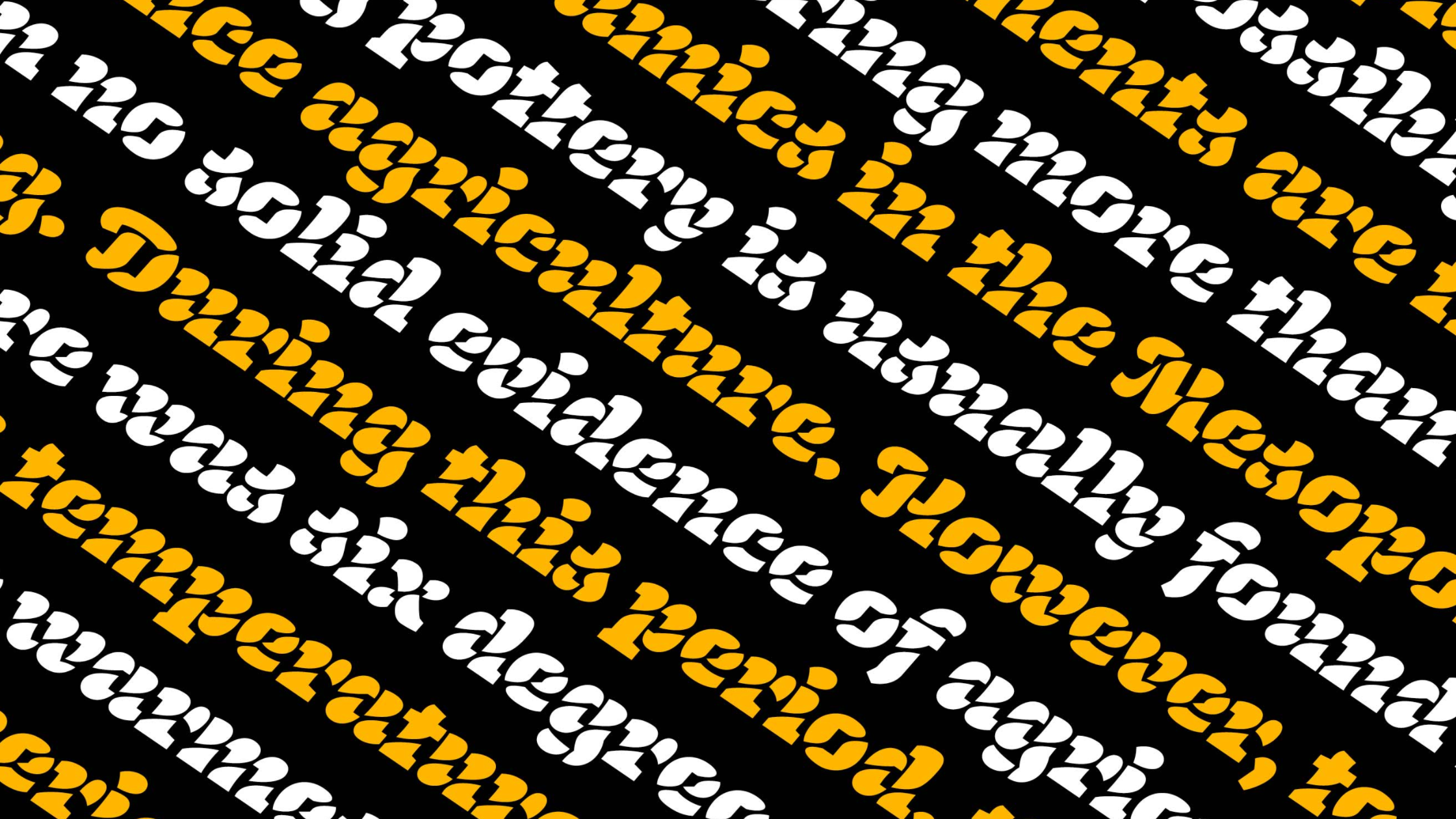
Inga Plönnigs—Magnet
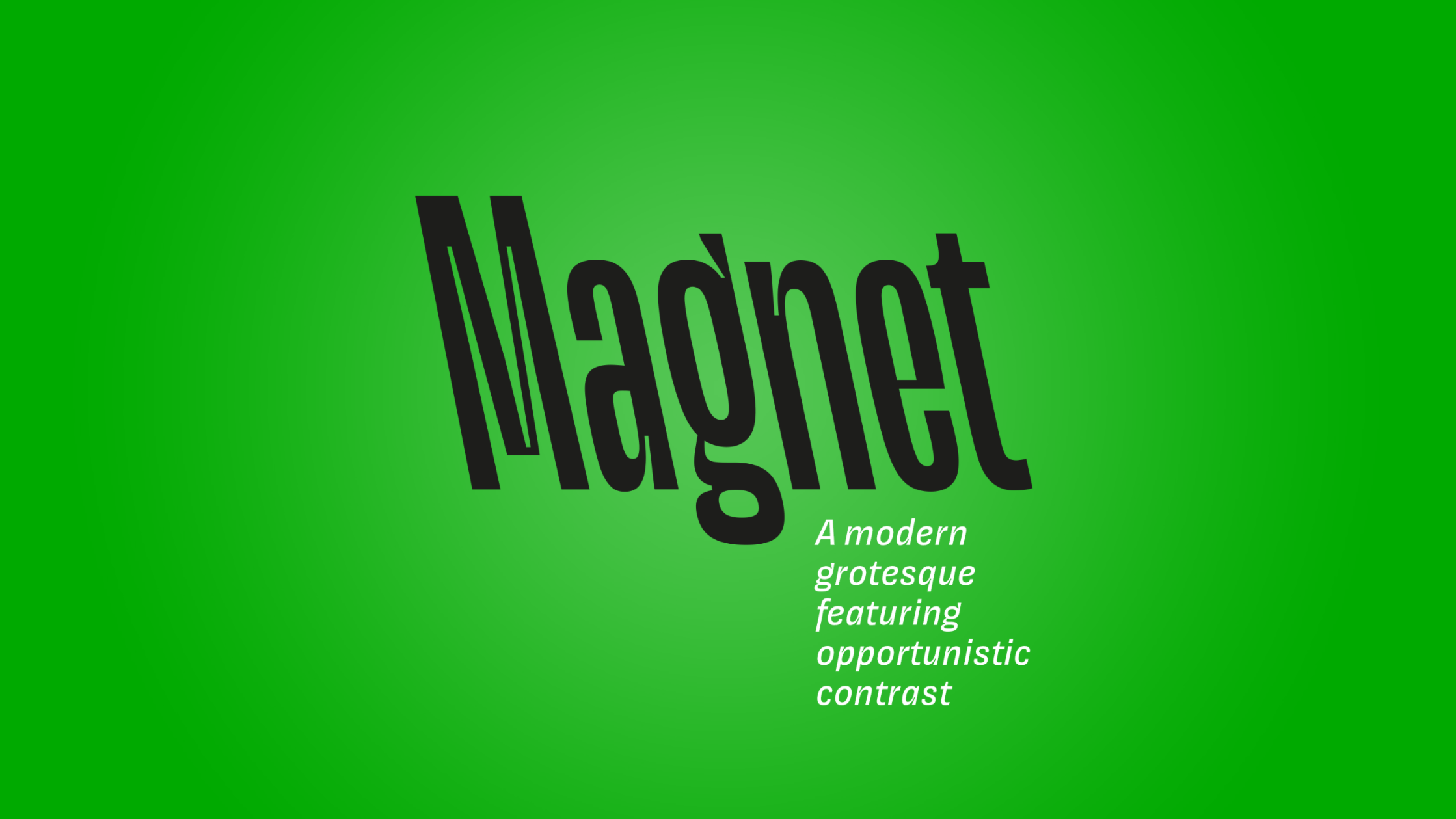
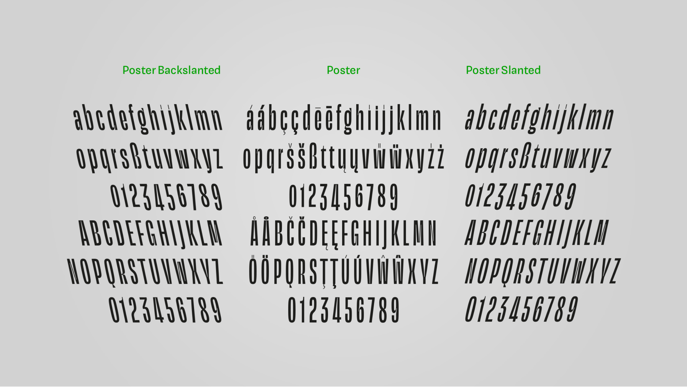
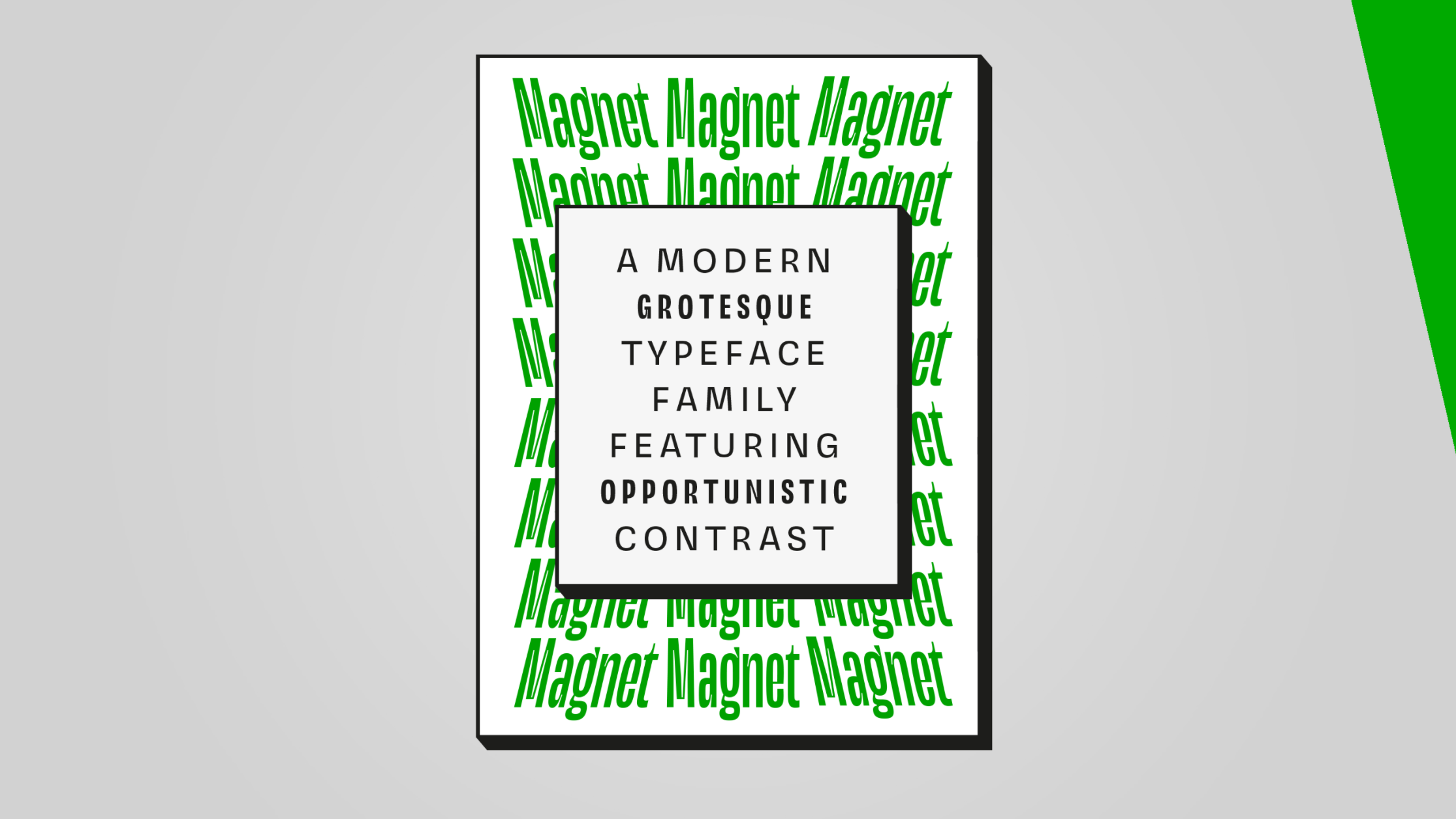
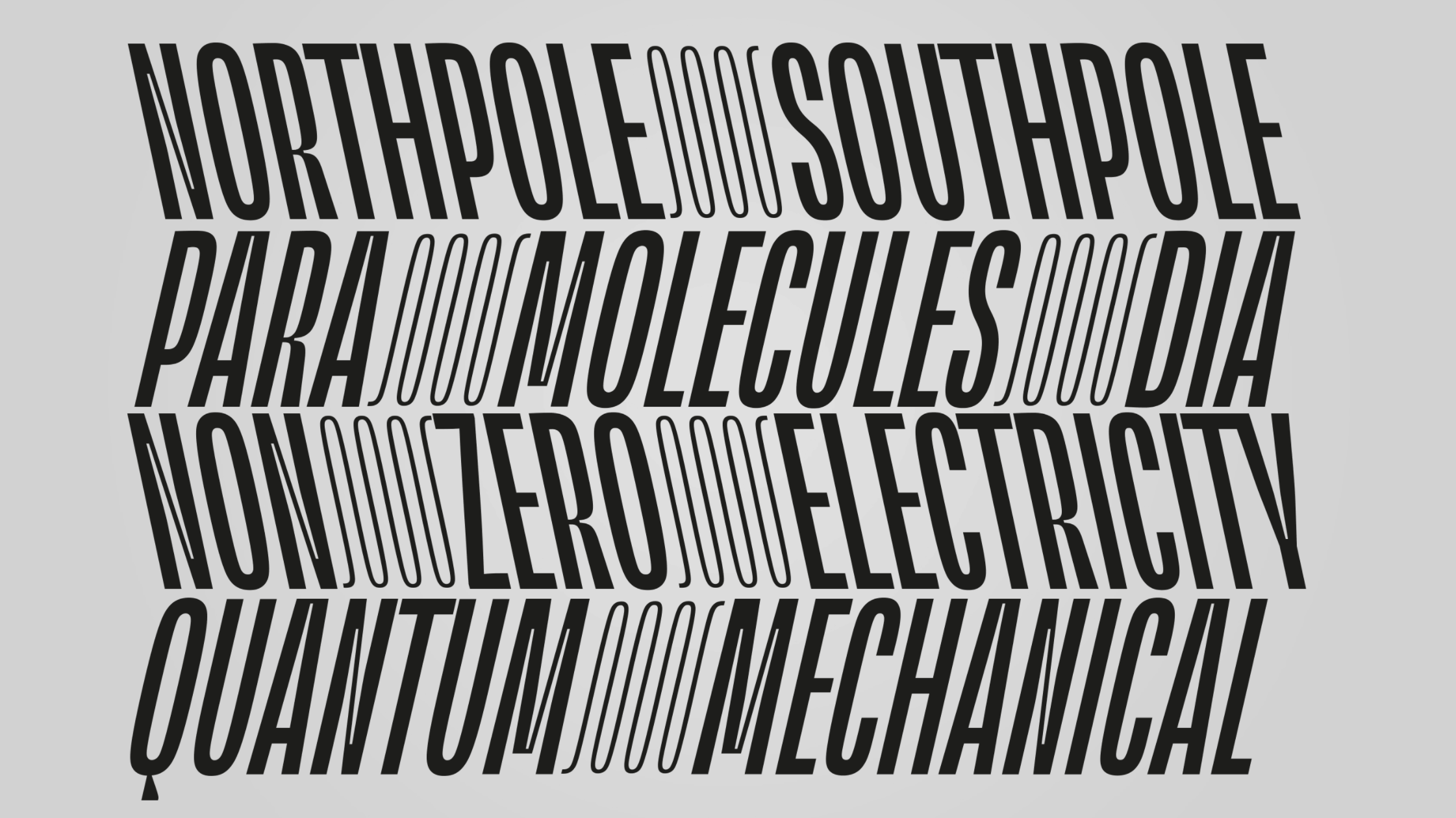
Inga Plönnigs describes Magnet as “a modern grotesque with opportunistic contrast.” The family includes a couple of weights in an upright, slanted, and a back-slanted style (which features some inspired typographic problem solving). It dives head first into some of the lesser explored typographic waters. With deep cuts, unconventional weight placements, an underlined version, poster and text styles, and decorative glyphs, everyone can discover something new with Magnet.
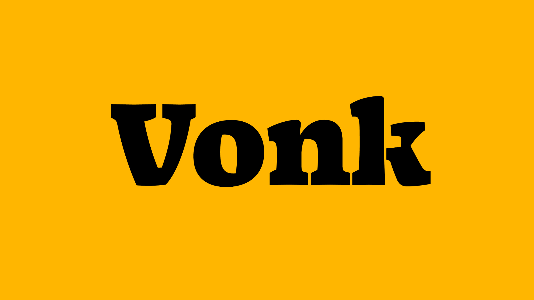
Bart Vollebregt—Vonk
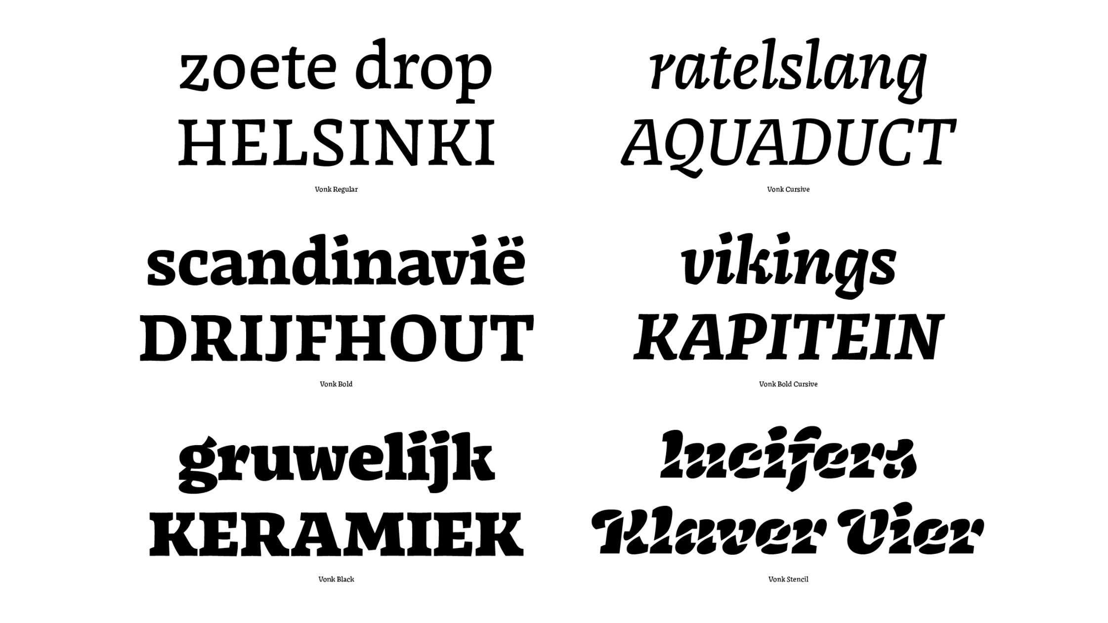
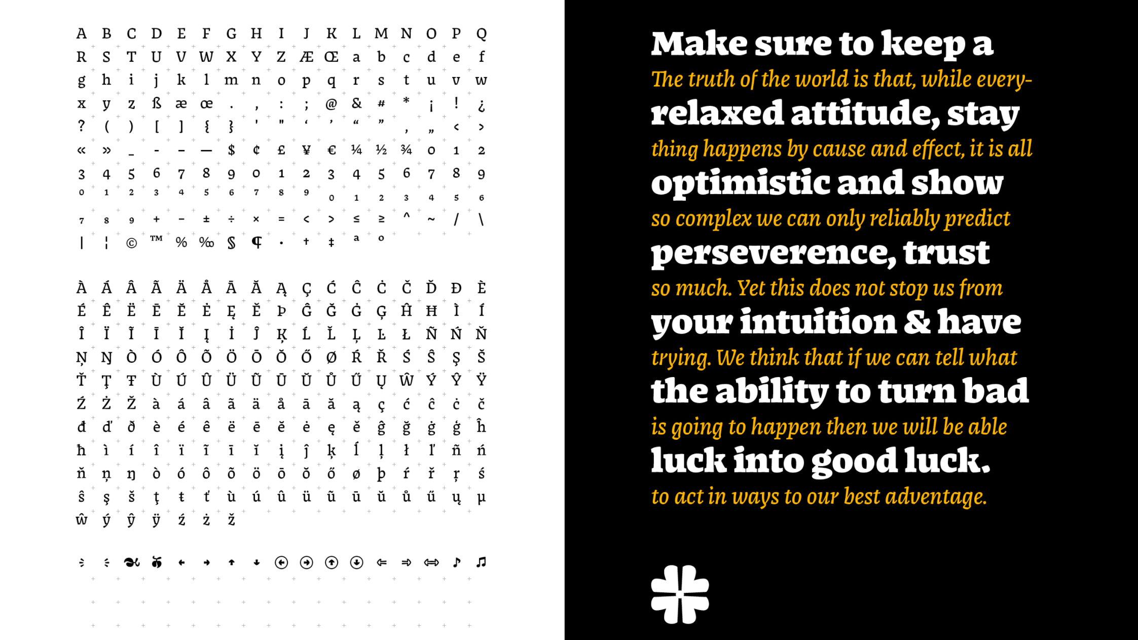
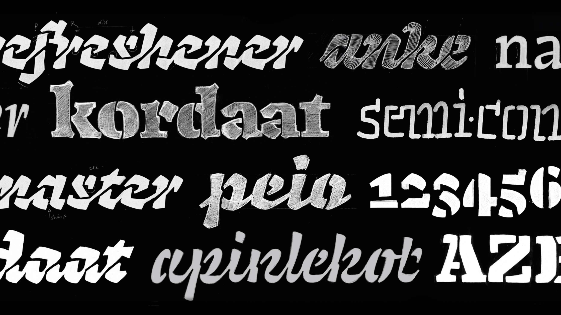
Bart Vollebregt has created something very friendly and very potent in Vonk; a family of six styles for display and text. The more traditionally designed regular and bold styles are packed with character and expression, while the experimental stencil takes its DNA and twists it just enough to still be considered of the same species. Vollebregt describes Vonk as a tool to “help build, rather than design.”
Selina Bernet—Junior
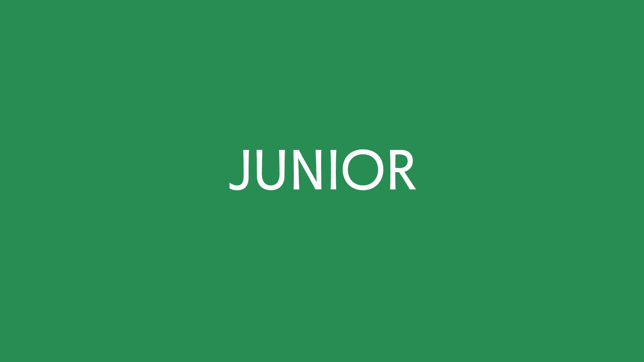
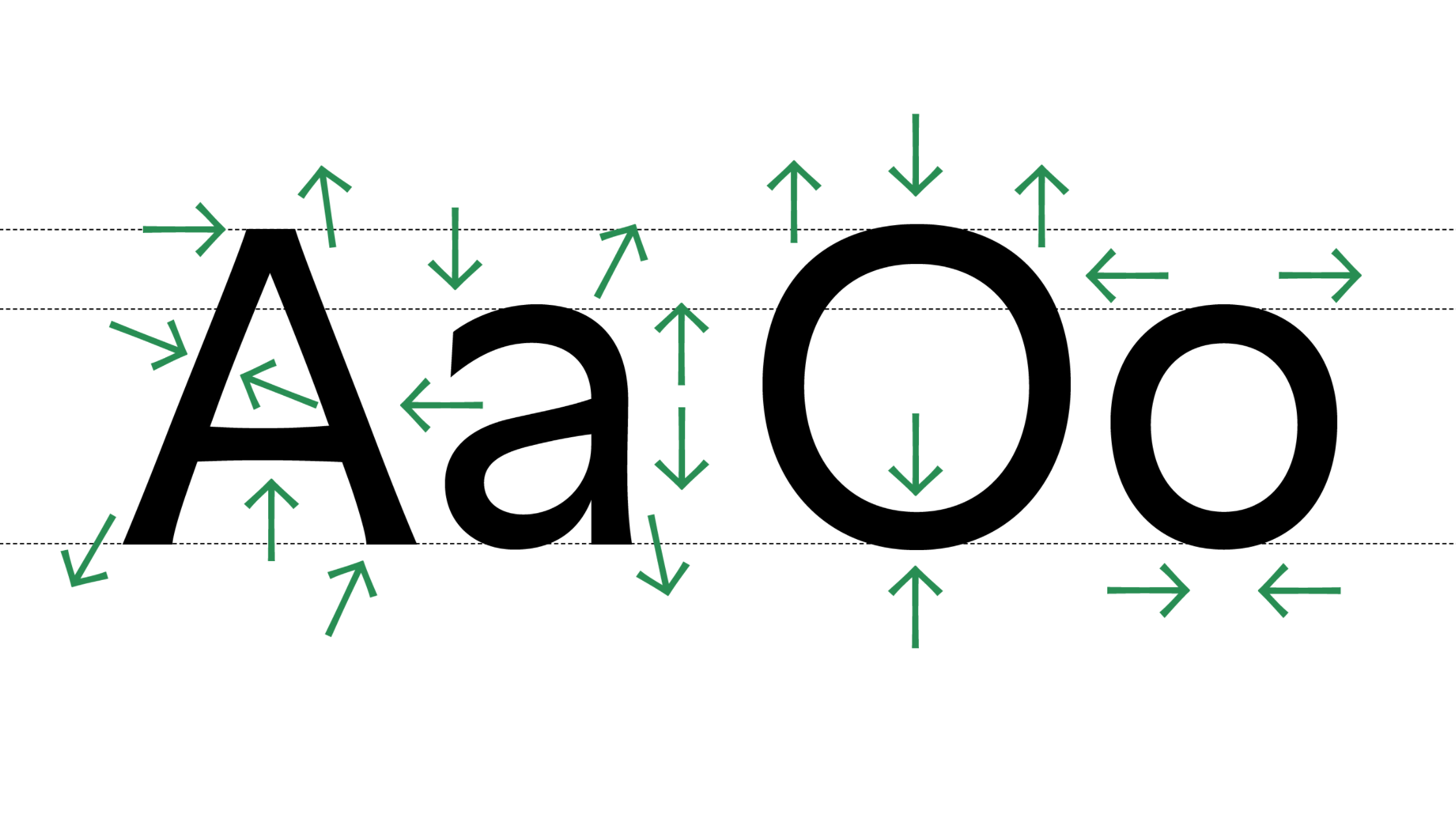
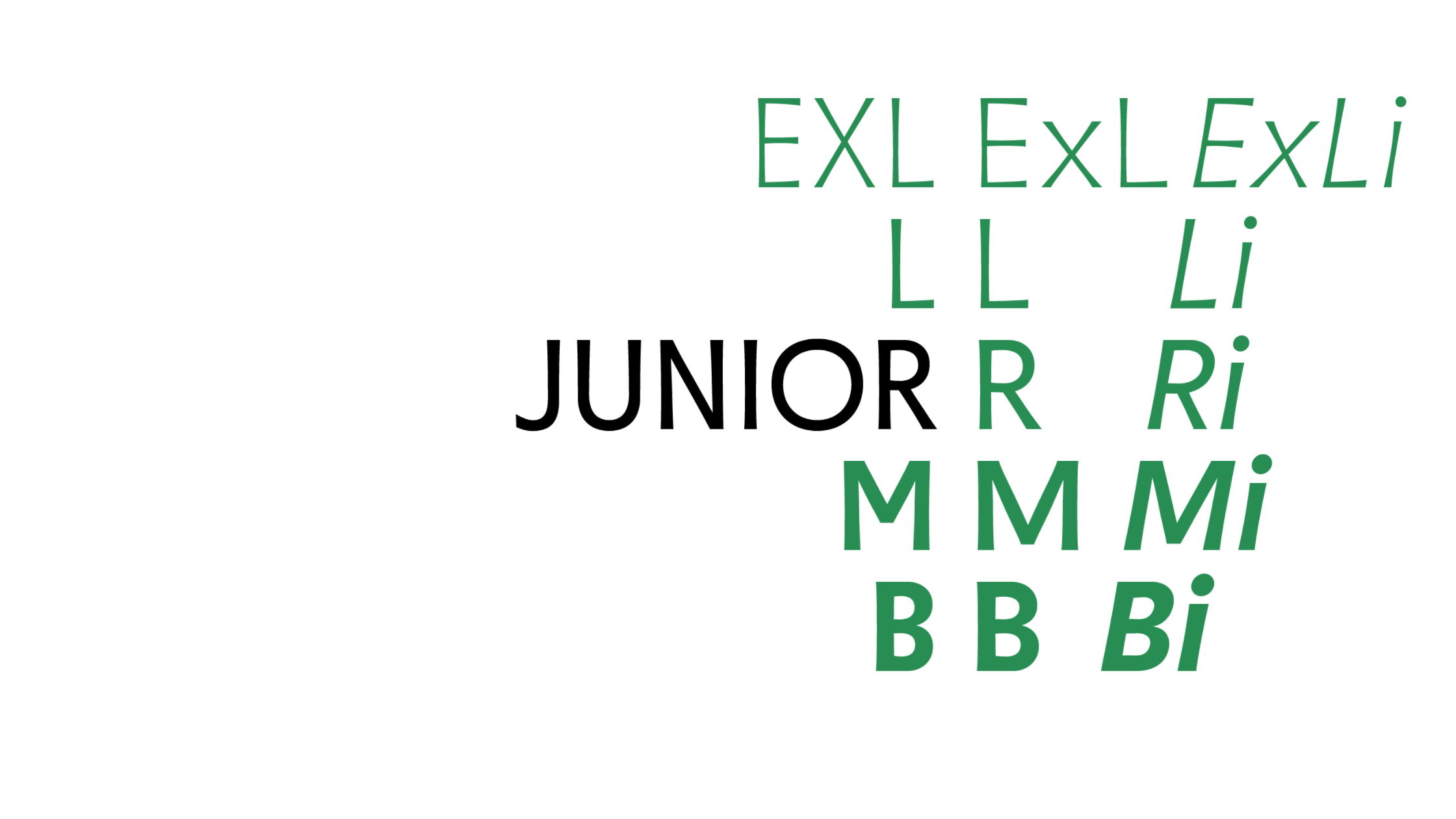
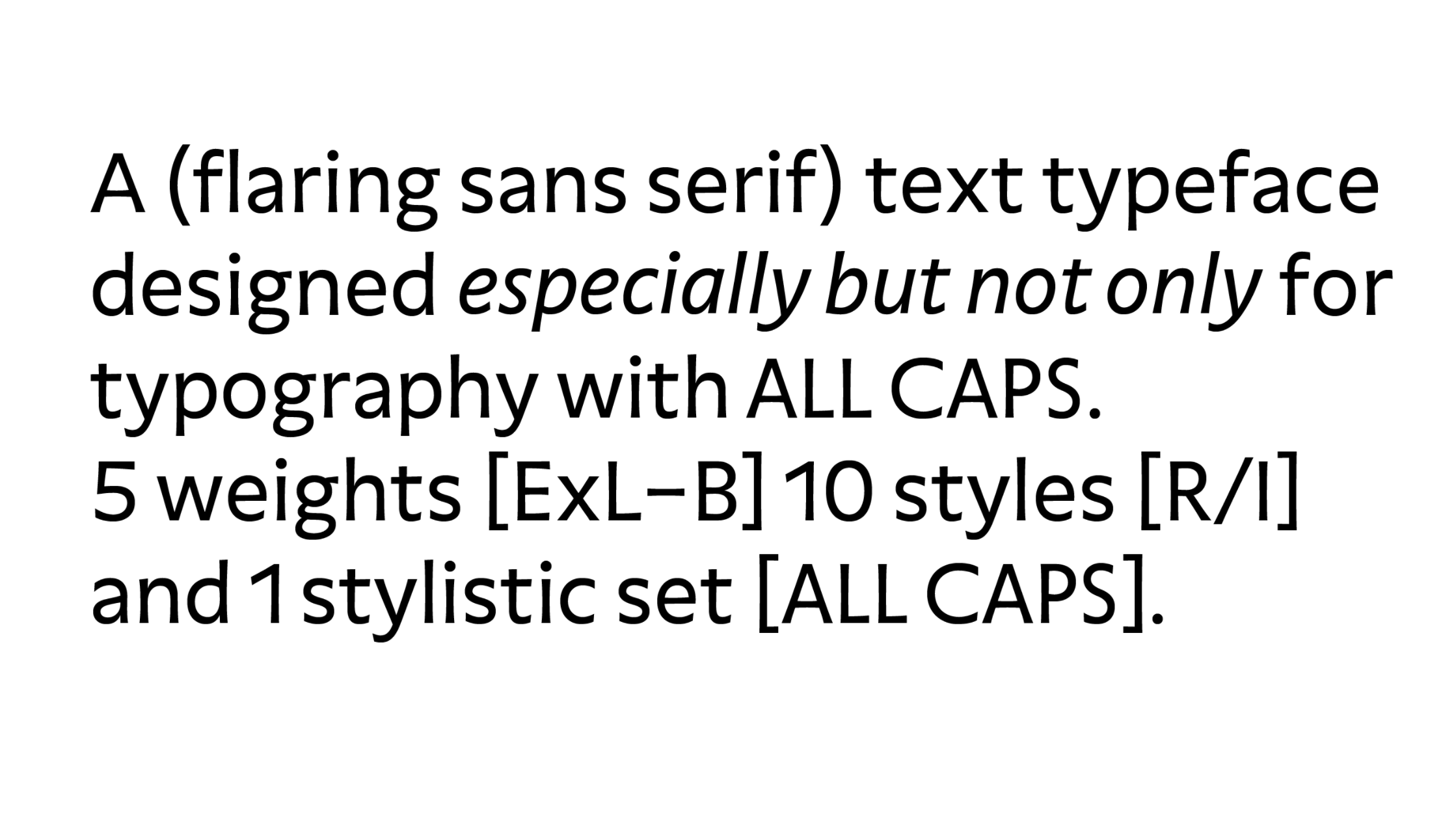
Where most typefaces zig, Junior zags. Selina Bernet’s unassuming flared serif type family Junior is all about subtlety in a world that wants to be anything but. Designed for editorial purposes, Junior makes spectacular use of asymmetry and slight angles to achieve an original design that conveys established ideas in new and contemporary ways. It’s worth a deeper look or two to discover the beautiful peculiarities present in its five weights and extra Roman-inspired capitals stylistic set.
There is an unbelievable amount of work that has been put into all the projects developed during the Type Media program, as any graduate will tell you. There’s more than could be portrayed in this article. Do yourself a favor and spend some quality time discovering all of the work by the Type Media class of 2016. Heck, you might even consider hiring a few.


