Type’s Colorful New Future?
Novo Typo’s new book makes a proposal for a colorful future for type.

Novo Typo is looking to start a movement.
This movement is not to take place in the minds of type designers, but more in the minds of the users of type—the designers, art directors, and type setters. It is a movement away from the comfortable conventions of positive and negative shapes, traditional form and counter form, there and not there. It is a movement away from the stark contrast of black typography on the white page towards a potential new future of color.
“Why do type designers traditionally think in black and white?” asks Gerard Unger; a question that has led to the publication of the Novo Typo Color Book, out this month from De Buitenkant.

““Traditionally, texts in manuscripts were written in black … But this is going to change.””
The Novo Type Color Book sets out to reconsider the traditions that spring from our long history of printing type, and ponders the real possibility of more color in typography. Unger continues: “Traditionally, texts in manuscripts were written in black, or nearly black, ink. Gutenberg’s invention did not make it easy, technically, to print a second color. So from 1450 up to now, text has mostly been presented to us in a single color: black. But this is going to change.”

“Is this akin to when motion pictures went from Black and White to Technicolor? Is this type’s “Wizard of Oz” moment?”
Perhaps, but not exactly. Color in fonts has a long history, and has been given much more attention in the last decade due to advancements in technology allowing for multi-layered fonts and improvements in digital printing. There’s always been the option for printing in a different color, or publishing your webpage entirely in hot pink. It seems that what Novo Typo is getting at is more of a cultural shift.
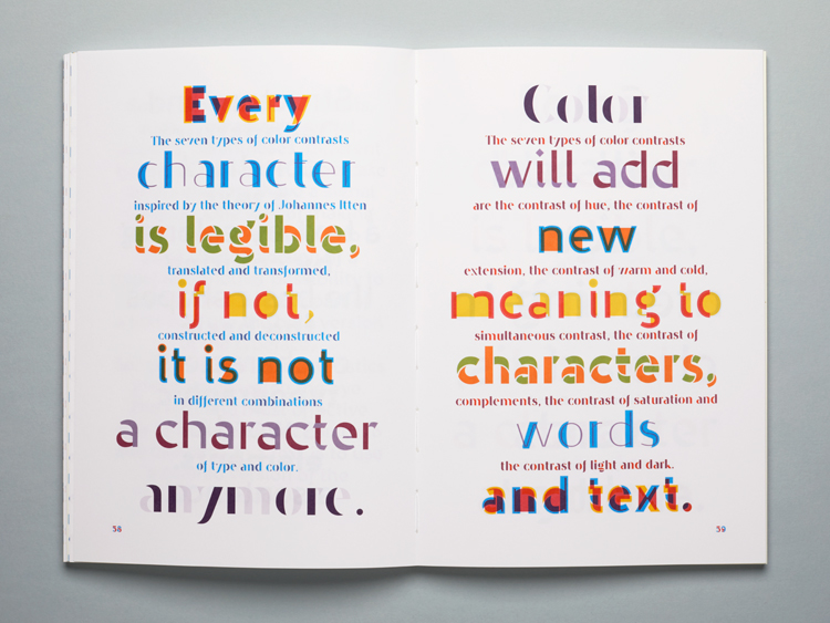
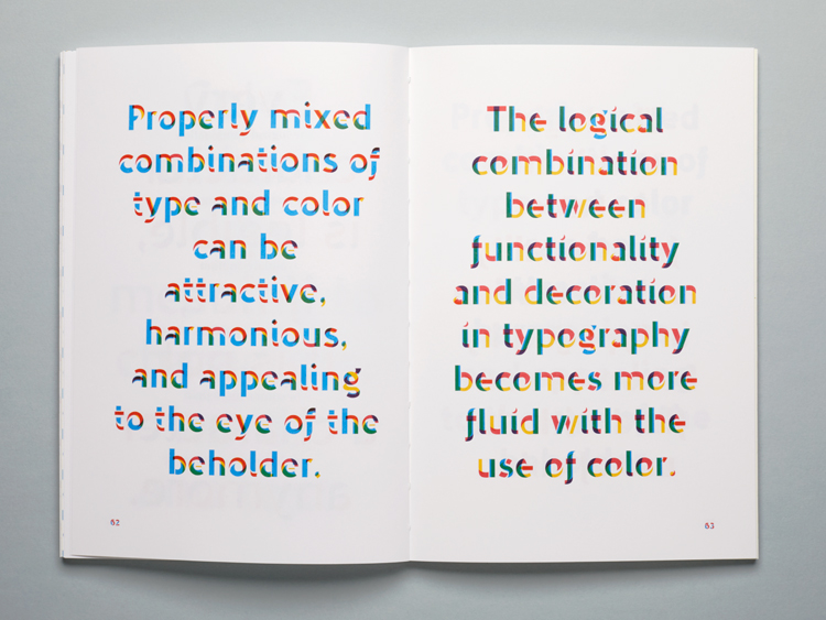
The Novo Typo Color Book is a example of what color can bring to type set in perfect proportion to the page. It’s a prompt to explore the ideas that surround publishing and designing type for color settings. It achieves this through the use of Novo Typo’s extensive Bixa type system, essentially creating an expansive type specimen of ideas about the past, present, and future of type in color.
“Unger quite boldy states that “color will be the new italic. Color will be the new bold.” As the world of type continues to evolve into its next iteration, perhaps he’s right—only time will tell.”