
Moniker: A Friendly Sans for Complex Matters
““I wanted to make a workhorse font that is friendly.” ”
This is how type designer Eric Olson starts talking about his recent release, Moniker from Process Type Foundry, and how it began to take shape. “The thing about rounded fonts is that they have split-personalities: they can be friendly and fun, but they can also fade into the background and do the heavy lifting.”

Fifteen Years of Maturity
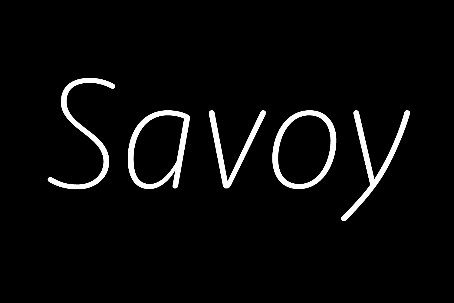
Moniker isn’t Olson’s first attempt at a rounded sans typeface. When he designed Bryant 15 years ago, he says there weren’t many rounded sans fonts on the market. He noticed that the rounded sans that were available were being “used for EVERYTHING—text, display, full annual reports, tiny type, et cetera” even if they didn’t work very well.
Bryant was his experiment at making a more usable rounded sans with a nod to mechanical drafting kits from the 1960s and ‘70s. “I love that style because it is outside the history of type.”
“He laughs and says, “Moniker doesn’t stay out late, but Bryant definitely might.””
Often, people think of rounded sans as only good for display sizes. “You can make a round font work in a serious context, but there are always compromises. So I wondered, ‘What if I could make a more workhorse rounded sans?’” This was the impetus for Moniker.
When comparing Bryant and Moniker, Olson states, “Moniker is a more mature and refined take on a rounded sans typeface than Bryant.” He laughs and says, “Moniker doesn’t stay out late, but Bryant definitely might.”

Practical Applications
When discussing Moniker, Olson has difficulties classifying it in a specific genre of type design. “It’s not a neutral sans, it’s not a grotesque, and it’s not a humanistic sans, so for a lack of a better term, I call Moniker an information sans.” By this he means that it is flexible, can do lots of tasks, and is an all-rounder.
““It doesn’t shout from the rooftops for big headlines, but it tries to do the other stuff.””
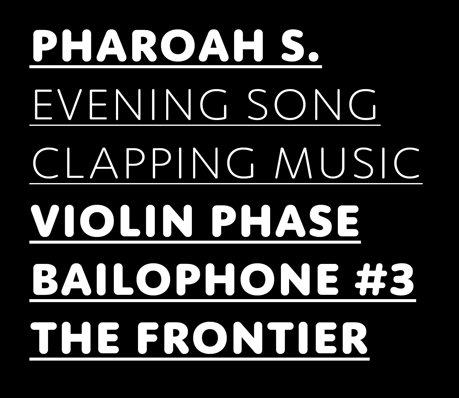
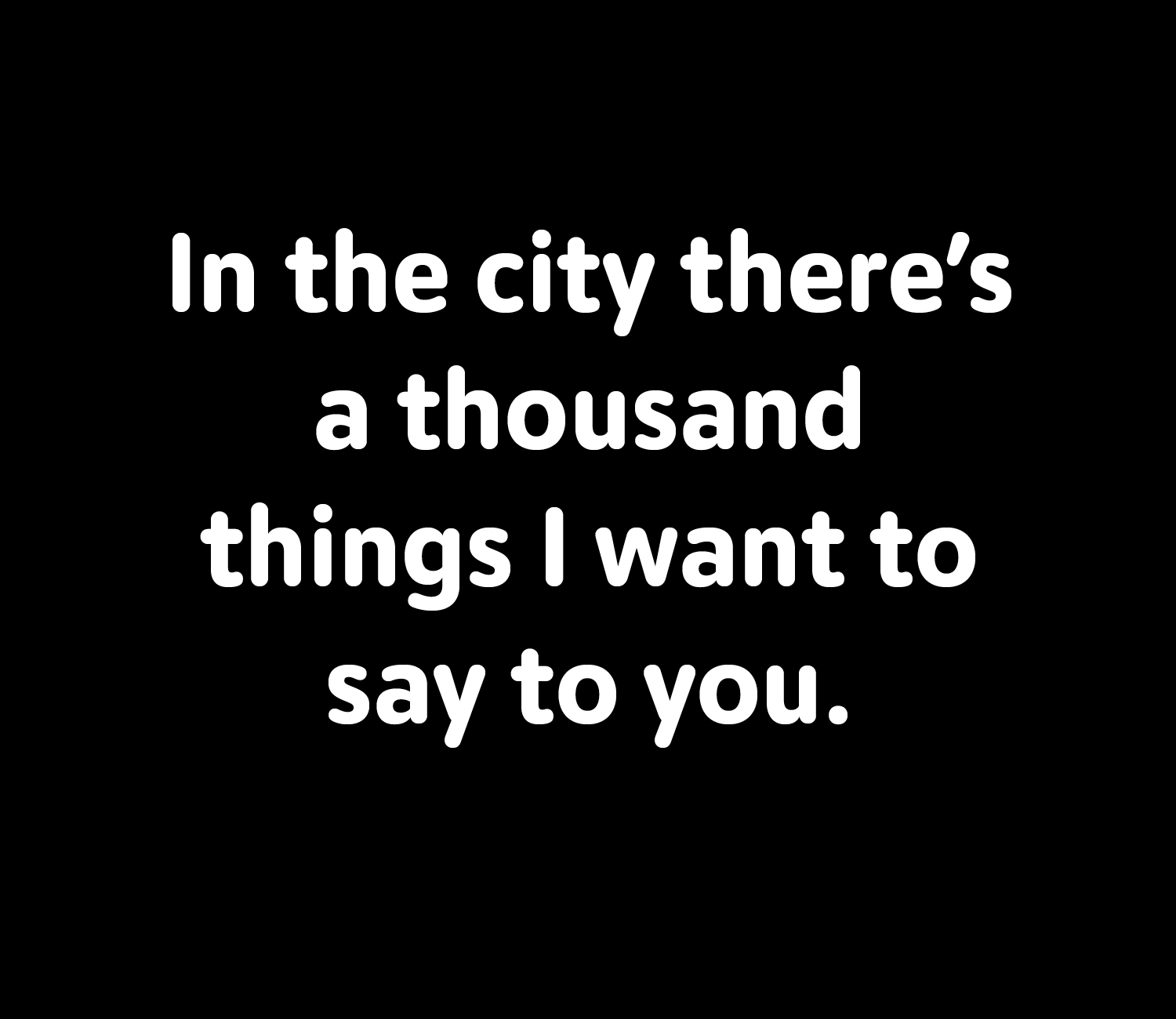
When you look at the specimens, you notice that Moniker does a lot of things well: specifically text sizes—which isn’t always the case for rounded sans fonts. From the beginning of the design, Olson kept text-to-medium sizes, not necessarily huge display sizes, in mind. “That was really intentional. I wanted to tackle that size range but with something that was round.”
Olson is okay with admitting that Moniker isn’t for everything: “It doesn’t shout from the rooftops for big headlines, but it tries to do the other stuff. When designing, I’m really thinking about HOW people will use it.
““I like that it can be useful for somebody; that they would want to use it again. I think that is highest praise.””
““It is one gestalt and one overall theme: that is the easiest thing to say and the hardest thing to make.””
Design Challenges
When designing a rounded sans font, Olson says that, “You really design two fonts. First, you design the general shapes and proportions, and then you have to design the tips.” Of course he acknowledges that there are automatic ways to round the ends of the strokes but, “you end up with something ugly and ungainly. They want to default to being lumpy; they tend to be rounded too much at the tips.”
Because of this, “Moniker is designed from the ground up. It is easier to do it all from scratch, so you know it is exactly how you need it to be. Rounded fonts have a tendency to gum-up and get overly-dark on the page. A lot of time was spent on Moniker to make the right range of weights and sizes.”
““You’re like a party planner … You’re trying to get everyone to have a nice time together.””
"In a typeface like Moniker, it doesn’t have a specific detail that stands out. There isn’t a crazy ‘a’ or capital ‘R’ that you can point to. It is one gestalt and one overall theme: that is the easiest thing to say and the hardest thing to make.”
Olson creates an analogy to explain the process of making Moniker, “You’re like a party planner. You’re trying to get 26 people to have a nice conversation and not let any one of them get too rowdy. You’re trying to get everyone to have a nice time together.”
You can learn more about Moniker and buy the family at the PTF website.


