
Kinetic – A Typeface Inspired by the Art of Alexander Calder
Kinetic is new typeface collaboration between designers Noel Pretorius and María Ramos released under their new “collective foundry,” NM Type. The two designers met at Reading University while studying typeface design and chose to work together on their first commercial typeface.
Seeing Sculpture and Thinking Type
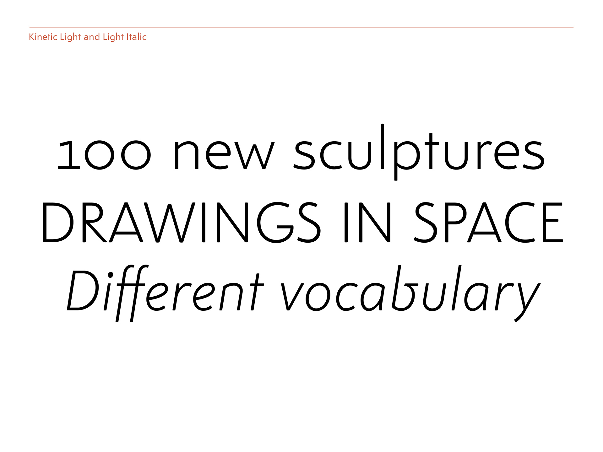
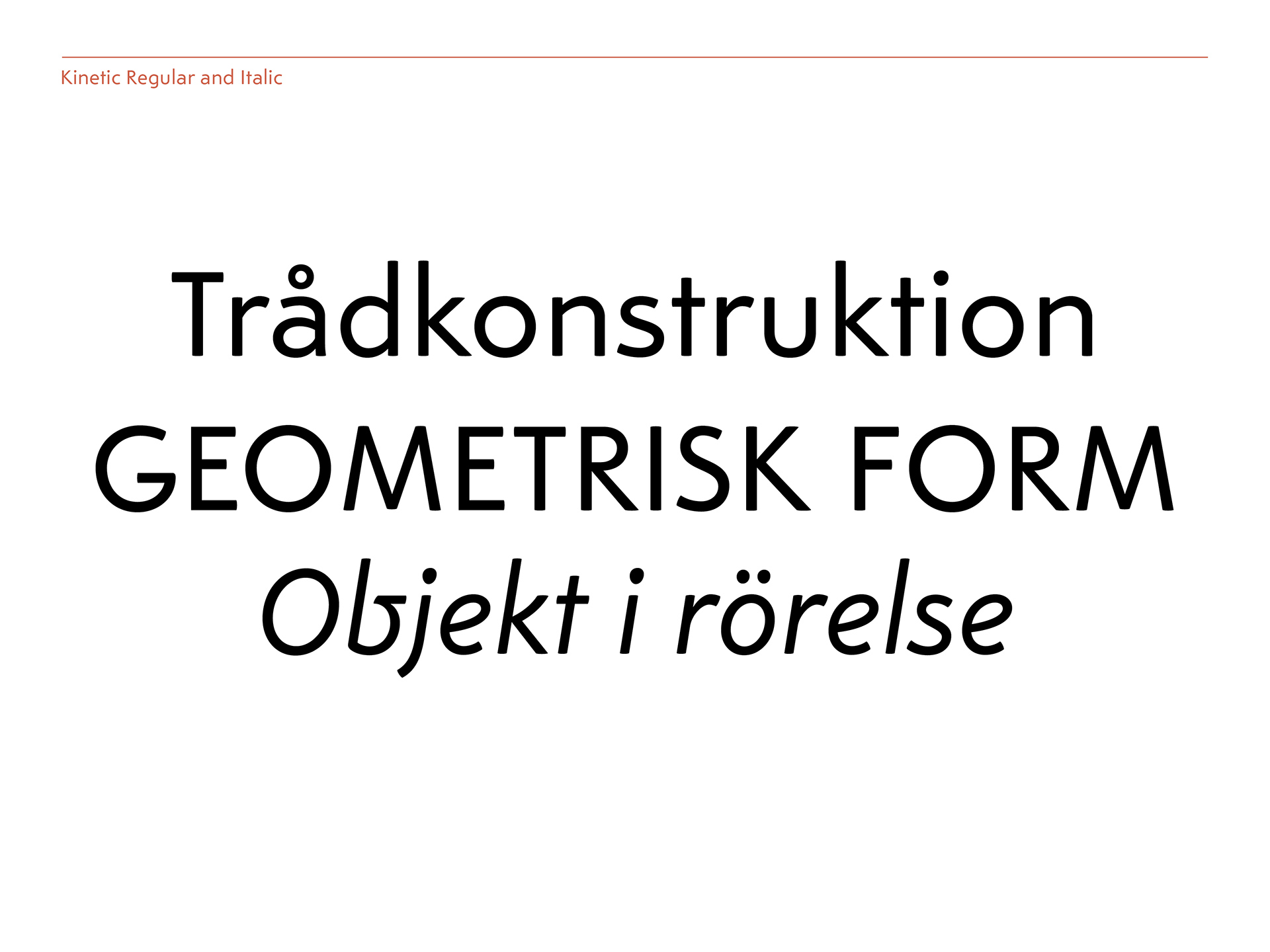
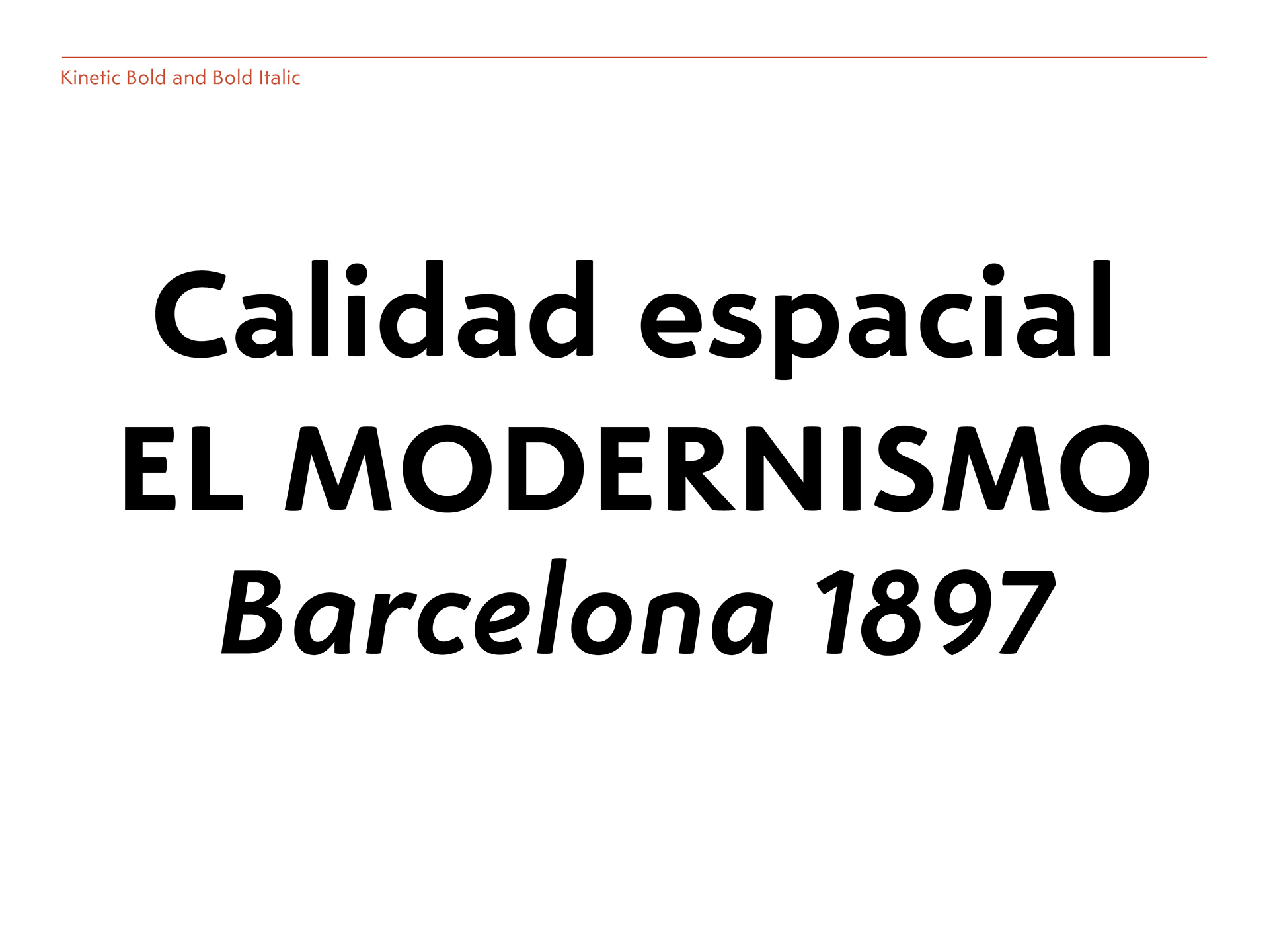
The initial inspiration for Kinetic was sparked when Noel visited an exhibition at the Tate Modern in London showcasing the organic mobiles of American artist Alexander Calder. “When I was viewing his art, the movement and lightness of his kinetic sculptures struck me. Sculpture is usually heavy, with heavy materials, but Calder made them light. We tried to translate what he was doing with sculpture into Kinetic.”
But Maria is quick to point out that Kinetic “isn’t about translating his sculptures into type but rather using similar ideas and tools. Kinetic is all about the concept of playing with geometry. Most geometric type is constructed and feels stiff. Calder was playing with sculpture in an organic way. We are playing with geometry, but the typeface is not constructed with geometry.”
““Calder was playing with sculpture in an organic way. We are playing with geometry, but the typeface is not constructed with geometry.””
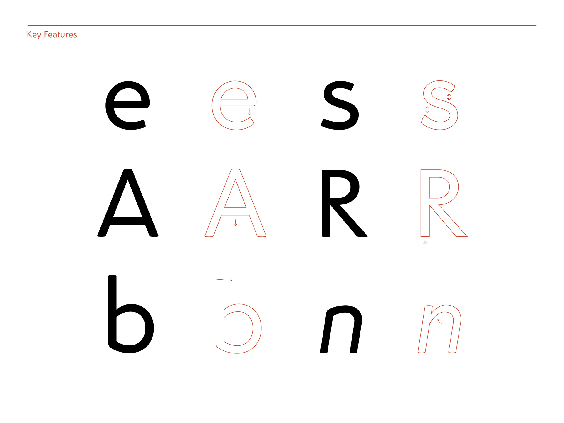
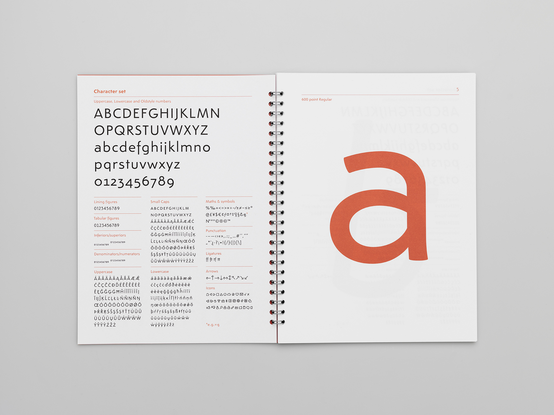
Noel continues, “It helped to keep Calder in mind when making informed design decisions so we wouldn’t get lost. We tried to bring in some of Calder’s tools, like twisted and bent wire, into the type.” You can see these influences in some of Kinetic’s letter forms. For example: The italic lowercase b has a bent shape and the each one of the dots in the typeface is slightly different and not perfectly round. This isn’t noticeable in small sizes, but it gives a playful appearance.
A New Way to Market a Typeface
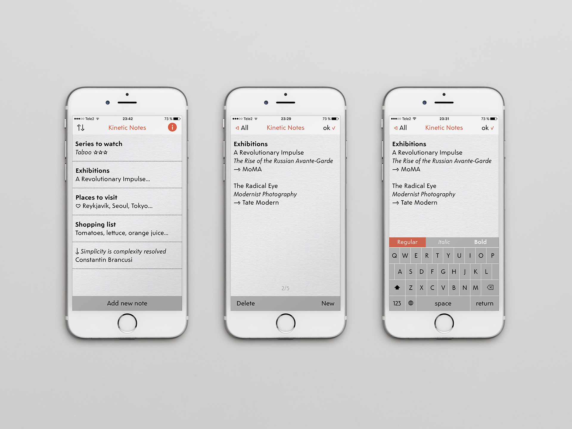
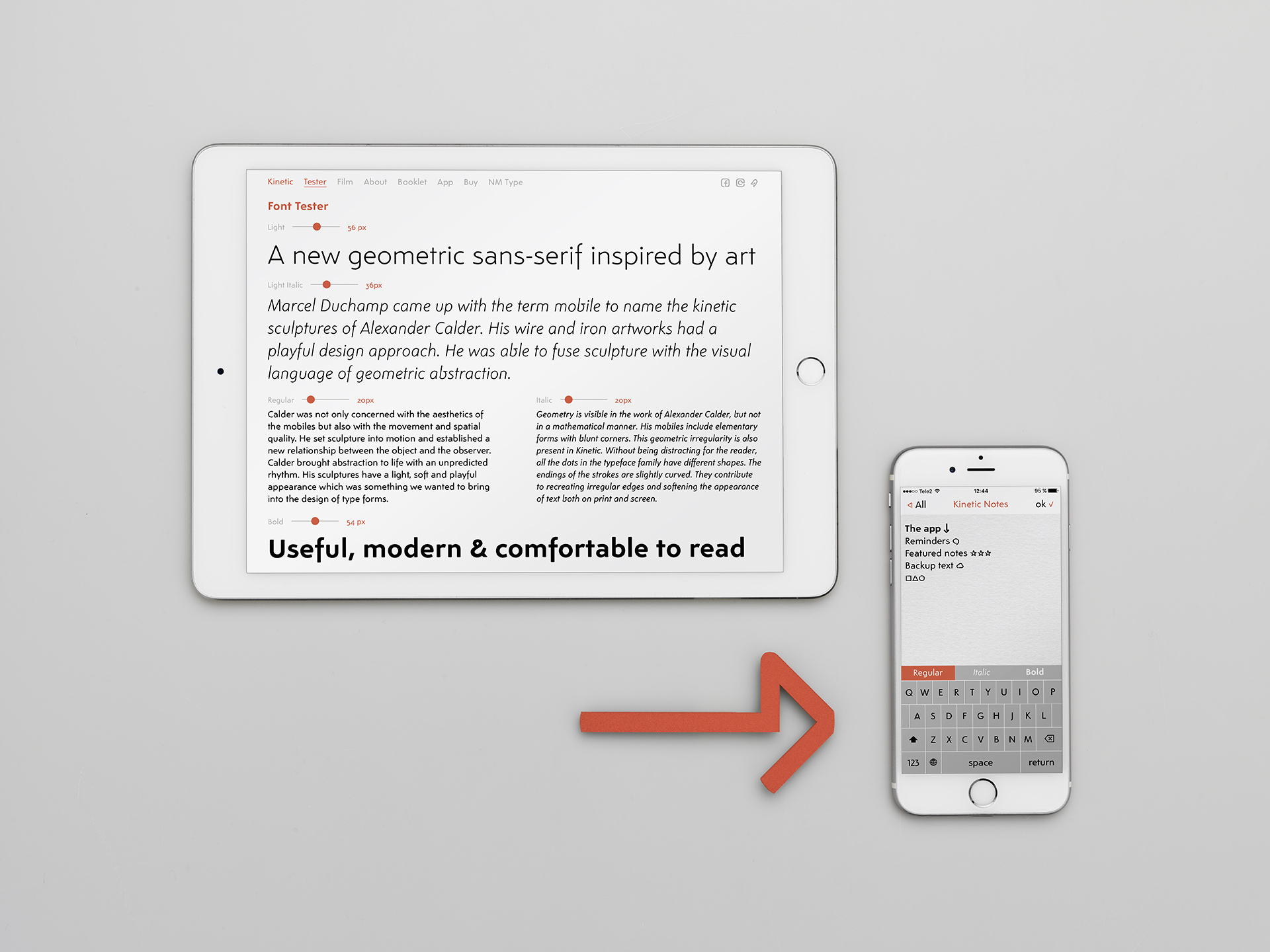
With so many new typeface releases from so many new type designers, all foundries must find new ways to market and promote their work if they want to get noticed. NM Type created a novel approach by building an iPhone app that showcases the typeface. Kinetic Notes is a free app for creating text notes that allows you to use the typeface on your mobile phone.

NM Type created the Kinetic Notes iPhone App to showcase the typeface as well as being a useful app for potential customers. As far as they know, this is the first app built as a “digital specimen” for a typeface release.
When they started thinking about marketing for Kinetic, Maria says, “We thought: Maybe it isn’t enough to just have a website. What if we do something where people can see the typeface in-use on the mobile phone but it’s not just another mobile website?” Noel continues, “We made Kinetic to specifically work well on small screens on mobile phones, so what better way to test the font than in an app?” The app allows NM Type to not only showcase the font, but also create something useful for potential customers.
But building an iPhone app is a long and challenging process. “It took a long time to create, and we had to hire someone to make the app,” Noel says “but it helped us learn more about the technology behind building an app.” Maria adds that because of the lead-time needed for submitting the app to Apple for review, “The font was not actually ready when we submitted the app, but it had to be approved and we just replaced it with the correct font later.”
““What if we do something where people can see the typeface in-use on the mobile phone but it’s not just another mobile website?””

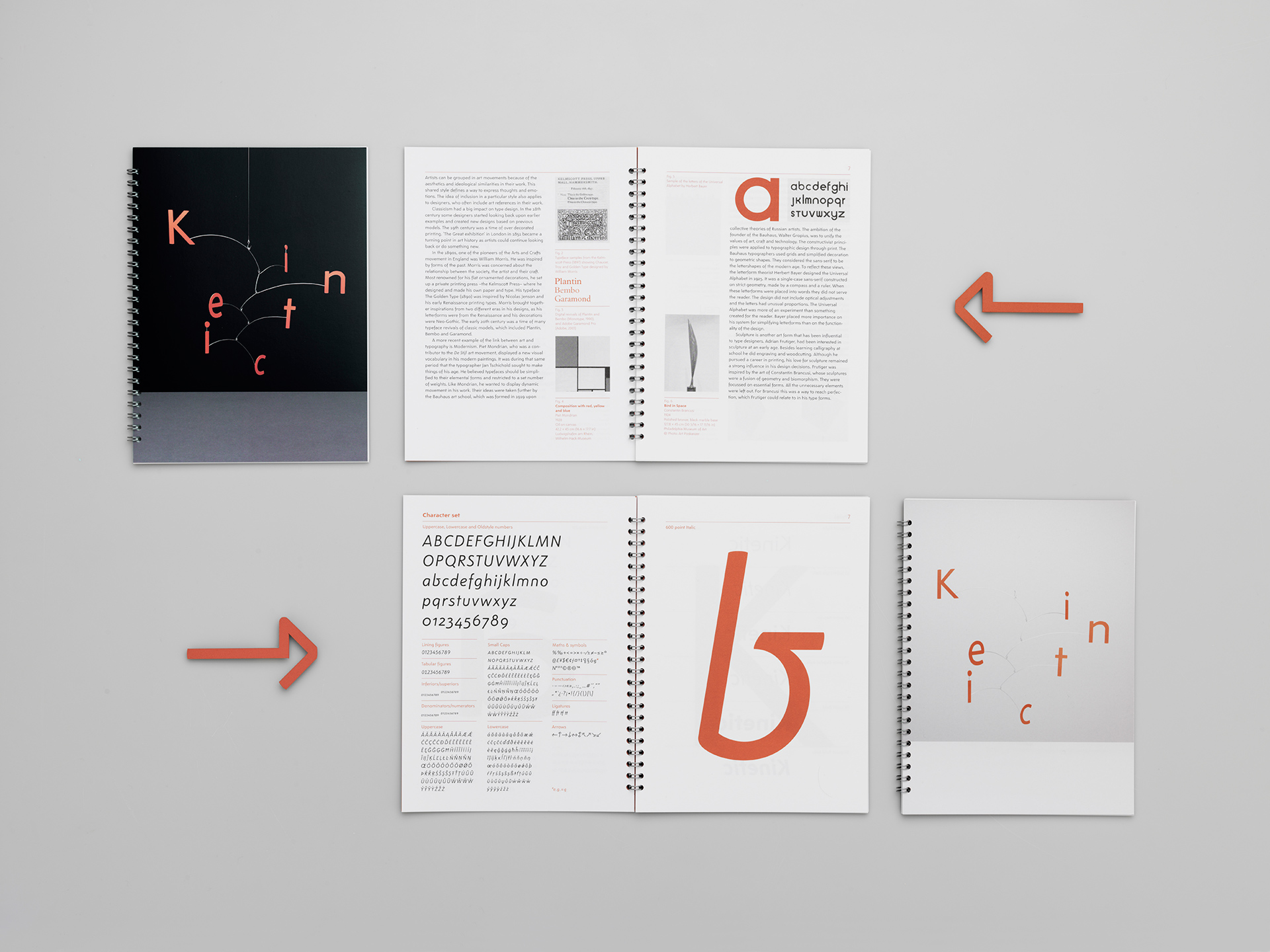
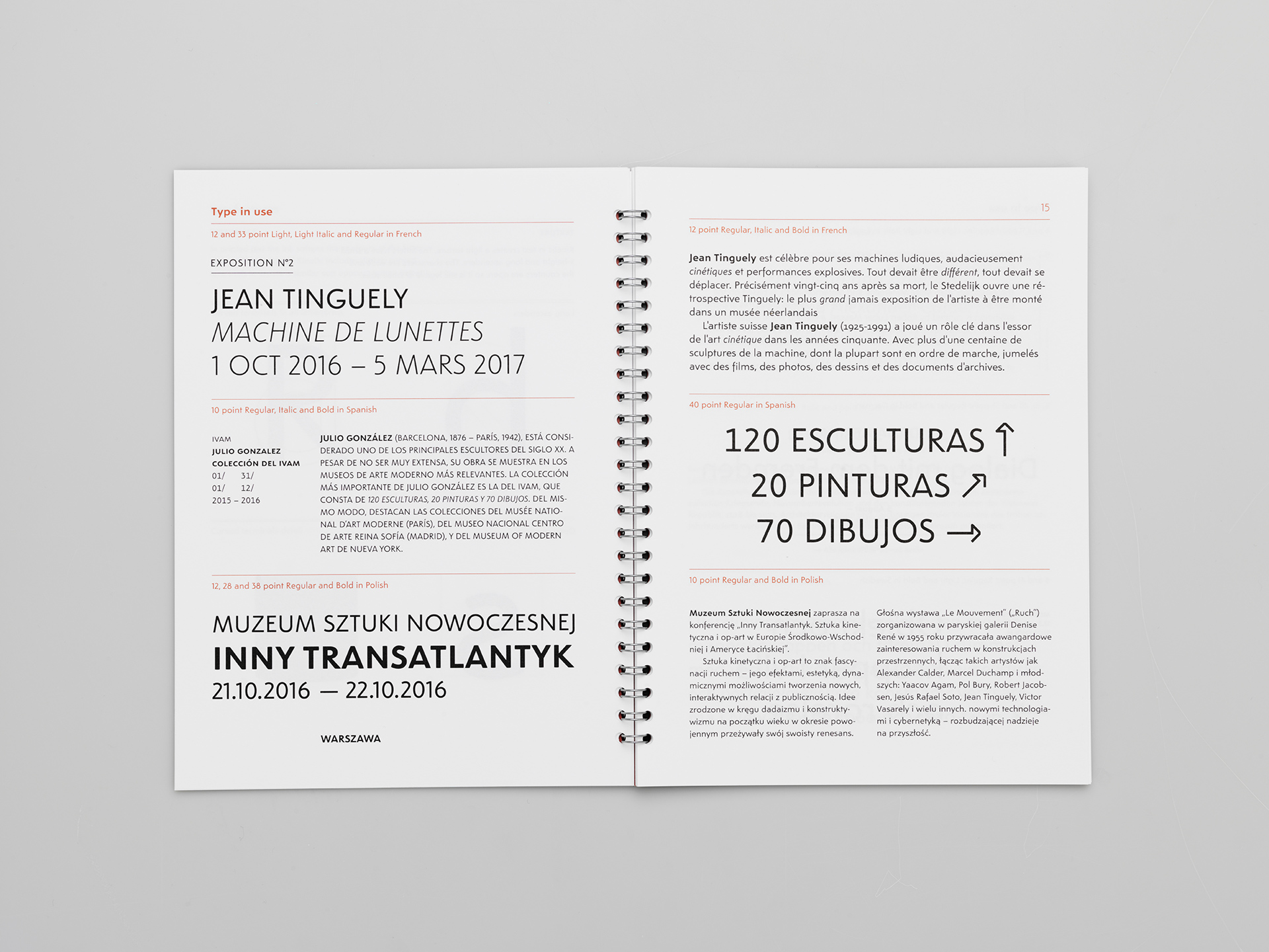
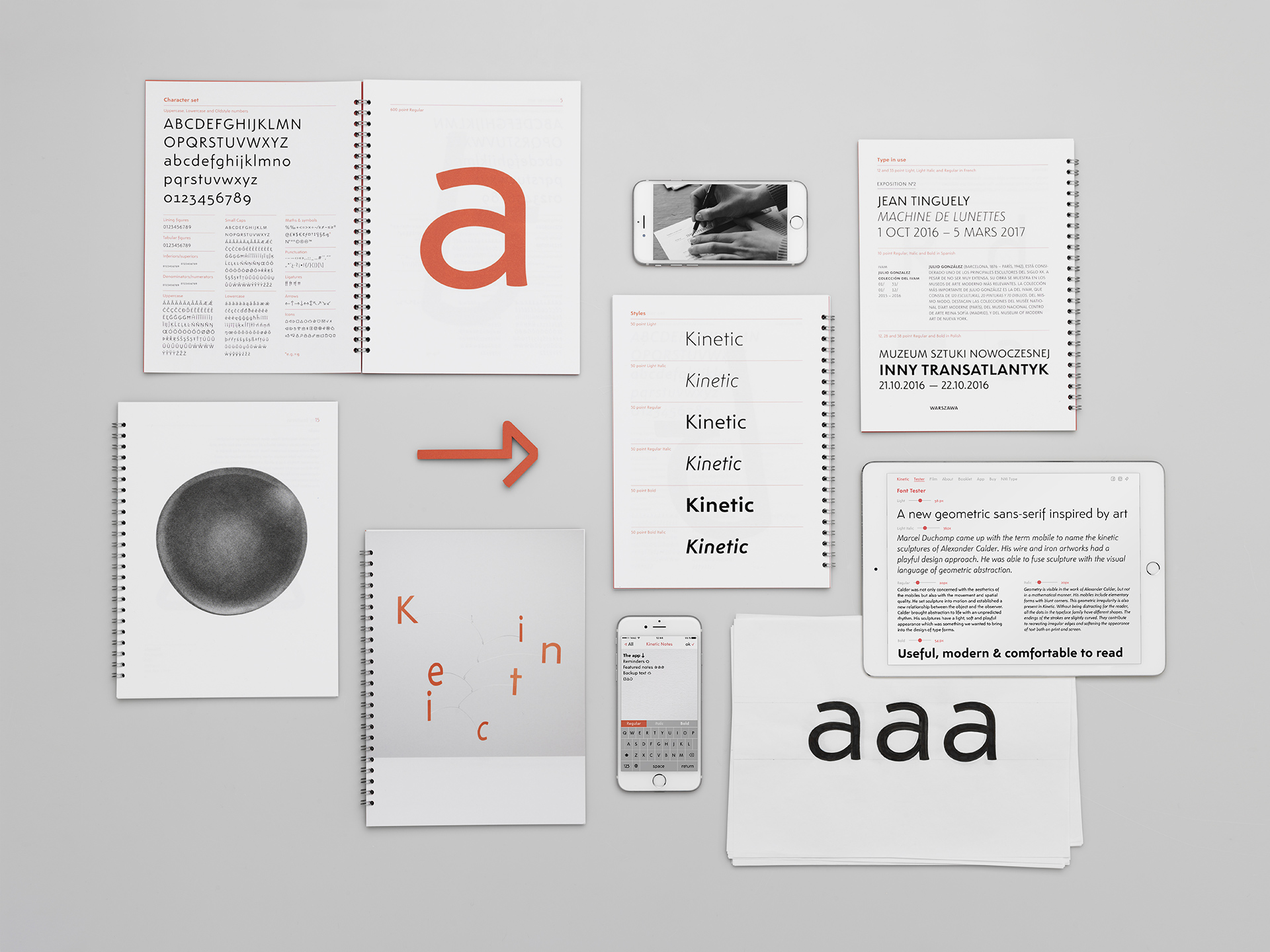
To make sure you don’t consider Kinetic a digital-only font, NM Type printed a wire-bound specimen booklet that shows off the typeface in many different use cases. Recently, many foundries have been spending the money to print specimens and this is a great way to make a physical connection with potential customers. You can learn more about Kinetic and purchase the booklet here.
As if making a typeface, an iPhone app, a website, and a printed specimen booklet wasn’t enough, NM Type also created a short film that talks about Kinetic and their concepts behind the typeface including their references to the art of Alexander Calder. You can view it below and see an actual “Calder-style” mobile they made for the typeface.


