
An informal type family—for everything?

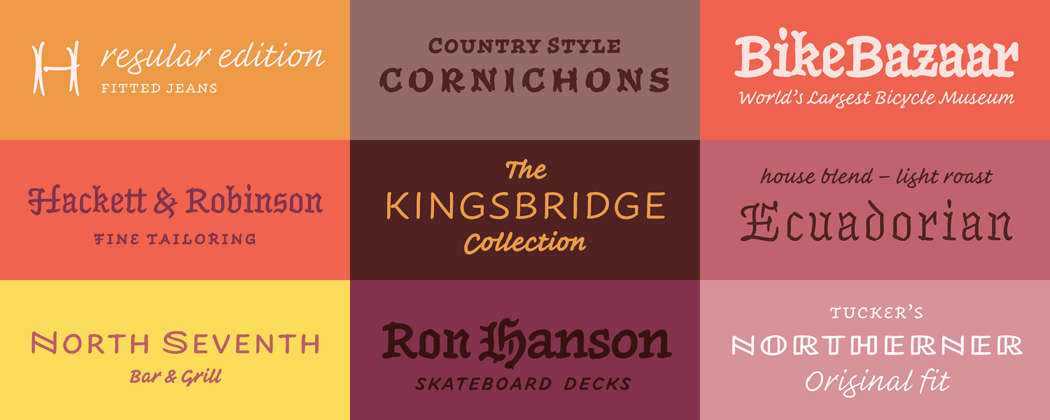
Inkwell's multitude of styles
On the first day of Typographics 2017, Jonathan Hoefler took the stage to introduce his foundry’s latest type family: Inkwell. He said he wanted to make an informal design that was versatile and organic, but avoided the pitfalls of fonts that imitate lettering: artificiality and disorder.
He hoped to combine all the best parts of type, calligraphy, and handwriting—the result? Inkwell.
The family is made up of many members, from Tuscan to Script, Blackletter to Sans, and pretty much everything in between.
Is Inkwell trying too hard? During his talk, Hoefler addressed this concern. First, he's been working on it off-and-on for 12 years. That makes me feel a little better about its breadth.
He didn't work on it alone, he carefully pointed out. Without Andy Clymer and Jordan Bell (learn about them here) there would be no Tuscan, no lining figures, and perhaps no Blackletter.
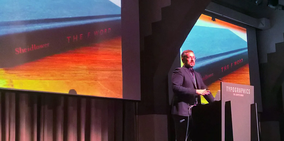
Hoefler at Typographics in New York June 16.
Every typeface—really every design of anything—should satisfy two sets of criteria: the technical and the aesthetic. What is it being used for and how should it look?
At one point in the talk Hoefler showed a Wikipedia page reset using Inkwell, suggesting: It can be used for almost anything! It seems best, in the examples he showed, for type outside of running text. It looks great in locator maps, infographics, recipes, and on labels on jelly jars.
But with the sweet array of styles, and the thorough informality, this family will find plenty of uses. So what is Inkwell? It's a handwritten Swiss Army Knife.


