Meeting grounds for typographers and type designers
Photos by Henrique Nardi
Typographics brings together the professions of typography and graphic design for a series of talks by “people who use type.” For the third June at The Cooper Union on the now fashionable Bowery, Typographics brings together more than 500 participants. It’s a fantastic location, and unlike much of Manhattan not filled with tourists. Attendees—marked with code-generated name tags—appeared to be some of the only non-locals around. The area isn’t too expensive, either. Attendees can easily find lunches and dinners for less than $10 in the immediate area.
The Great Hall
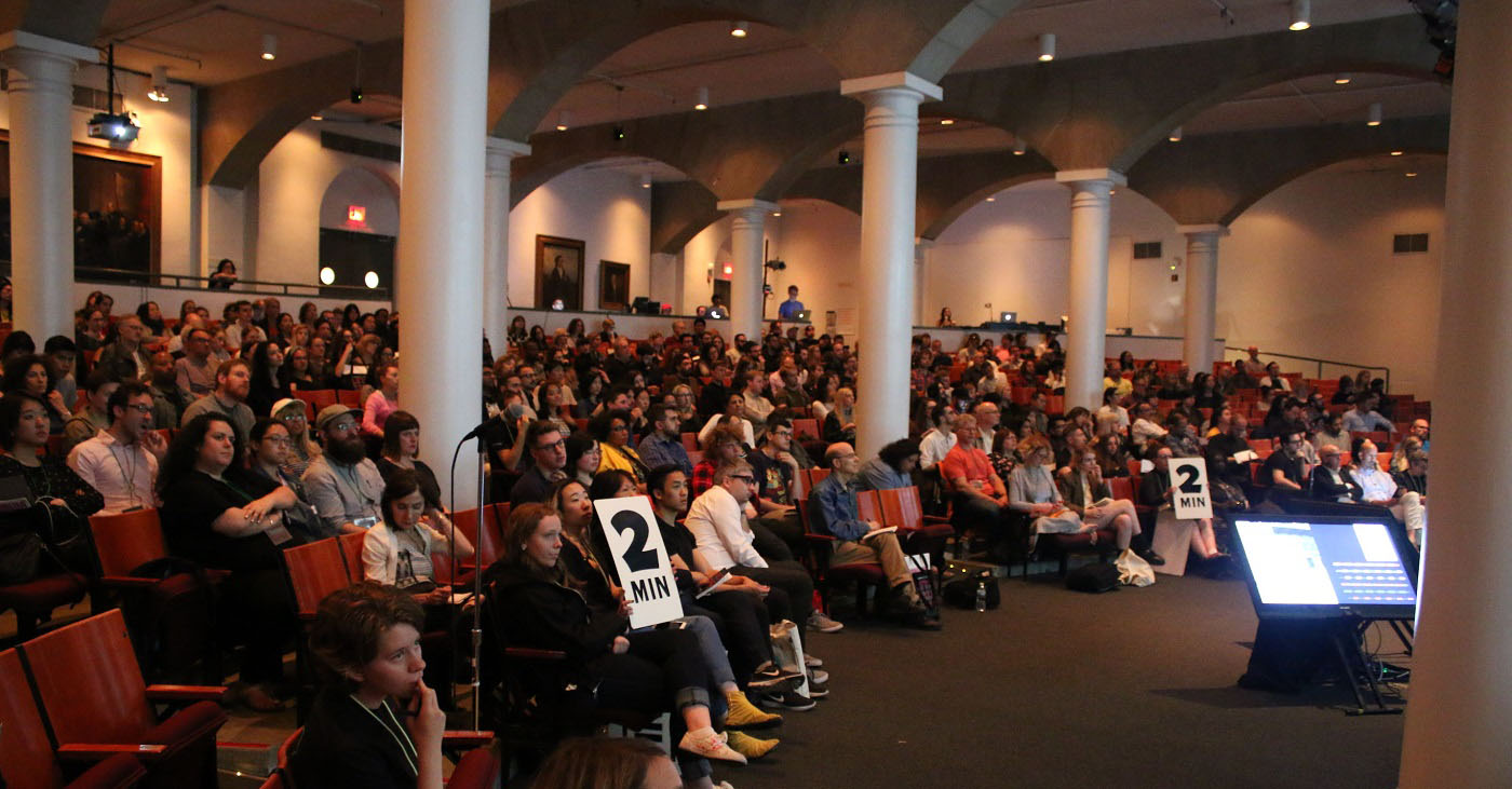
The main stage of the conference is The Cooper Union’s famed Great Hall, a legendary venue of Lincoln, Roosevelt, and Obama. The 19th century cast-iron theater is filled with columns that sometimes block the line of sight—but if you plan for that when choosing your seat, move seats between speakers, or don’t need to see the faces of every single speaker, it’s quite tolerable.
With an increasing number of design conferences, it has become trickier for organizers, lead by Cara DiEdwardo, the head of Type@Cooper, to pick the ideal weekend. This year, Typographics slipped in right past Kerning and a few others.
The Conference Content
Typographics seems to improve its speaker lineup each year. While 2016 boasted names like Tobias Frere-Jones, Fiona Ross, and Stephen Doyle, this year’s conference featured Jonathan Hoefler, Lara Captan, Helen Yentus, Kris Sowersby, and Jonathan Key, among others. The standout moments deserve recapping:
Helen Yentus gave a thoughtful talk on book cover design and its nuances in the Amazon-era. Helen took the audience through her career—spanning more than a decade—and showed how marketing and design synthesize in book covers to produce “the ultimate design challenges.” She showed an eye-opening image of two-inch book covers—the way consumers see them while scrolling through endless search pages online. It became strikingly obvious how taxing this genre of design must be, especially when one must produce interesting covers for countless “multi-generational romances.”
Forest Young offered a survey of his eclectic and innovative typographic work. He described pixels as a metaphorical extension of atoms, explaining that we build our visual world with these uniformly measured, endlessly customizable dots. Forest went on to show how, using this metaphor, designers can unlock new ways of thinking and constructing—breaking these atoms, bending them, and so on. Ultimately, his talk revolved around the idea of critical typography versus stereo-typography and how the former should obsolesce the latter. The pragmatic approach to developing critical typography, Forest claimed, is to harness and challenge the stereotypes in our users’ or readers’ minds: “All these ideas about what is good and evil relate to what we think of as left and right and up and down.”
Marlene McCarty with "Resist Typography"
Marlene McCarty’s spoke about the oscillating role of typography in American activism. She contrasted the civil rights movement and its signs with the signs used by contemporary activist groups and current political campaigns. The current idea, Marlene observed, is to decolonize protest posters through a greater interest in the “power of individual voices.” In an age when virtually everyone has access to professional-grade graphics tools, more and more activists are hand-painting, drawing, or even needlepointing their signs, spending far more time creating graphics that are not so traditionally attractive. Marlene summarized the challenge this poses to socially-minded designers: “How do we as typographers listen for and image the unspeakable?”
The best talks at this year’s Typographics were those that illustrated an issue or obstacle, then explained a potential solution. Many of the talks did this—far more than included in these three highlights.
Notice how none of these three highlights were type designers. The type designers on stage at Typographics often sounded like they were selling, while the graphic designers were showing. Kris Sowersby stated quite bluntly during a speaker Q&A panel, “This whole thing is about selling you fonts.”
That said, Typographics is one of the few conferences bringing together the type design and graphic design communities. The type world needs more of these events, and Typographics needs ceaseless support. If the goal of this conference is to coalesce type design and graphic design, then it might be more about sharing problems, solutions, requirements, requests, and even pleas for help. What do graphic designers need from type designers? What kinds of problems are type designers working to solve and why?
Outside the Great Hall
Many conferences offer little besides talks and social events. At Typographics there is more content, sometimes even counter-programing: Side-room talks, a book fair, demos, and a lounge. The extra talks add a great deal to the program; one talk—run by two professors at the Hoffmitz Milken Center for Typography, Gloria Kondrup and Ty Drake—thrilled and disturbed and otherwise moved the audience. The talk, titled Wordism, explored how language—particularly derogatory and inflammatory language—in the role of designers today.
The book fair seems to improve each year, and the Monotype lounge offered a calm oasis to charge your phone or rest your eyes. There was a tour of neon signage in New York City, and a calligraphy tour by Jerry Kelly. The program director of the conference, Alexander “Sasha” Tochilovsky, welcomed participants to Cooper’s Herb Lubalin Center, where he personally showed them some of the collection. There were several studio tours, and Jesse Ragan showed off the Pencil Factory, a space shared by a number of talented designers, including his foundry, XYZ.
Petr Van Blokland again was impresario of TypeLab, which this year overlapped the main conference some of the time. It could use a bigger room since a lot was going on, with a swirl of speakers and panels. Live demonstrations included calligraphy, DrawBot, PageBot, sign painting, RoboFont, and the Gylphs App. And Van Blokland closed with his famous Design Game, a kind of reality TV show about the design business—that everyone acts out live.
And to give the "festival" some academic backbone, there was a series of intensive workshops, with stars like John Downer on sign painting, Tânia Raposo on grids. James Edmondson on hand lettering, Michael Doret on combining letterforms and images, and Erik Van Blokland on type design. Some of these cost as much as the main conference, but they were all filled.
Annik Troxler on "Developing Type & Image for Poster Design"
Verdict
Typographics tries to accomplish more than most conferences, offering itself as the connection between the type and graphic design industries—for the most part, it pulls it off. The location, venue, and time of year are nearly perfect. There were a few issues, which we can attribute growing pains and the fact that this is organized by type-people rather than event-people.
Maybe the fourth year, Typographics will come of age. It is surely becoming a yearly tribal gathering, and one that I’ll be happy to rejoin.


