
We have seven winners!
TYPE’s “What is this?” contest closed over the weekend. The question refers to this photograph, which we now credit to St. Bride Library, London.
The answer is:

A matrix for the O from Vincent Figgins’ Five Line Pica Sans-serif.
Here are the winners:
The first winner, within hours of the post, was Jandos Rothstein, editorial designer and a professor at George Mason University in Fairfax, Virginia. He wrote, simply, “It is a matrix for the letter O.” This it is.
I may have been hoping for more detail, like the name of the typeface. But before the project began with Paul Barnes and Vincent Winter, I would have had no idea that this is a matrix for the uppercase O of the astonishing Figgins Sans, which first appeared in the 1833 specimen book.
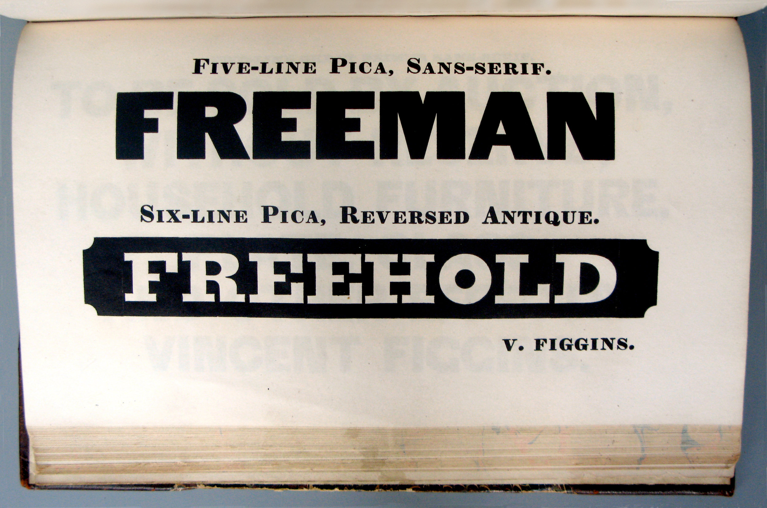
Photograph: St. Bride Library
Specimen of Printing Types, by Vincent Figgins, Letter Founder, West Street, West Smithfield, London MDCCCXXXIII.
After Jandos, there were six more winning answers in order of entry:
Marco Walker of Berlin said, “A mold to make the letter "O" for a letterpress printer,“ adding, “or a 15th century iPod.”
Pierre Pané-Farré, type designer and researcher in Leipzig put it simply “This is a matrice [the french spelling] for letter O or zero.” Bingo.
Patrick JB Flynn of Madison, former art director of The Progressive, and recently The Baffler, was more elaborate. “It’s a sanspareil matrix for casting large type. Sanspareil mats were created as a stencil cut-out of the letterform which was then riveted to a backing plate. This matrix is for the letter O, invented by William Caslon IV, 1810.” All true. But no one got Figgins. . . . In the scramble to make bigger (and cheaper) type for the rapidly expanding commercial market, a number of techniques were tried to replace the historical steel punches and brass matrices. Sanspareil is a laminated matrix, which allowed larger sizes.
Terrence Chouinard, a typographer and print enthusiast in Portage, Indiana, got it right, too: “It is a typecasting matrix (hot metal) O of some foreign origin, meaning not Linotype, nor Monotype, but from continental Europe or Asia.” Well, after Brexit, perhaps Europe will not be the right word.
Renee Tafoya, an active Western publisher and teacher—an associate professor at Northwest College in Powell which is halfway between her home in Cody and Yellowstone Park, and board member at the Yellowstone Museum in Billings—also got it right: “I think it's a die to cast the letter o in metal. Looks like the font is a geometric sans, maybe Futura.” Of course it’s nearly a century older than Futura, but the word “die” was used for sanspareil matrices.
Love Lagerkvist, of Västerås, Sweden, also thought, Futura. “The matrix for a geometric O, ready to be cast into some foundry type! It's rather fat, so maybe Futura bold (being very generic)? Well, it is geometric, so that qualifies.
Also ran
There were some close runners up.
- Tim Smith of Cincinnati: “The backside of a hot metal glyph. Possibly an O.”
- John Jezierny of Boca Raton: “It appears to be the letter O from a Linotype machine.”
- James Colton, the photo editor, now in Palm Beach Gardens: “A plate for the letter O.”
Others were not so close. But fun. Here are some of them, with the names suppressed. “Inkwell” was the most frequent guess.
Is it a lead type inkwell???
Linotype period
Lead type period
Letterpress—bullet point
I should know, I should know . . . something round goes on the nib and stays upright . . . damn! I can't remember
Eclipse viewer
A registration guide for a press
Rocking ink blotter
A press roller bracket
Inkwell and brush/pen rest
It is a gong from Southeast Asia probably Burma
"The first Mergenthaler/Linotype operator-activated silent alarm button. It was used to alert the type police (upstairs) when em-dashes were used indiscriminately. If pressed a second time, it would activate a high-decibel audio alarm“STOP THE LINOS.” [Refuse to take this personally—Ed.]
Gee I dunno, how about a miniature bundt cake pan! A type of one, anyway!
A spillover device to catch rivulets of black paint.
Ancient bell
Engraver's "O"
My guess is that it has something to do with a vintage press and is some sort of metal type stabilized (male) that fits with an opposing female piece.
Form used to make dimples
Stone base for color and swab for inking metal types?
I think it's a “sort”or “type” of a full stop—a piece of type representing a particular letter or symbol, cast from a matrix mould and assembled with other sorts bearing additional letters into lines of type to make up a form from which a page is printed
I think it holds a roll of paper in place on the press.
Vintage rivet mold
Antique door knob
And on FB
Some suggested answers from Facebook:
- The first baked donut panI
- Is it the back of an electrotyped mat?
- Bell without the cover?
- Iron Man's heart?
- Copper ink vessel with brush rest, Han dynasty, China circa 200bc. Okay, I have no clue but do think it's ink related 😊
- Is it possibly a dingbat type block?
- Inkstand
- An antique doorknob
- Matrix for an o. [Not an official entry]
- This character -----> ”•”.
- An early (very early) emoji. . . . No, really I think it's a period
- Painting
- A bullitt from a metal font
- Whatever it is, it's sexy
- Cast iron or antique doorbell?
- Wax seal? lol I give up
- I've spent way too much time puzzling over this. . . . It's a stand for a medieval Apple Pencil. I give up.
- A magnet door catch
- A sombrero
- One of my sketchbook covers . . .
- Snap setting die
- GONG
- Old electro-mechanical transducer, (old phone)?
- Part of the housing for a lock
- This is a very early precursor to the iPod back in the first part of the 20th century, when the screen images were cast with led type and the sounds came out of a wooden piece held up to the ear. Resolution was very poor, but the interface was highly advanced
- Embossed letter O?
- Hot metal monotype period
- What's left of the Capitol Dome?
- Linotype O or perhaps for an old donut shop ad
- Oh c'mon. iPod
- ¿Un timbre?
- A level
- Overcooked egg?
- The o from a 1970 Olivetti typewriter?
- It's an old iron doorbell
- Hot type period
- Does it have something to do with a law enforcement star ? Texas Ranger badge perhaps?
- A mould for making jeans' rivets :)
- Ink mixer for a VanDerCook
- Peter Venkman's spleen
- Sombrero
- I go with doorbell or something about printing
- Linotype period
- Female side of jeans rivet die
- Looks like a 1st generation Apple iPod that was found in the remains of a house fire
- Gene Simmons’ belt buckle
- iPod prototype
- Back half of a doorbell
- It’s an inkwell
- Is it some sort of spacer for set type??
- Drum symbol mold
- Mold for a snap enclosure
- A device used to create bullet-point-copy
Everyone who entered will be sent a copy of the first print edition of TYPE. No. 1. The six winners each get a complimentary Charter Membership. Congratulations!
More to come
There are two pieces in TYPE No. 1 by Paul Barnes and Vincent Winter about the amazing St. Bride collection. The issue devotes 20 pages to pictures of punches, matrices, type and more. Copies are being mailed this week!
The section will be posted on this site.
If you didn’t win you can still become a Charter Member for 2018. Members receive all the issues published during the year. (We’re planning four.)
Notes
James Mosley, former librarian of St. Bride now at Reading University, is the one who brought the Figgins material to London from Oxford, where it had been kept by the university press, along with a lot of other stuff. There is an account of his efforts on the St. Bride site.
David M. MacMillan provides some history about the development of punches an matrices on his site, Circuitous Root.
And, there are some interesting historical details in Trade Union and Social Studies, by H.E. Musson. The book gives a perspective on how important typefounding was in the 19th century industry and labor. A facsimile in Google Books.


