
Take a visual vacation with Russia's new branding.
The end of 2017 marked the conclusion of Russia’s two-year-long tourism brand competition. The winners—Vladimir Lifanov, Ilya Lazuchenkov, Yegor Mysnik, Denis Schlesberg, and Erken Kagarov—submitted their entry in 2015; their design, along with 479 others, went through three rounds of selection: a juried narrowing, then two rounds of public voting.

Ilya Lazuchenkov and Erken Kagarov
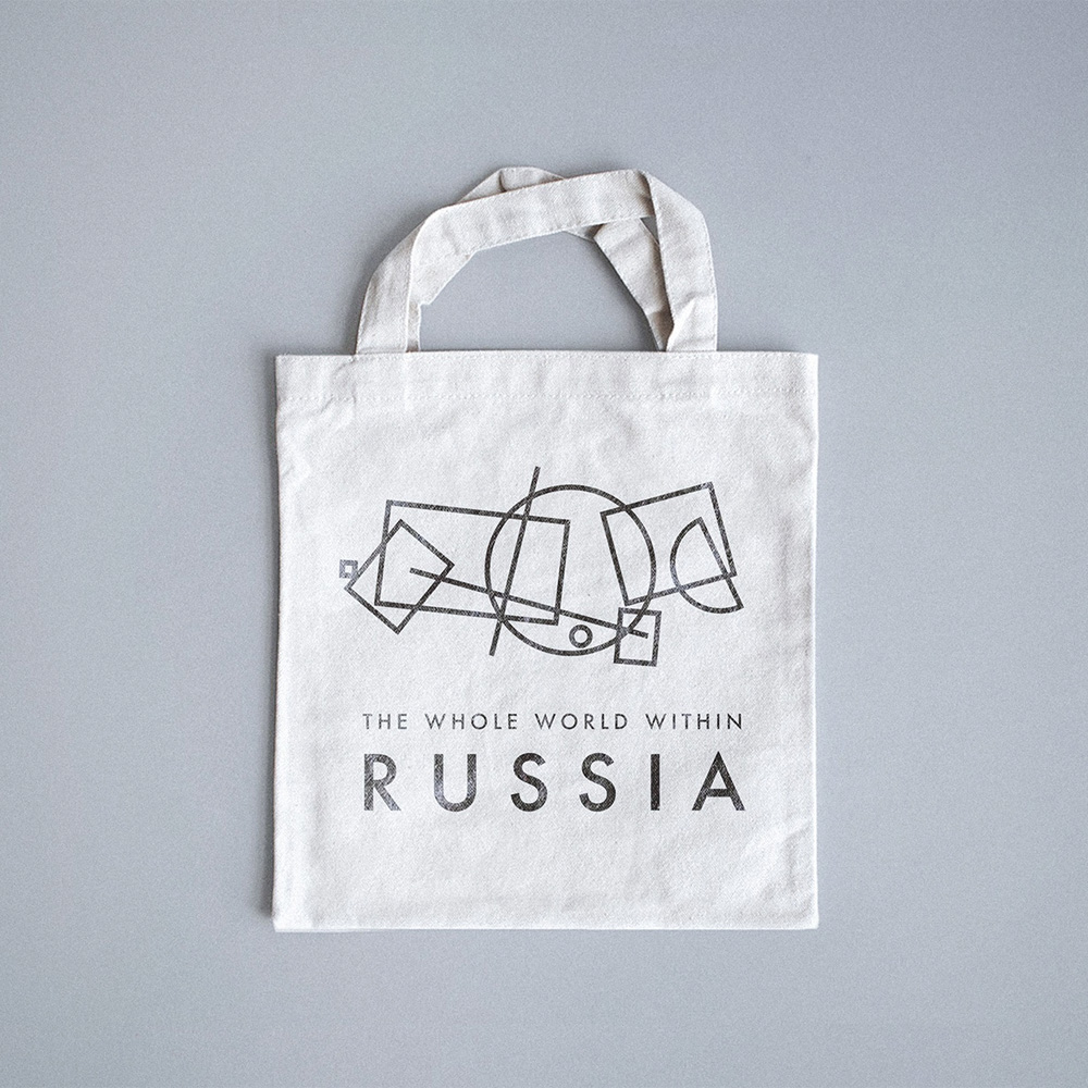
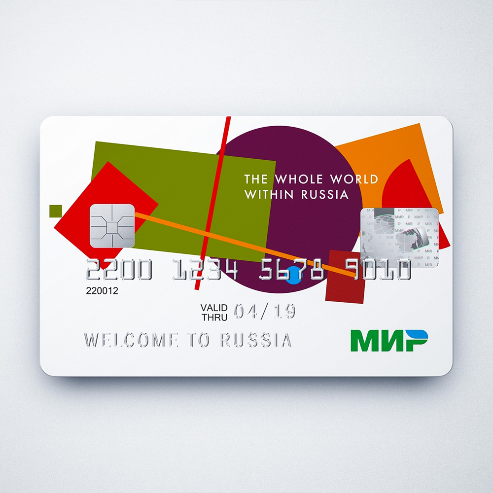
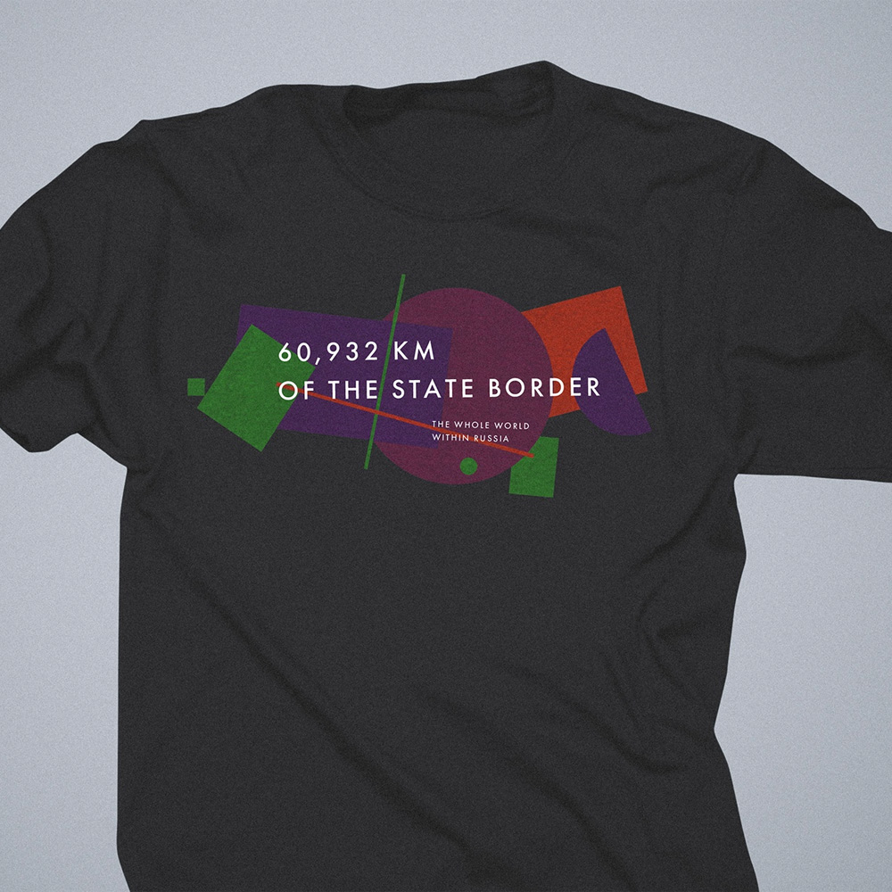
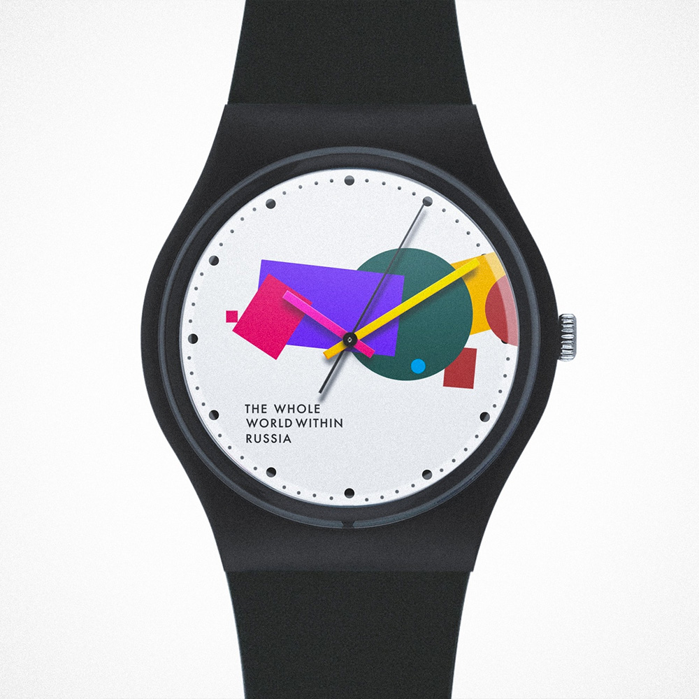
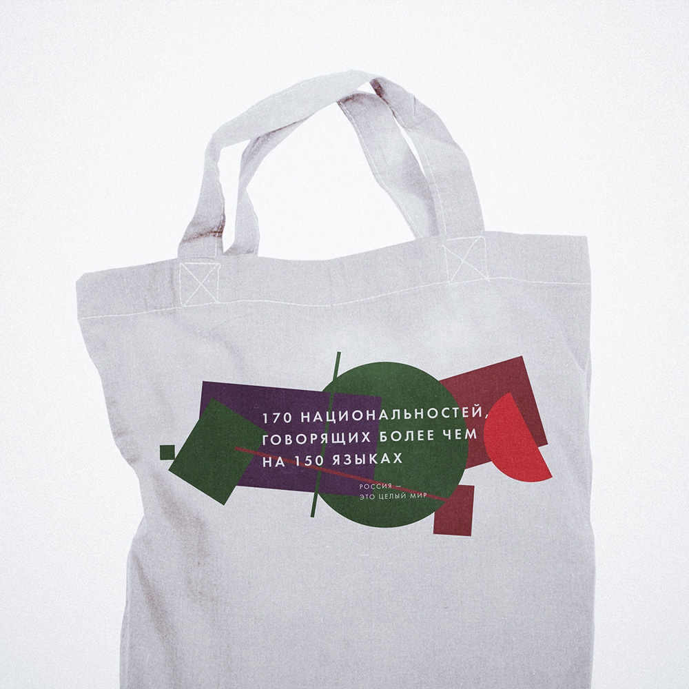
The brand system incorporates a rough map of Russia—one of the globe’s most recognized states—as a multi-colored Suprematist construction. Suprematism, a Russian avant-garde development circa 1915, is characterized by simple geometric shapes; in the case of this logo—the shapes “denote the points and territories of our Motherland, conveying its character convincingly and accessible.”
After the selection announcement, Lifanov, one of the core designers, revealed his involvement and described the system:
This is a very simple graphical story about the diversity of our country, complex, sometimes piled up and sometimes completely empty, like an incoherent patchwork quilt, not too mushy, gloomy and not smiling at first glance, but responsive inside.
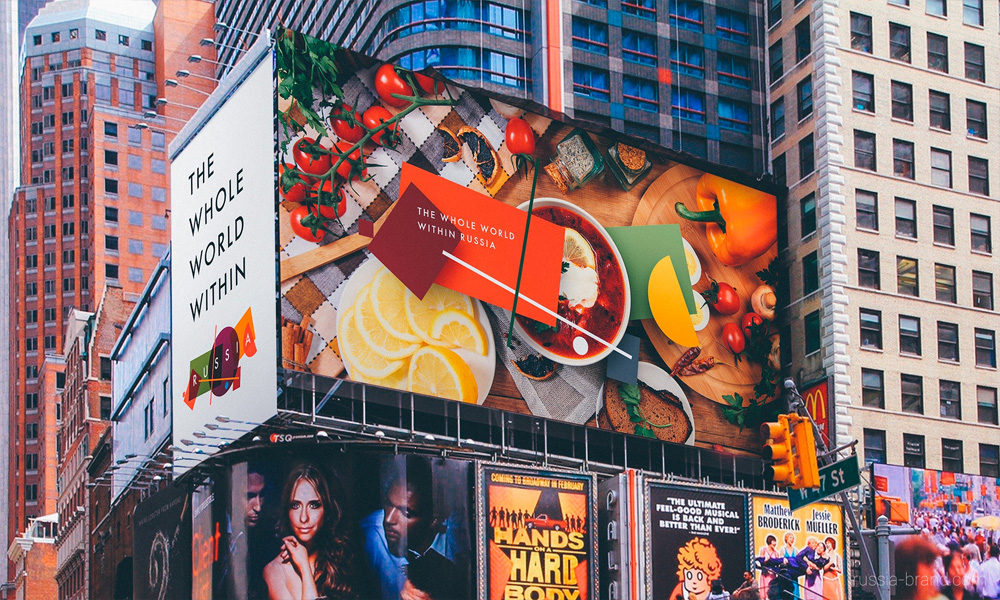
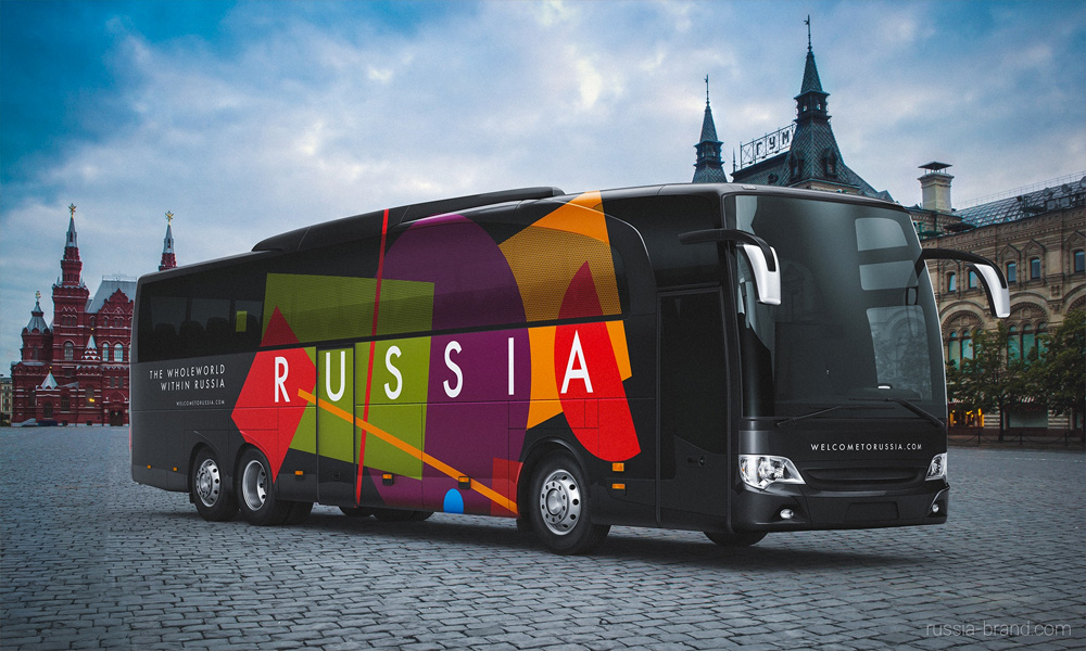
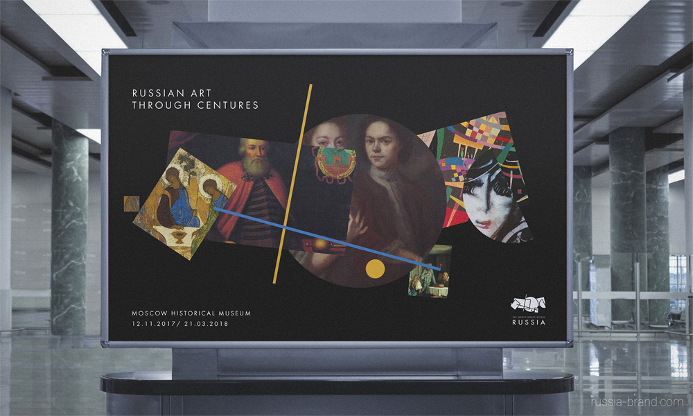
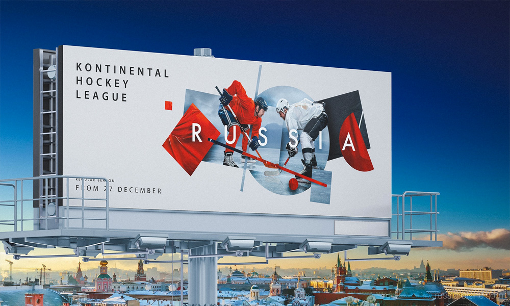

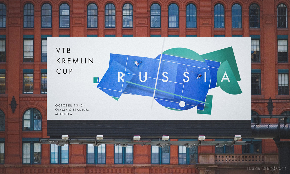
An eye on flexibility, the avant-garde mark functions just as well in one color as it does combining images and graphics. Going into 2018, we should expect to see the system applied to everything from spaceships and art to sports and cuisine. Notably, with the 2018 FIFA World Cup taking place in Russia, the brand should soon appear on ESPN and other sports networks globally.
To learn more about the brand, take a look at its website.


