
Converse’s old logo is new again
Over its 109-year lifespan, Converse has seen countless challenges and changes. From owning a monopoly on athletic shoes to producing military equipment during WWII, from being the official shoe of the National Basketball Association, to bankruptcy, Converse has been through the ringer. Now, fourteen years after being acquired by Nike, they’re introducing a new logo.
“New” here is used loosely. Long-time Converse fans will immediately notice the logo's uncanny similarity to their classic star-and-chevron logo, introduced in the '70s. The return to this vintage trademark abandons two star-in-circle logos they used during the years they lost market-share, went bankrupt, were acquired—and then and resurged in the casual fashion market, to the tune of $2 billion revenue in 2015.
Converse's two star-in-circle logos.
The new logo aims to wipe the slate clear and return to the days when people loved their Converse shoes. Speaking about the goal of the design to Cool Hunting, Adam Cohn, Converse VP global brand design said the company wanted to “leverage an icon that’s part of our heritage that’s also representative of moving forward.” They may have hit their mark.
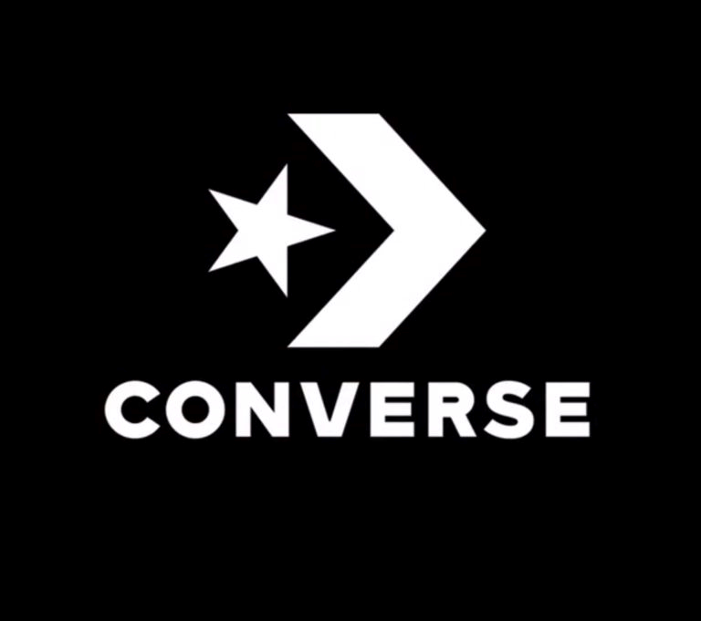
Star-and-chevron trademarks: New (left) and old.
The difference between the new lock-up and the one from ’70s is that the type is bigger in relation to a slightly stouter chevron, and has gone to a Gothamy 19th century geometric sans. The new trademark has rolled out in social media and the website.


