
The Type of TYPE: An Interview with Richard Lipton
Richard Lipton has been designing type and lettering for over 40 years and continues releasing new typefaces with style and utility.

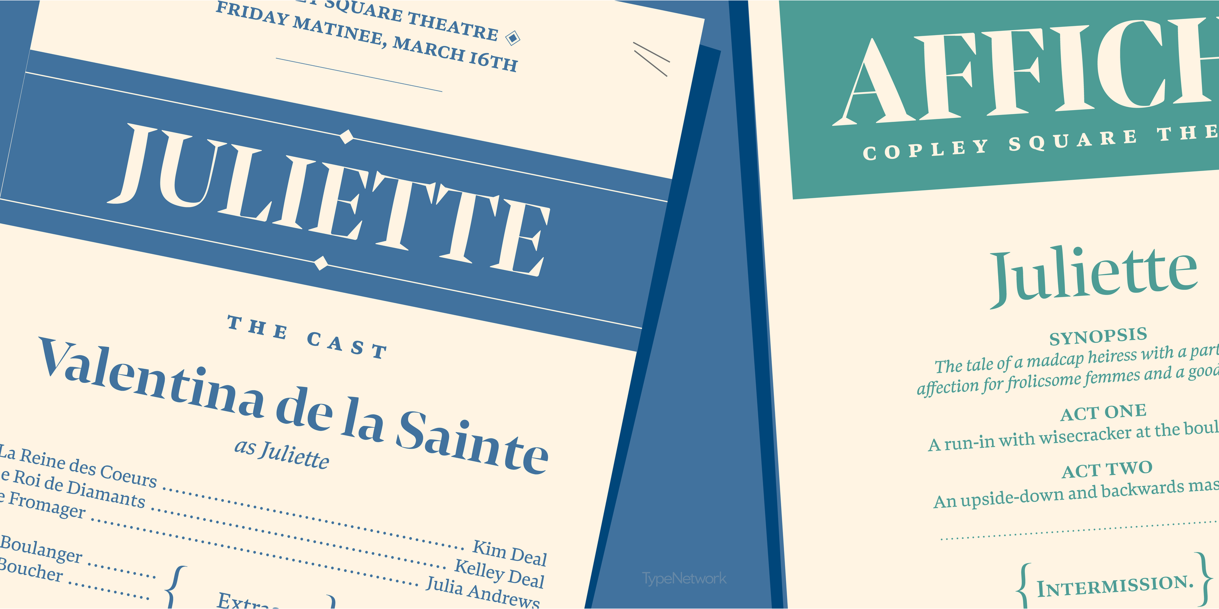
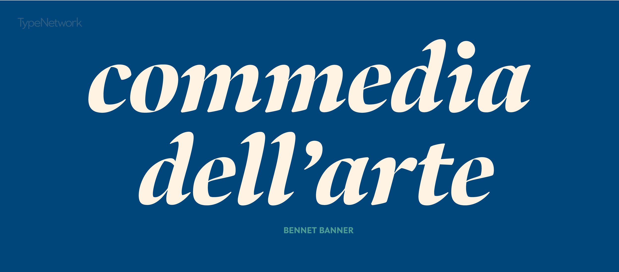
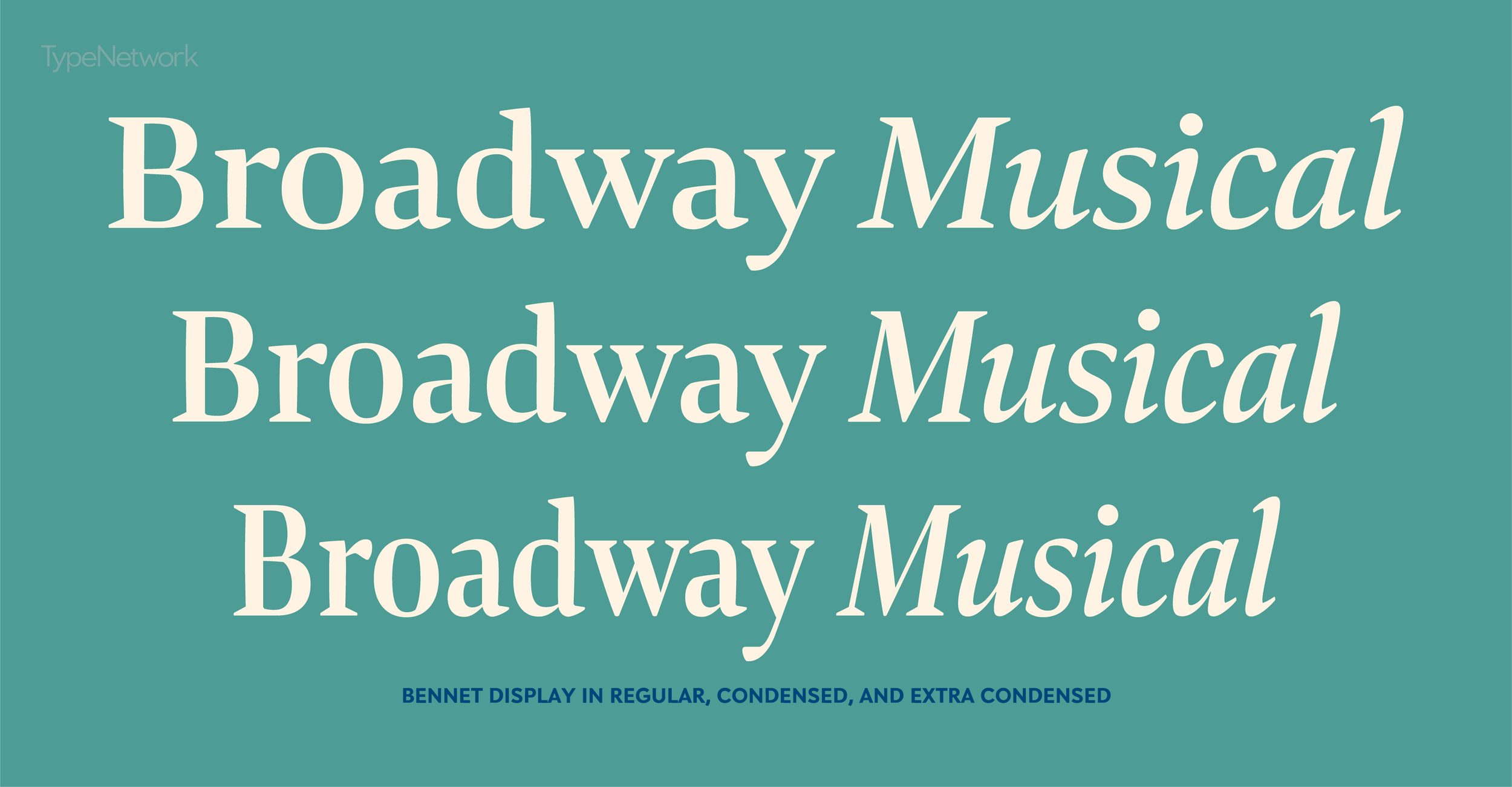
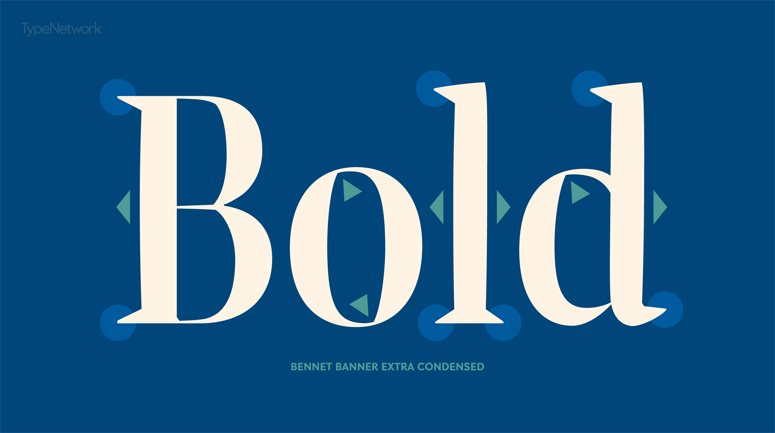
Showing off different weights of Bennet Banner
The most recent example of Lipton’s craft in action is Bennet—which is the font that you are reading right now. We loved it so much, we chose it for the body copy font on our website. Bennet was recently released by Lipton’s foundry, Lipton Letter Design under the Type Network alliance.
Soon after our website launch, we interviewed Richard about Bennet, his path to lettering and type design, and camping in the snow.
Is There Life Outside of Type?
TYPE: Tell us about what you like to do outside of type design? What are your hobbies? What drives you to stay in the Northeast U.S.?
Richard Lipton: I love to bike, hike and kayak mostly. In Bristol, Rhode Island I have the good fortune to be at the start of the East Bay bike path which snakes up to Providence about 14 miles away, so that always provides a decent work out. I also love backpacking in winter and try to get up to New Hampshire’s White Mountains as much as possible, preferably when the snow is deep. Some people think that’s crazy, right? I love the quiet of snow—and there’s not many other folks up high, and there’s no bugs.
I grew up in New York, I attended college upstate and then I moved to the Boston area where my lettering work took off. Now after many years, I’m in Rhode Island and can’t really imagine living in any other part of the country though I’ve been to many beautiful parts of the U.S.. I’m also currently teaching at RISD and that provides an enjoyable anchor to this particular geography.
You seem to like being outside of the limelight (which this interview is messing with!) Why is that?
I’ve always been a somewhat introverted person which is perhaps why I love this work. It can take on the trappings of an isolated life similar to what I imagine a writer might experience; as quiet as you want it to be. I do have ample opportunity though, through teaching and contact with colleagues to be pretty sociable on a regular basis.
I used to give lettering workshops early in my career and still occasionally do some demos at type conferences but I feel the nature of the work is solitary for me. It’s just not in my nature to want to travel much either giving talks at conferences, offering lots of workshops or even having a heavy social media presence. It just takes away from the time and joy I get making letters.
““You might compare me to a studio musician, out of the limelight but hopefully making great music nonetheless. So I count on my work becoming the star, not the person behind it.””
What inspires you outside of type?
I tend to focus on nature which provides a necessary balance for me to all of my computer work. I’m a fan of the movies as well and fortunately, I’m blessed with a poor memory so I can see most things twice and enjoy them as if I’m watching for the first time!

Richard Lipton hiking at the Norman Bird Sanctuary in Middletown, RI.
Designing Type & Teaching at RISD
How did you get into type design?
I had a friend and calligraphy colleague who started working for Bitstream in it’s early days. The work sounded interesting. I was a freelance calligrapher based in Cambridge at the time and the appeal of working on type seemed like a natural extension of my lettering pursuits. So I joined Bitstream’s type design staff in ’83 and stayed until ’91. I learned a lot there under the guidance of David Berlow, Mike Parker and Matthew Carter. I eventually had the opportunity to design several original typefaces: Arrus, Cataneo, and Bremen.
When I left Bitstream, I pursued my type interests in an affiliation with Font Bureau and now have my own foundry within the larger umbrella of Type Network.
What is it about your personality that gives you strengths in designing type?
I’m very detail-oriented though I’m sure most type designers are. I like working things out after my initial vision, fitting the pieces together, trying to see the whole puzzle. I enjoy the abstract elements of type forms, their grace and beauty, infinite nuanced variety, and I’m challenged by the strict working parameters of designing type for text.
““Letters are very powerful symbols and I feel lucky to be able to add something that is practical, useful, and hopefully beautiful to type’s historical legacy.””
Tell us about teaching at RISD. What do you teach? Do you enjoy teaching the next generation of designers?
I’m starting my third year at RISD. I’ve taken over teaching undergraduate type design from Cyrus Highsmith who devoted many successful years teaching this class and has now moved on to teaching type at the graduate level. I also teach calligraphy there as well.
I enjoy teaching both for several reasons. It gets me out of the studio which is a great energy change and allows me to share my experience with talented, eager young people who come to RISD from all over the world. It’s great to see them work out all of the complex challenges in designing a typeface and create something they are hopefully proud of and that is useful to them.
Being in the type and lettering world since the 1970s, what keeps you interested and motivated to keep making type?
Type design is experiencing quite a resurgence right now with many independent and small foundries proliferating nearly everywhere. When I began in the industry at Bitstream in ’82, the Mac hadn’t yet appeared and the release of Fontographer was still three years away. So there wasn’t the kind of frenzied output that is going on now. The industry was much more laid back and new designs had a chance to be regarded and assimilated at a slower pace. But I think the world spun a bit slower in every regard.
The most dramatic change is of course THE RISE OF THE MACHINES a.k.a., the personal computer. In so many ways it is an amazing tool for researching, exploring visual ideas, and creating type. Though I think it is important to realize that it is in fact just another tool and it can’t magically turn you into a thoughtful type designer if you don’t have some foundation in letter drawing design skills to begin with.
““You certainly don’t have to become an accomplished calligrapher to design good type, but it is important to see and understand the historical transitions of letterforms that occurred from the pen to the punch to the mouse.””
I tell my students at RISD it makes historical sense to study calligraphy before studying type design. You certainly don’t have to become an accomplished calligrapher to design good type, but it is important to see and understand the historical transitions of letterforms that occurred from the pen to the punch to the mouse. If you have the opportunity, look at some original print manuscripts and take in the beauty and grace of the first roman types, the texture of the paper, the depth of the letters, the richness of the ink. It can be a pretty heady experience and there is much to be learned.
I think it’s that rich history that inspires me and keeps me motivated to design new typefaces and hopefully make beautiful and useful letters. We have so many fine models to guide us going back 2,000 years to the enduring influence of the classical Roman capitals.
““I think it is in our interest to salute this splendid legacy of letters, but our designs must inevitably be sensitive to the times and culture in which we live.””
Designing Bennet

Courtesy Lipton Letter Design, Illustrations by Evan Lipton
Your previous work seems to have a large focus on scripts—was it a nice change of pace to design Bennet?
With my background as a calligrapher, I’ve always been drawn to the liveliness of the handmade letter and I really enjoy working on scripts for that reason. I do like to mix a variety of projects into my work flow so there are always several different stylistic families in various stages of development going on.
Bennet was completed just two months after I released the Meno expansion, which I had been working on (and off) for a couple of years. So Bennet wasn’t really a change of pace from scripts so much as a decision to follow through on ideas I had for a new serif design with some lively qualities of the broad-edged pen.
Next up is an expansion to Canto, with two additional weights and the introduction of a brand new calligraphic companion italic. I’m pretty excited about that.
Did you have any historical inspirations or rationale behind the design of Bennet?
There was no direct or historical inspiration to the Bennet design. I tend to approach the starting point of drawing an original design as a calligrapher with a broad-edge pen and though there are many fine historical types to draw on, I try to engage a new idea without any direct influence from these models. The key word there is “try.” You can’t really separate what you know from what you do, so it’s a challenge. Most of my inspiration comes from just spontaneously sketching and messing about with pens and brushes.
As far as the rationale behind the Bennet design, it’s well worth reading the background story from Type Network’s news release “Bennet Makes the Grade.”

Courtesy Lipton Letter Design, Illustrations by Evan Lipton
Finally, tell us about the bird illustrations and stamp designs for the Bennet promo—are they real stamp designs or just a beautiful way to promote the type?
I hope people think they are a beautiful way to promote Bennet, I certainly do. My son Evan is an illustrator and I asked him to design some colorful graphics for the release of Bennet. He came up with the stamp designs—and oh by the way, don’t use them for postage!


