
Profile: Christian Schwartz, Commercial Type
Whether or not he realizes it, type designer Christian Schwartz came to typography quite naturally.

Growing up in the 1980s, Christian Schwartz’s father was an animator working on various PBS (Public Television) science and documentary programs from his home studio in New Hampshire. The programs needed titles and his father would often use dry-transfer (Letraset) lettering instead of sending it out to a photo-type typesetter.
He would give his half-used dry-transfer sheets to Christian, who started playing around and labeling his drawings as well as school projects. At the age of 14, Schwartz got a bootleg copy of Fontographer and started making his first fonts. During high school, Schwartz worked at a local sign shop learning paste-up and early graphic design using CorelDraw and PageMaker. The shop would often do vinyl signs for a restaurant and he would be asked to design the menus as well. “At that time, it was really called commercial art, not graphic design.”
Going to School and Making Connections
Schwartz attended Carnegie Mellon University for communication design and while he was a freshman, type designer Erik Spiekermann gave a lecture at the school. One of Christian’s teachers forced him to talk to Erik. “I asked my teacher ‘He is famous! What am I supposed to ask him about?’” and his teacher said, “I’m sure you'll think of something.” Christian showed Spiekermann his early type designs and two years later, Erik came back to CMU for a conference. He remembered Christian and invited him to come work at his studio in Berlin, MetaDesign, when he graduated.
““My life is a matter of being at the right place at the right time and meeting the right people. I’ve been phenomenally lucky just to meet people when I met them.””
Schwartz did just that and worked for a summer on several corporate design projects as well as a lightweight version of Volkswagen’s Futura typeface. After MetaDesign, Schwartz moved back to the United States and worked at Font Bureau as well as with magazine designer (and Editor of TYPE) Roger Black.
“My life is a matter of being at the right place at the right time and meeting the right people. I’ve been phenomenally lucky just to meet people when I met them: Meeting Paul (Barnes, his business partner), meeting Erik, and getting an internship at Font Bureau to work with Tobias (Frere-Jones).”
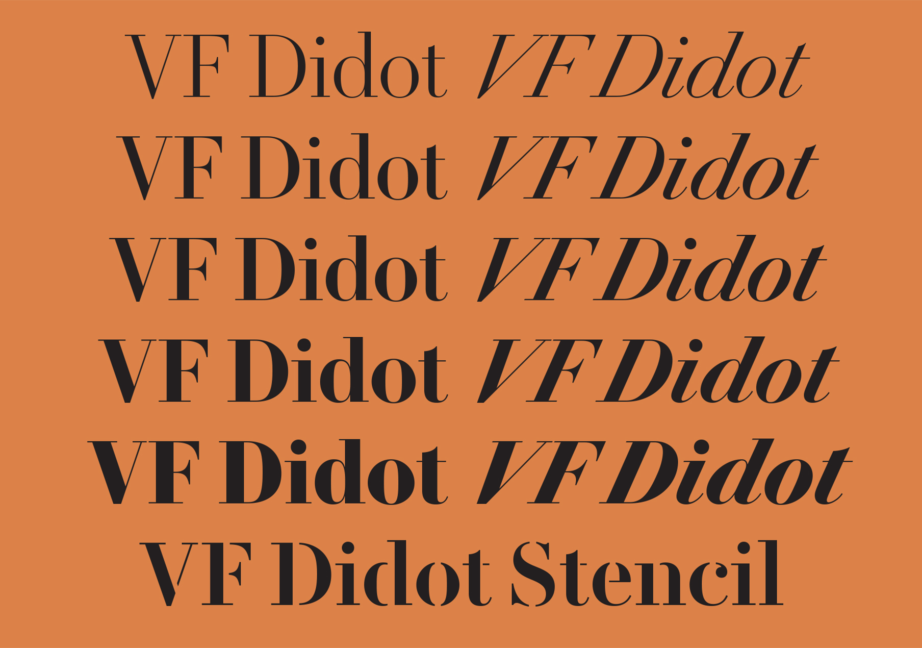
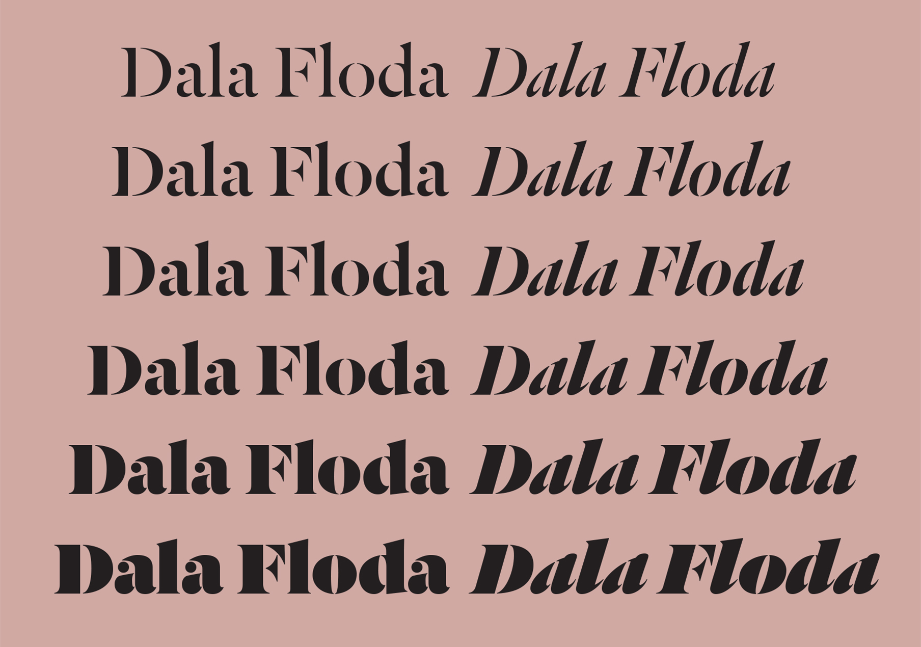
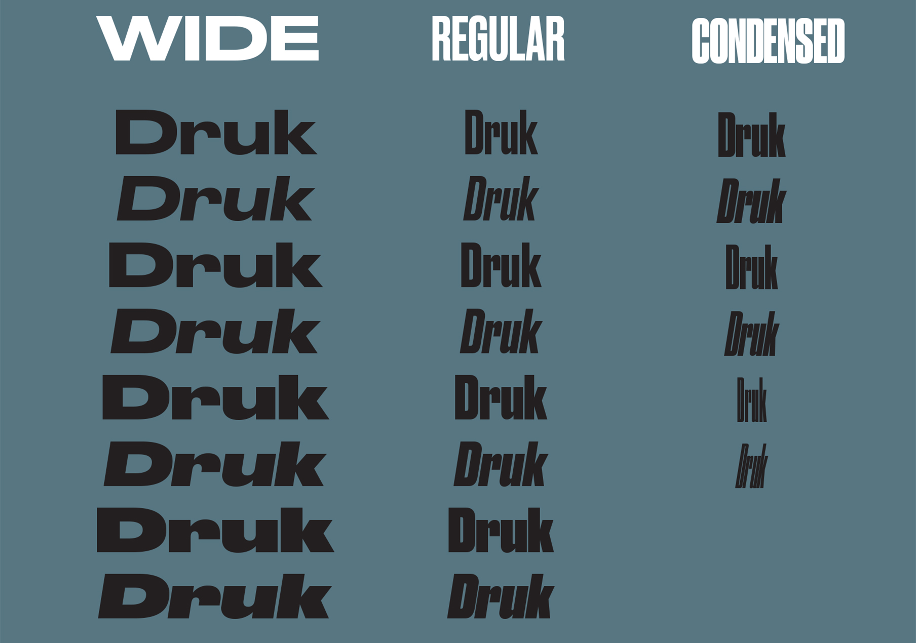
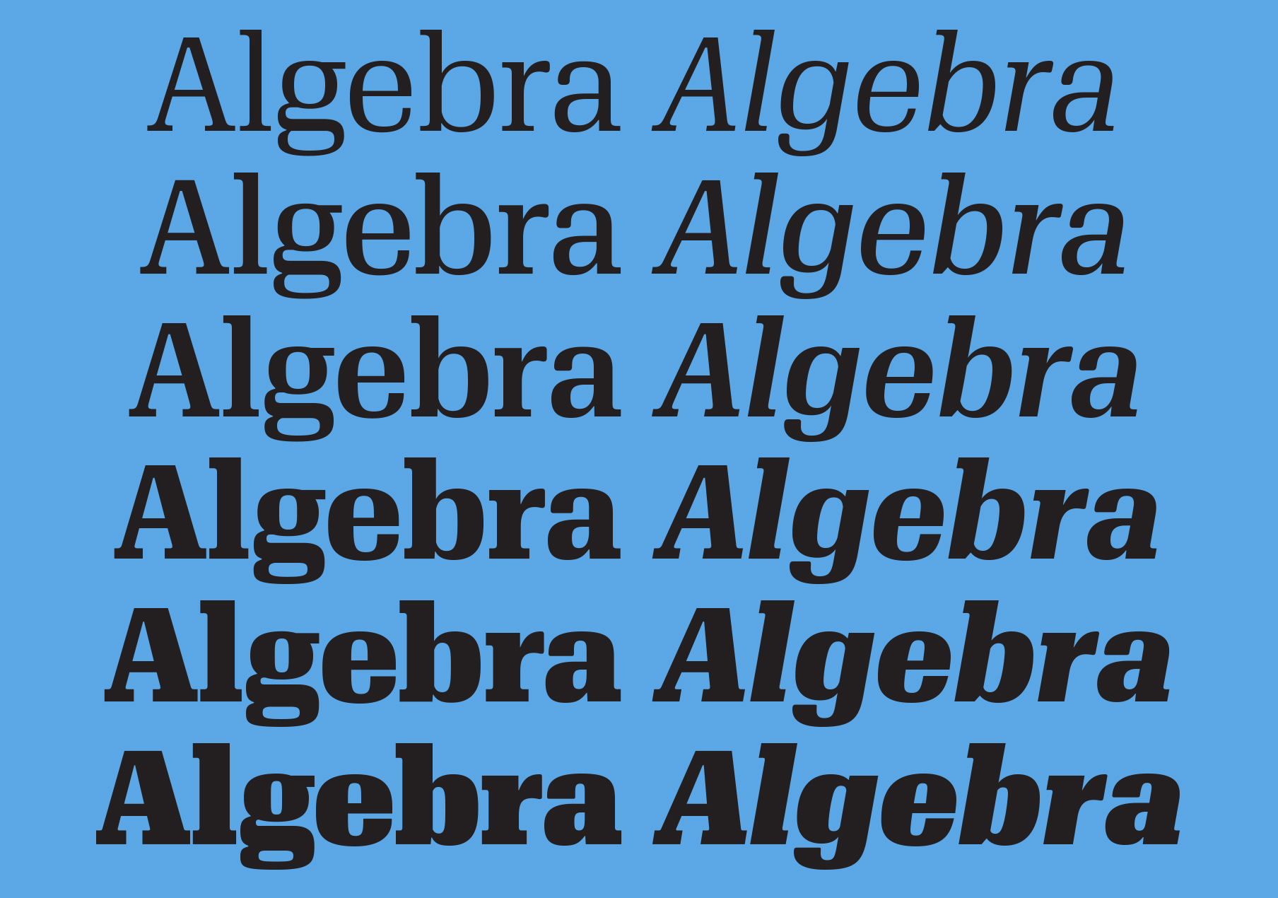
The Start of Commercial Type
When asked how he met his business partner Paul Barnes who co-owns their type foundry, Commercial Type, Christian is quick to say “Like all couples these days, I met Paul over the internet.” Around 1999 or 2000, there was a blog (before there was such a term) by Andy Crewdson called “Lines and Splines” that Christian loved reading. Crewdson was interested in type and wrote compelling articles about design.
A few years later, Crewdson started a new blog called “New Series” which used one of Christian’s typefaces, FF Bau, in the headlines. Paul also read the blog and contacted Crewdson wanting to know what typeface he was using as headlines. He had designed a revival of the exact same historical typeface but with different source materials which resulted in a different lowercase g. Crewdson put Christian and Paul in touch and they started trading old specimens back and forth that had inspired their typefaces.
Soon after, Paul asked Christian if he had any sans-serifs in process that had not yet been released and, as chance would have it, he did. This typeface, Amplitude, was used for Wallpaper* magazine, and was soon after released by Font Bureau.
From there, they worked together from 2003–2005 on the award-winning redesign of “The Guardian” newspaper in the U.K. and launched Commercial Type in 2009. Today, Commercial Type publishes retail and custom typefaces for clients all over the world.
On Being a Graphic Designer
Schwartz sees his early years (even back to high school) as a graphic designer to be intrinsically helpful to his current work. At Commercial Type, they always try to have an end-user in mind when designing a new typeface. “How will someone use this?” “How will it be applied?” “What magazine will use this design?” This focus on graphic designers—the actual users of the type that they create—helps focus their type releases.
But Commercial Type doesn’t only consider graphic designers outside the company; they make sure that all of the employees that they hire have a background in graphic design. “I meet a lot of type designers at the beginning of their careers and they all want to get away from graphic design and clients, but Commercial approaches it from the opposite direction.”
““No matter what, you’re making tools for other people to use. You still have to be able to talk to clients and, most importantly, listen to them.””

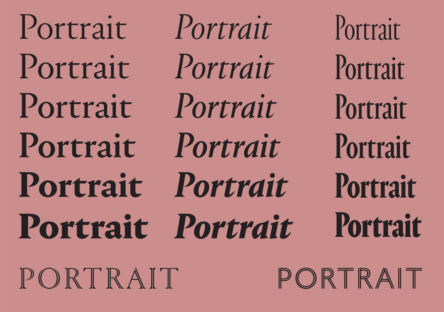
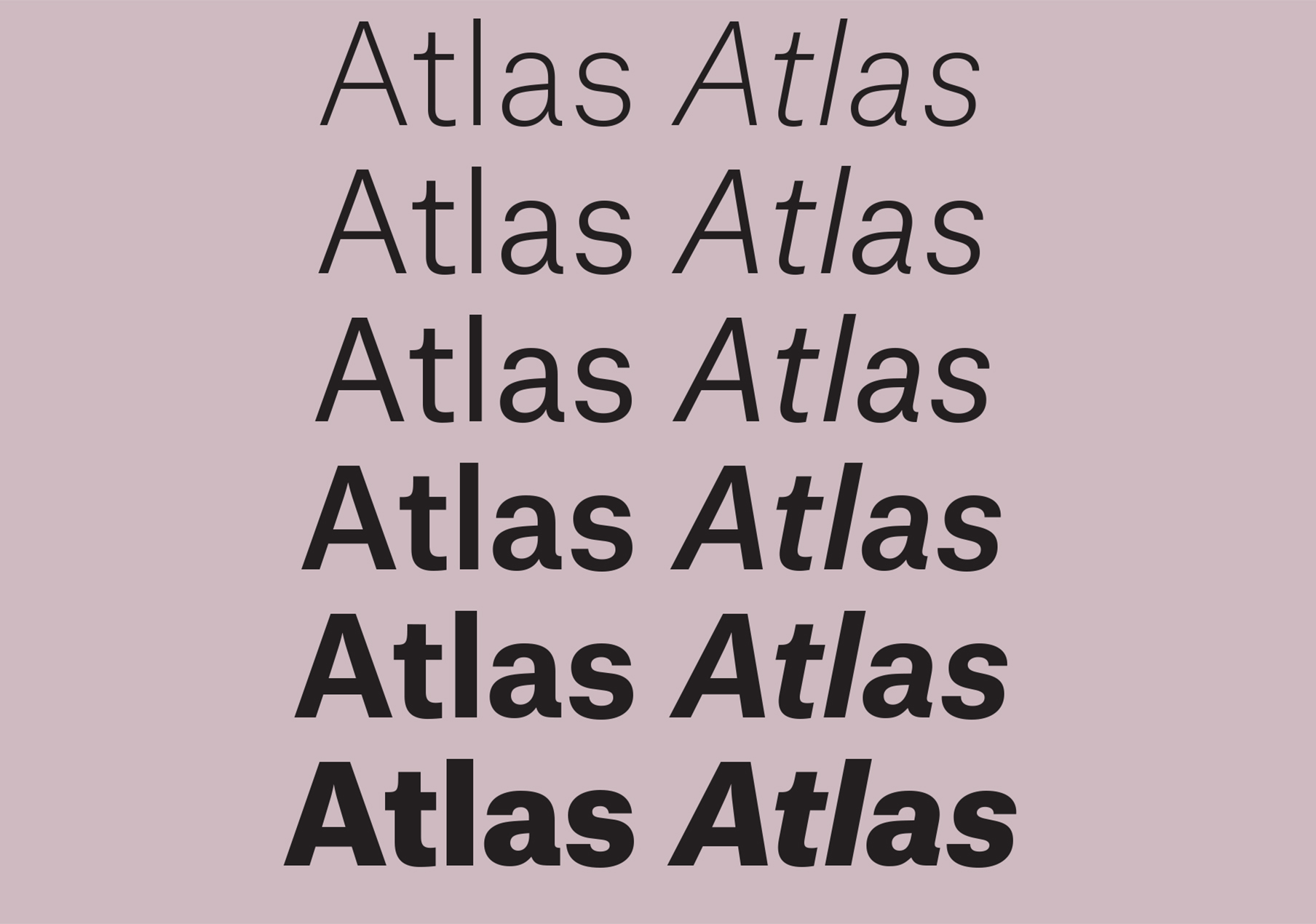
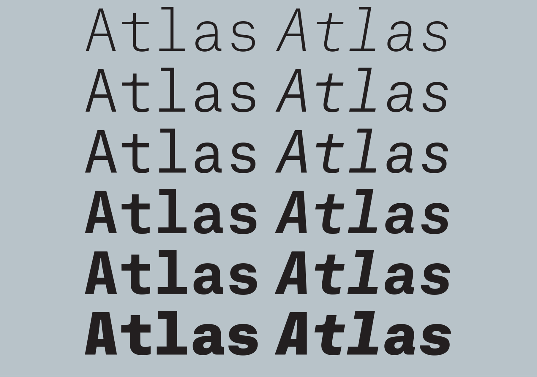
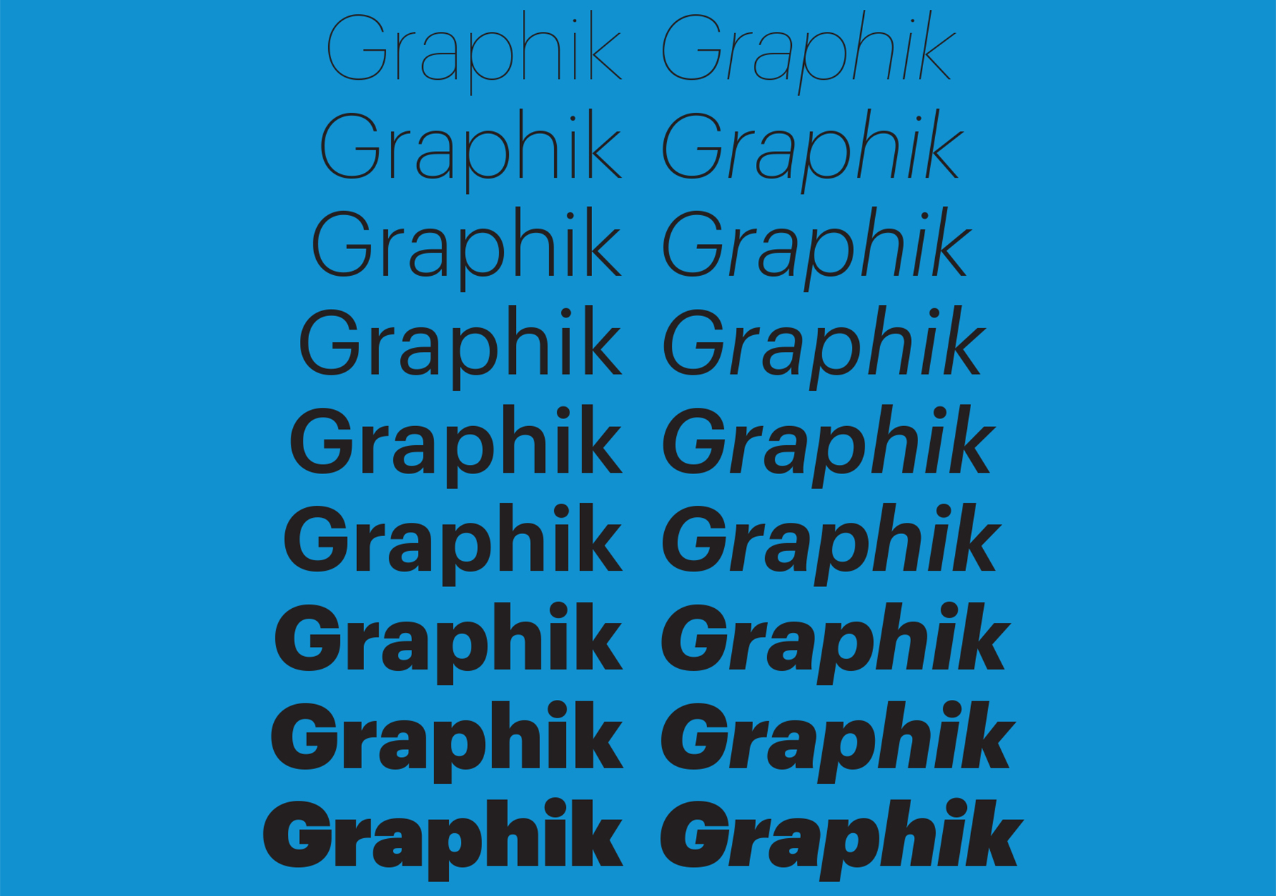
Christian Schwartz and Paul Barnes, co-owners of Commercial Type


