A Place to Discover.Typography
What started out as a way to play with their fonts has become a favorite destination to showcase their work
A Place to Discover
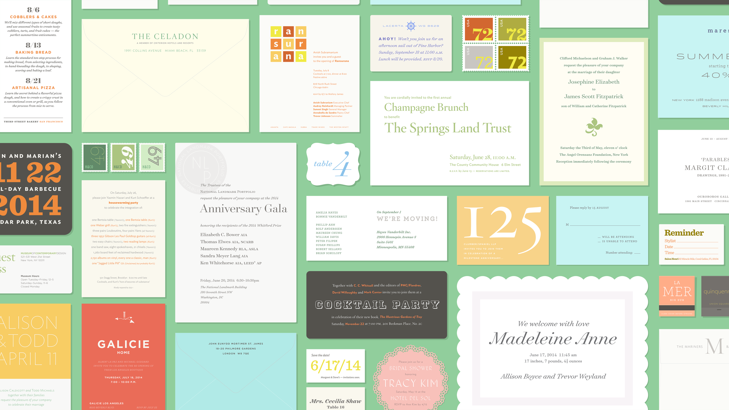
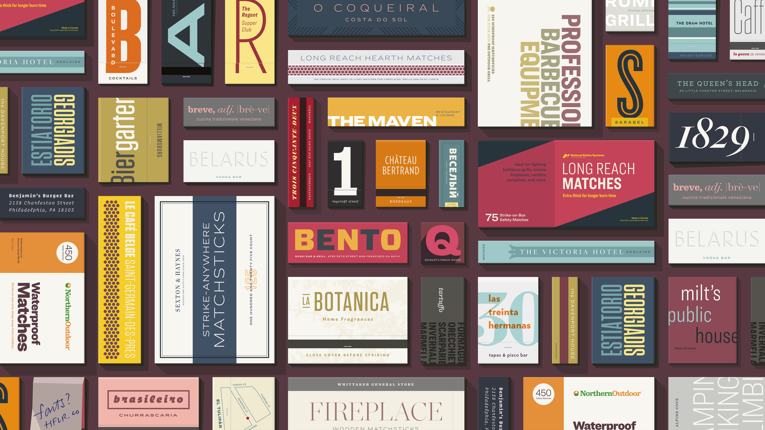
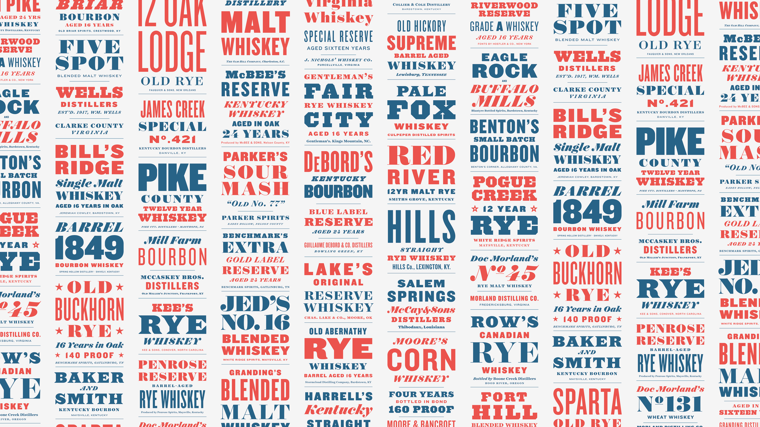
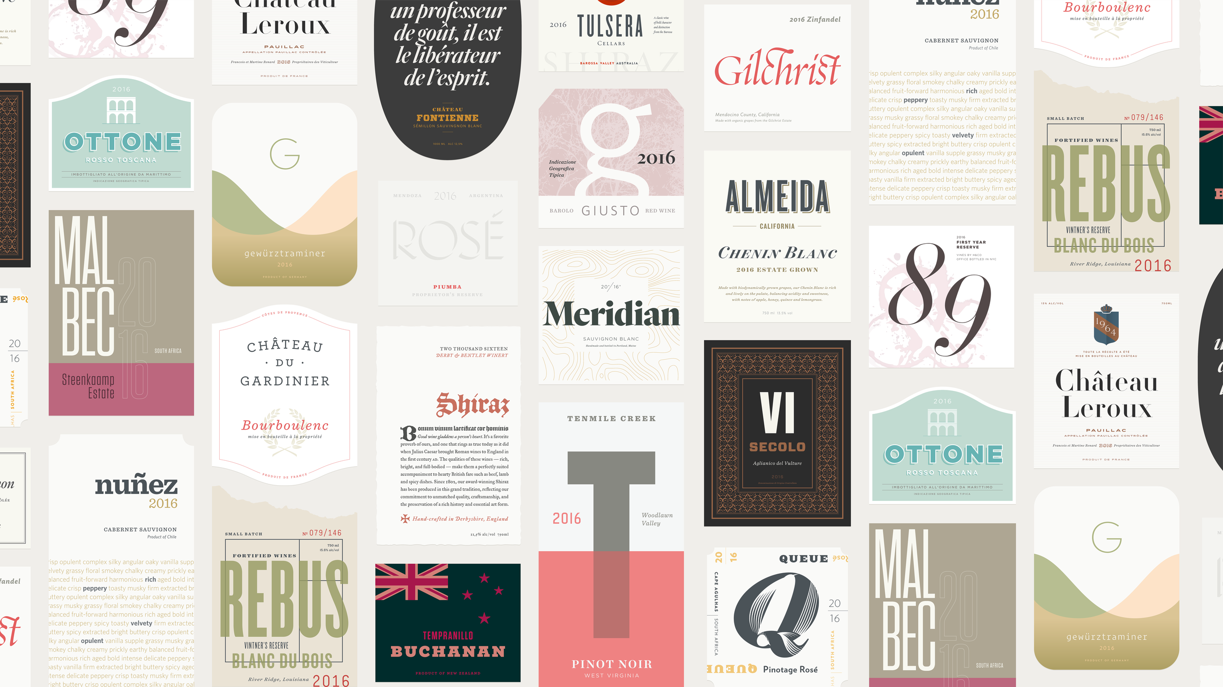
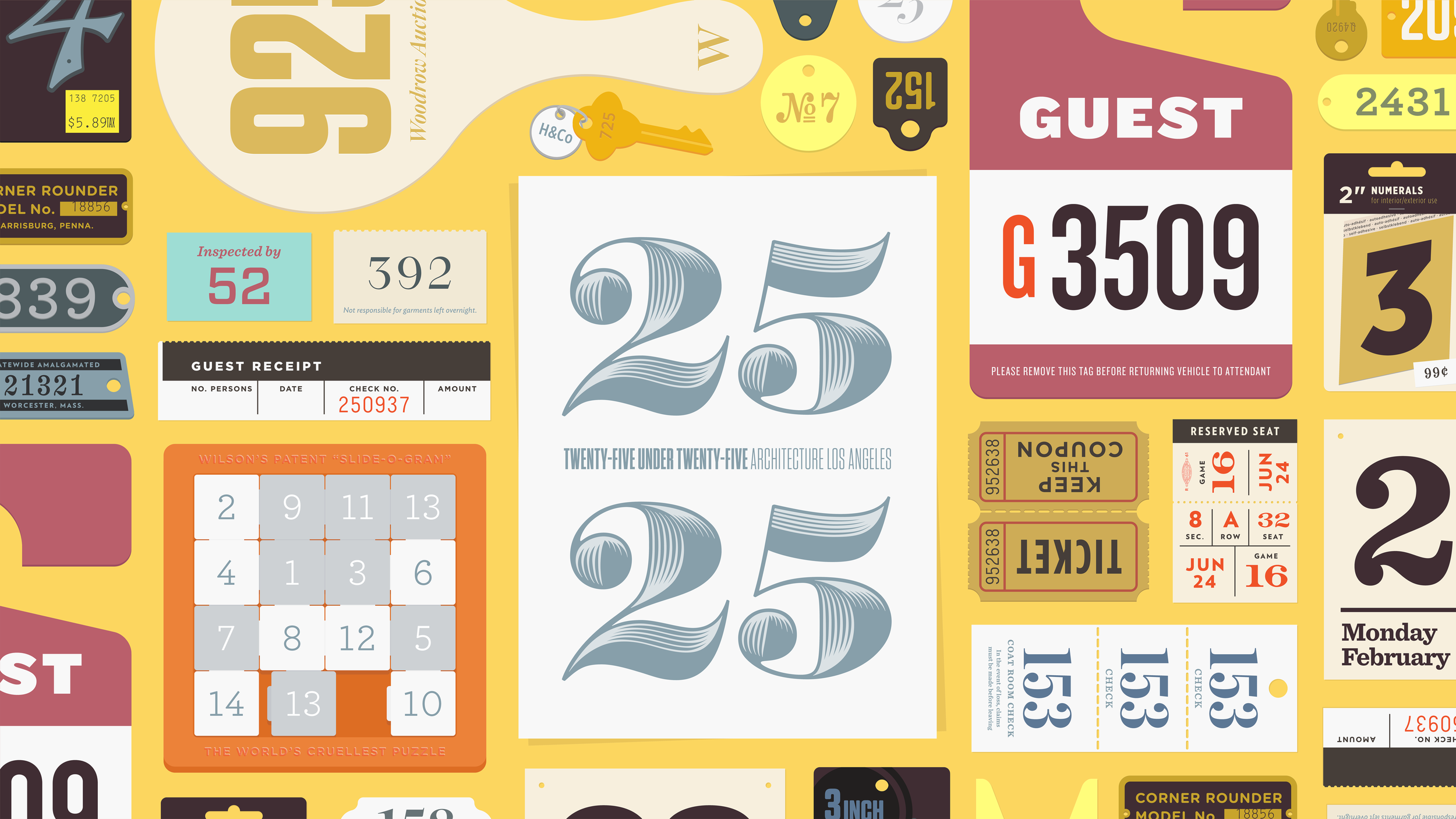
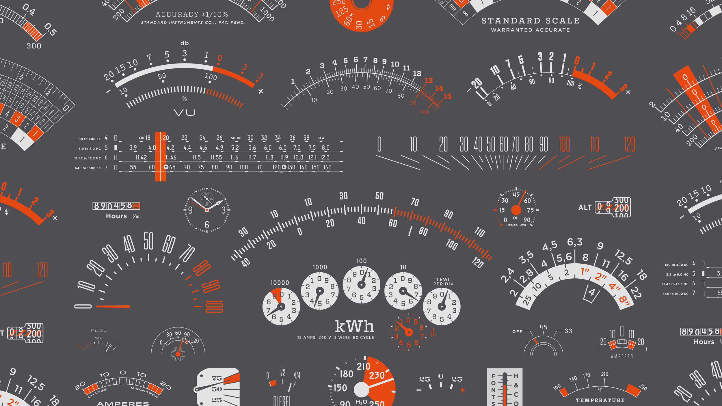
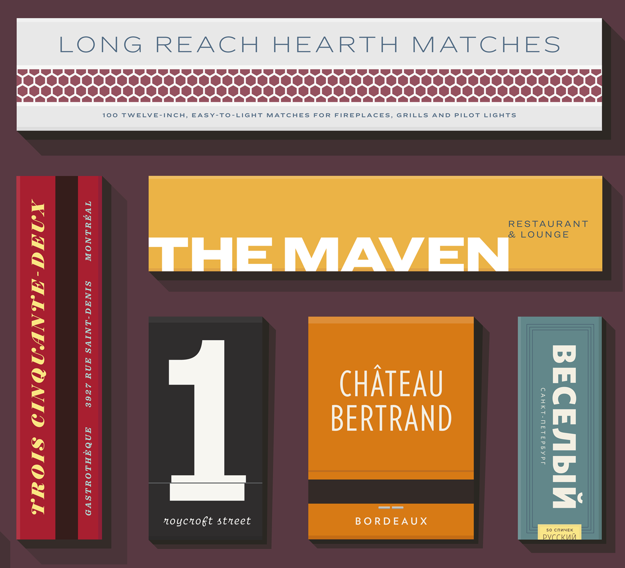
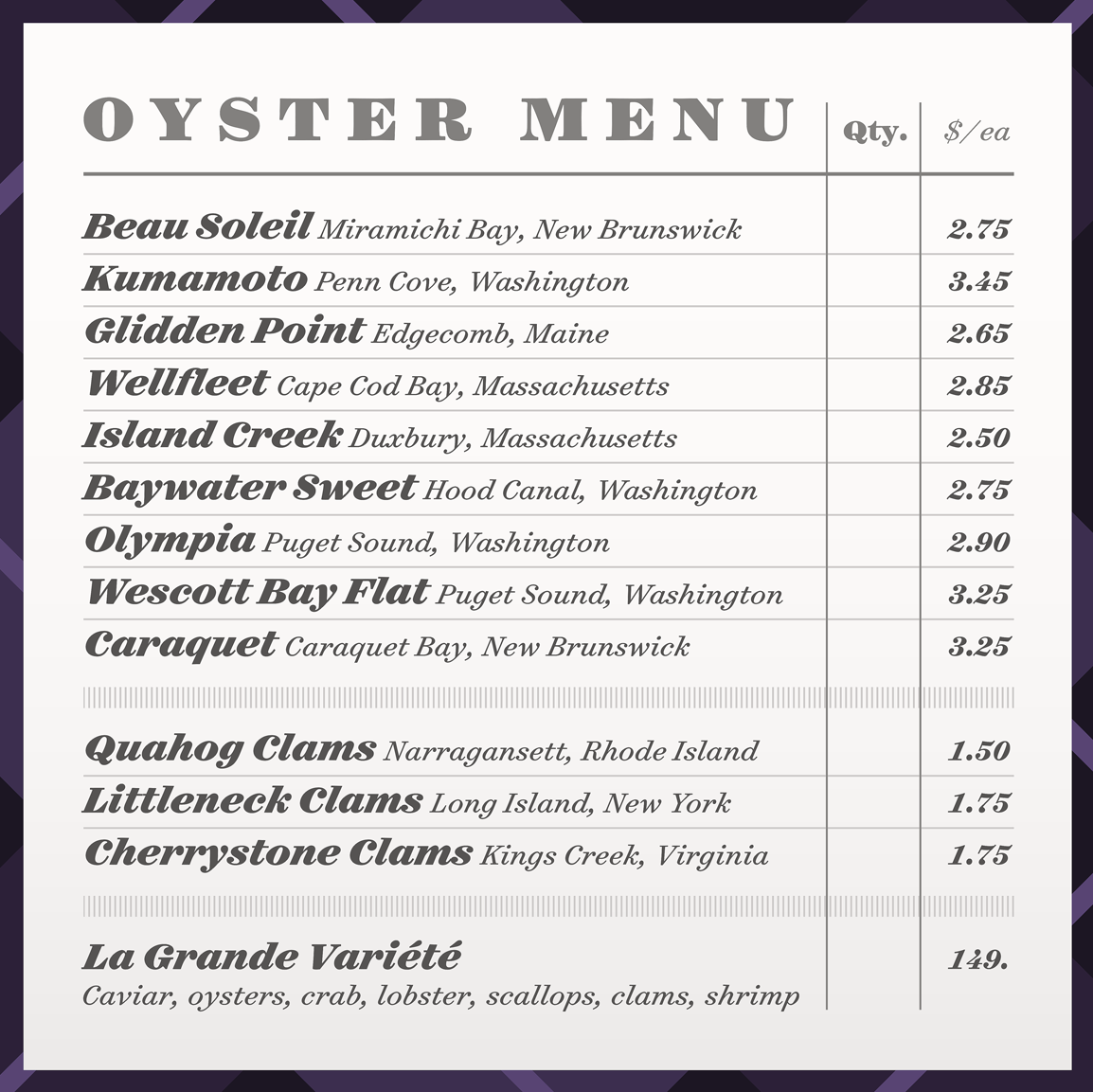
Jonathan Hoefler started with a simple idea; he wanted to design something with more than one of his company’s fonts at the same time and put it on their website. But at the time, he didn’t have a place to do it. So he worked with his team at H&Co and created Discover.Typography in May of 2014 to showcase the fonts that his company sells in a new and unique way.
“I love working with more than one typeface at a time and never have had a place to do that on our website. Discover.Typography is a sort of a storefront window where I can dress a whole mannequin with an outfit that matches and not just one piece. It is a place for the company to show off.”
““It scratches all of my itches; to design things with things that we design.””
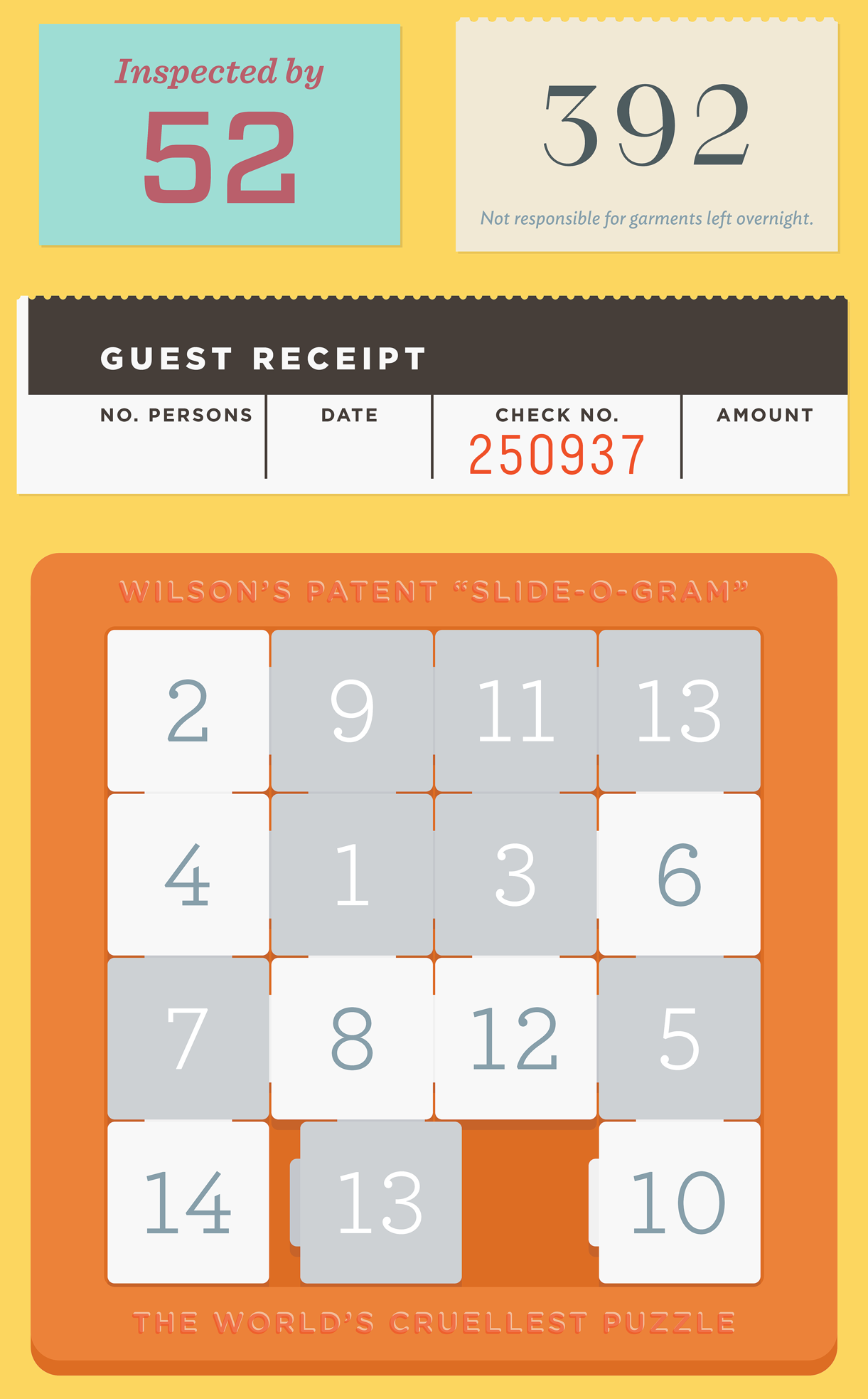
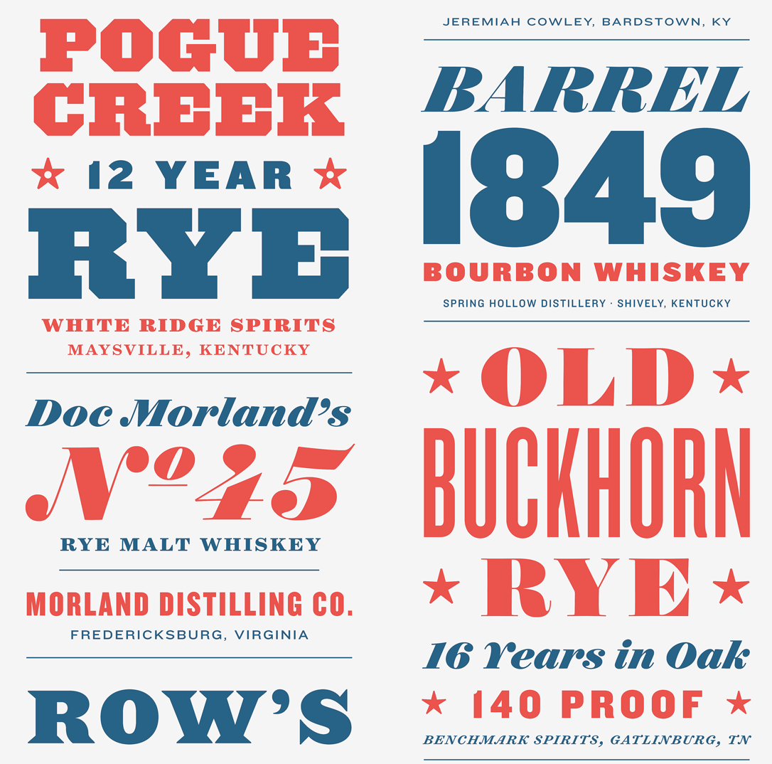
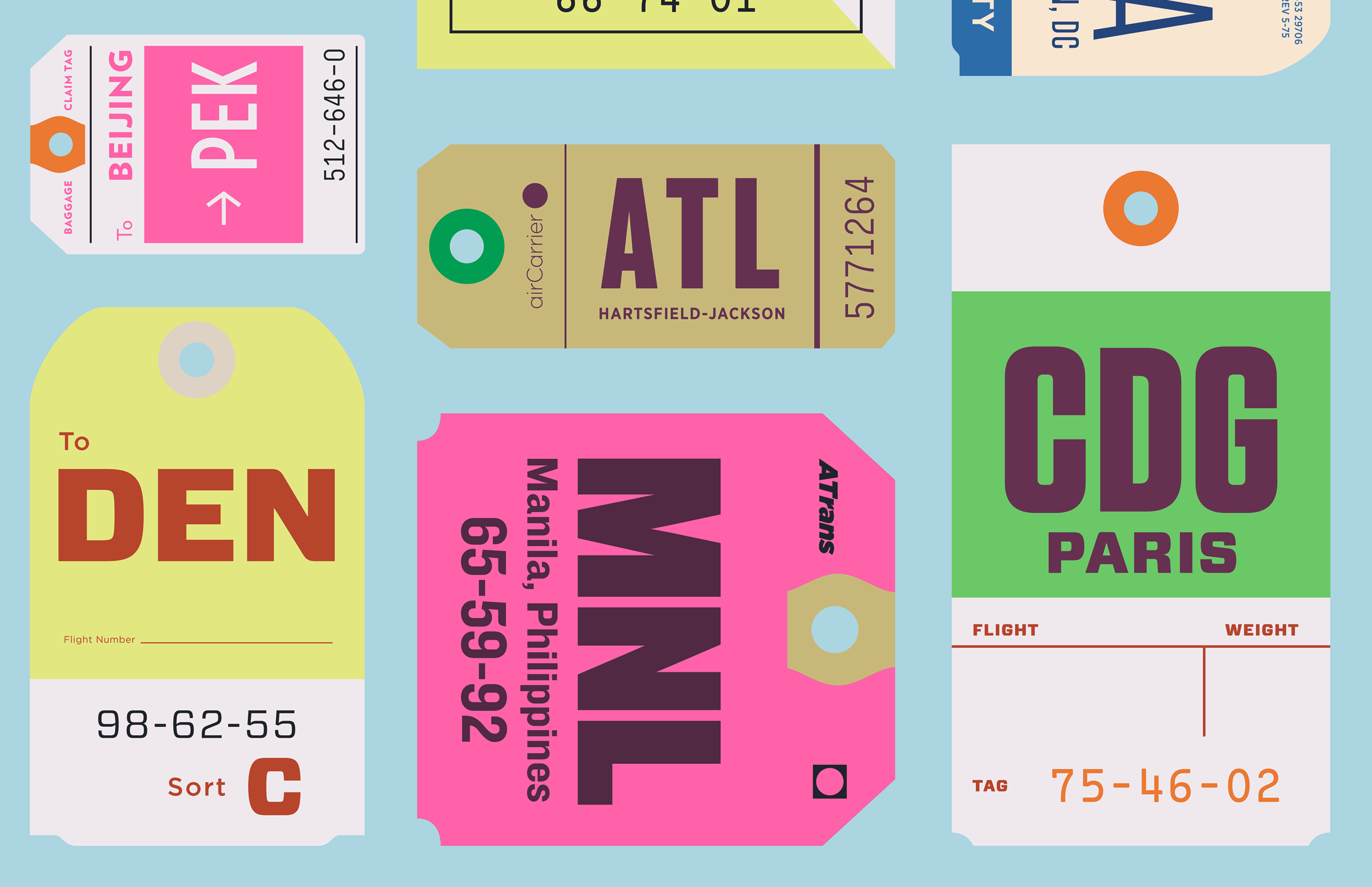
Hoefler continues,“This is as much a personal indulgence as something we created for the community. I don’t want to write an essay about my love of travel tickets, I just want to make them and see what makes them look good. It scratches all of my itches to design things with things that we design.”
How a Theme is Created
Each theme begins as a conversation between Hoefler and Carleen Borsella, which together direct the company. The visuals themselves start with artwork that Hoefler creates and is typically developed with the help of H&Co’s designers Brian Hennings and Maurizio Masi.
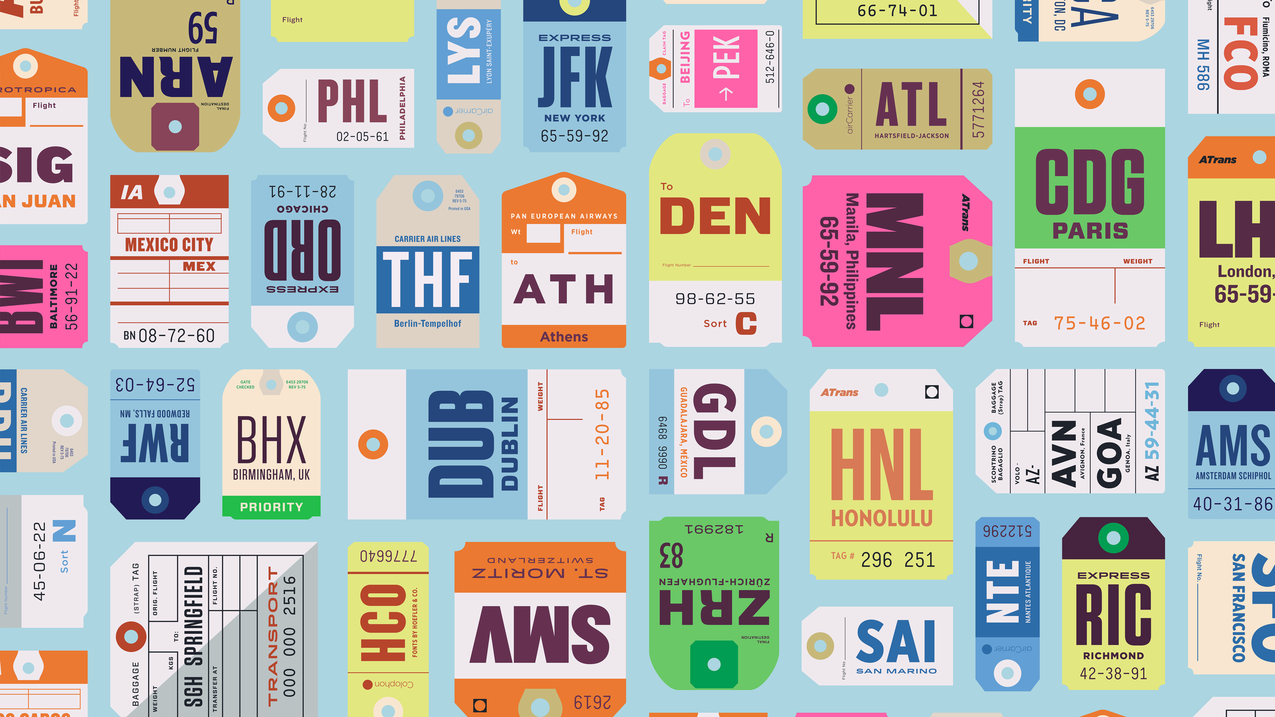
“The themes we pick are either very specific (like “matchboxes” or “travel tickets”) or very vague (like “camping” or “Sunday at a museum”)—which are more difficult to design, but more fun in the end.” Although there is no planned schedule, they try to release a new theme three or four times a year.
““But no matter the theme,” Hoefler laughs and says, “they always take longer than we expect!””
Something that Hoefler did not expect is that Discover.Typography has become a tool to drive ideas for new typeface designs for the company. Recently, someone suggested a theme that started a discussion which grew to create three new typefaces that are now in production.
Hoefler humorously acknowledges the long time it takes to create a new typeface and says, “Of course; they will take two more years to complete, but you’ll be sure to see them in use on that theme once they are finished.”
Interactive Discovery
Hoefler is quick to point out, “Discover.typography could so easily have been a gallery of static images, which typefounders have been creating for more than a century, but we wanted to take advantage of the medium to do something new, by creating a meaningfully interactive experience for designers.”
““ … we wanted to take advantage of the medium to do something new, by creating a meaningfully interactive experience for designers.””
Visitors to the site can zoom into the designs and see which fonts are being used and how they are paired together. “For the first time, Discover.typography gives us a chance to do everything with type that designers do—layer fonts, crop them, embellish or obscure them—while still allowing people to see these combined ingredients in their original, whole form.”
Designing and Discovering Secrets
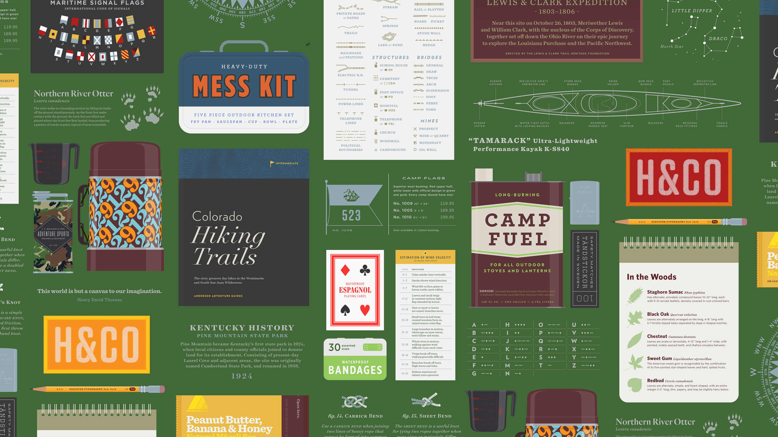
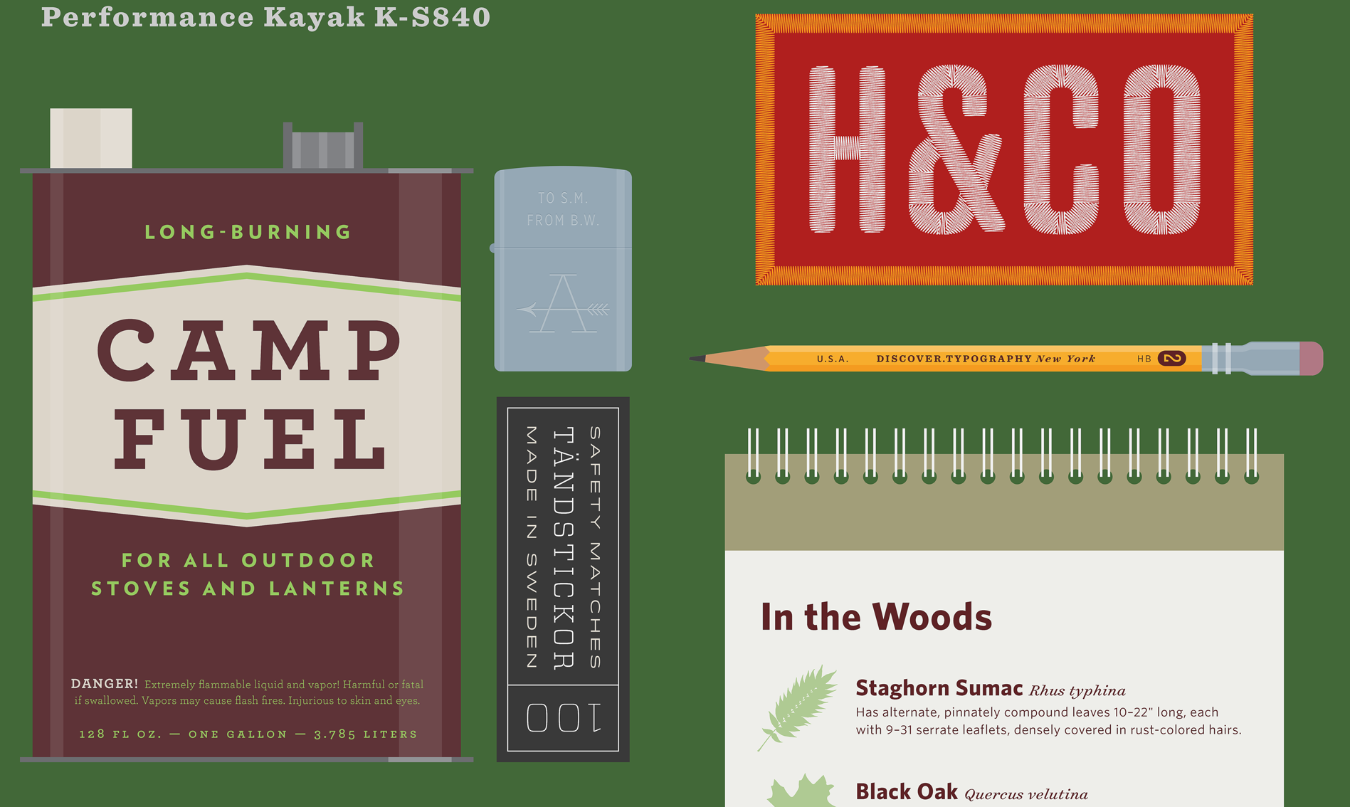
Since the launch of Discover.Typography in 2014, a total of 12 designs have been released—but there is always something more than meets the eye with each design. The designers as H&Co insert special “easter eggs” to have a bit of fun. In one of their designs, Trail Mix, you’ll find a tiny ant made out of type crawling on the green background.
““I couldn’t resist making an ant out of type!””
“There’s always one mention of the company (either as Hoefler&Co or H&Co) hiding somewhere in the art. Sometimes it’s hiding in plain sight; in Wanderlust it’s an apocryphal HCO airport code; in What’s Cooking, a bit of fortune cookie wisdom.”
Hoefler states, “People often take to social media to reveal which of the easter eggs they’ve found, but I don’t think anyone has yet copped to finding the ones in Made for Mobile, It’s a Date, or Cheers. I’ll give you hint on the Made for Mobile one: it’s a real playlist.”
See all of the designs (and try to find the easter eggs) at Discover.Typography


