Don’t call Lamon a lemon.
For those with a penchant for novelty fonts (or anyone looking for a big, flowing display face) Lamon might make you look twice. Designed by 22-year-old design firm Art. Lebedev Studio, the typeface started as an experiment.

Art. Lebedev Studio's first few Lamon sketches
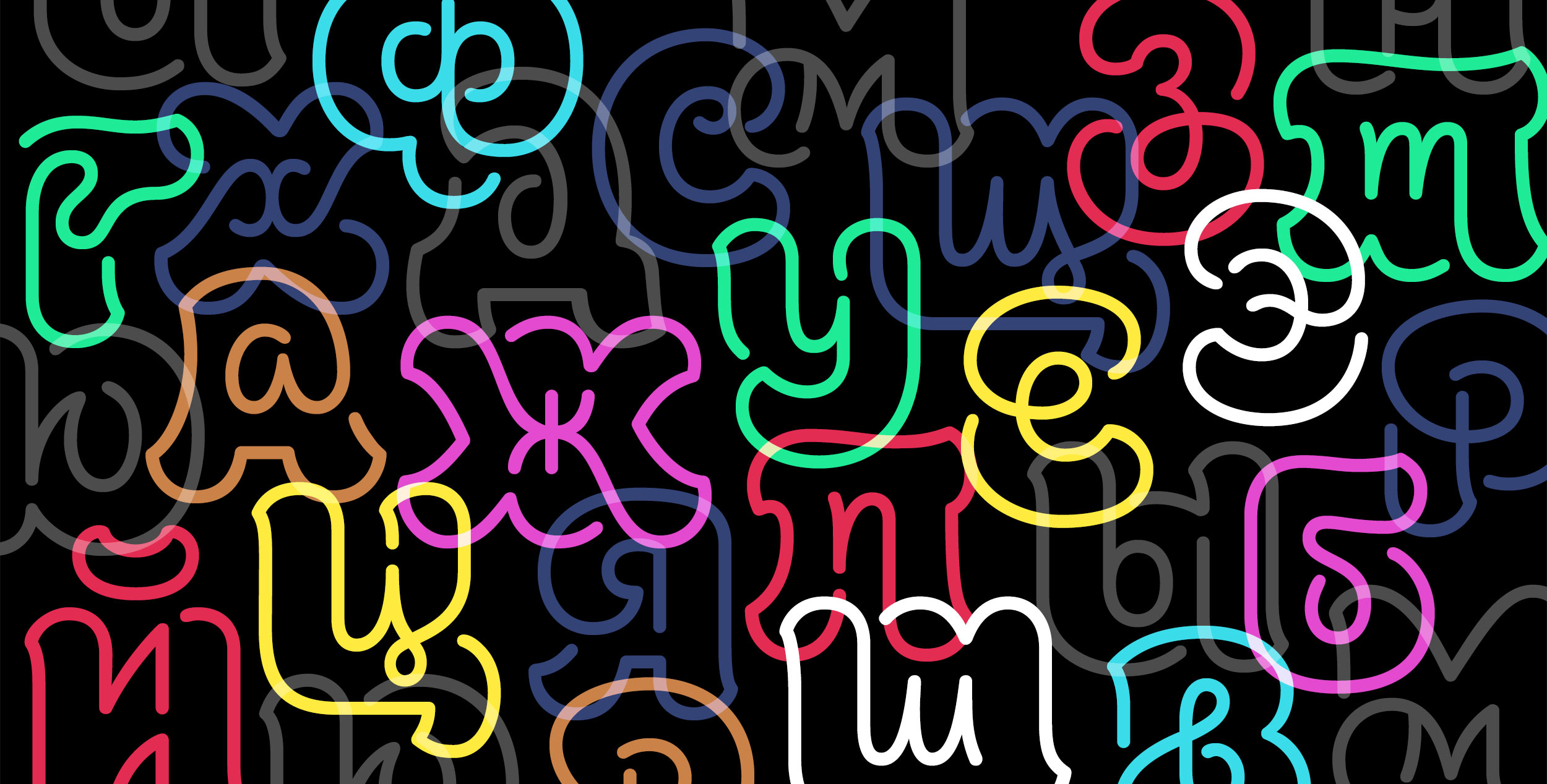
After stumbling across illustrations of a lower case y shoved inside of an upper case y, the Moscow-based team wanted to test their abilities with other characters. After a thoughtful process of smoothing, scrapping, rethinking, and refining, the team created Lamon.

Lamon graphic by Art. Lebedev Studio
Including both Latin and Cyrillic, the display face features every character (including punctuation and numerals) inside of itself. You can read more about Art. Lebedev Studio's design process with Lamon here.


