THE STORY OF YATRA
CATHERINE SCHMIDT takes a trip on Mumbai transit and learns what it takes to make fonts for Indic scripts
In Mumbai, India, the suburban rail stations are the heart of a neighborhood, blending in with the bustle of sellers vendors selling of okra, mangos, and fried samosas, while cows in jasmine garlands look on. I became comfortable with the ever present crush of people and the heat as a Fulbright scholar living in India in 2014–2015. I took many train trips while studying typography for Devanagari. From that study came a font called Yatra, which means “journey” in Hindi, like a train trip.
Journeys
Visiting India as a student, I wondered: Why? Why are there so many hand painted signs here? There weren’t nearly as many Devanagari typefaces as there were sign painting styles. I met with Indian typographers, calligraphers, and type designers who patiently explained to me why designing and setting Devanagari is more difficult than Latin.
As a new resident learning how to navigate one of the world’s largest cities, I noticed the painted signs at my local rail station. Most painted Devanagaries highlighted by designers are more decorative—think truck art, shop signs, and painting on temples—but the rail signs are a civic, structural example of sign painting that is harder to fetishize. The Mumbai suburban rail is a massive system that serves 7.5 million commuters daily and began operation in 1853. Its signage, uniform despite being hand painted, is as critical to the city as that of the Underground to London or the Subway to New York City.
Generally, signage is not as important to everyday life in India as it is in the West. Mumbai’s streets, though named, are often unmarked. People use landmarks for reference—my legal street address included “across from Jain temple” and, amazingly, Amazon had no issue with that when delivering parcels. The Indian attitude toward maps and signage might be a product of generations of meager signage infrastructure combined with a general unfamiliarity with map-reading, and illiteracy. The rail lines are very old, and most commuters already know where they need to go. When trying to find a location, commuters trust a person over a sign.
For the purpose of research for my scholarship, I photographed nearly every station sign in the system. This was a hilarious and exhausting process involving hopping in and out of a train at every stop, garnering even more stares than usual. Despite access to digital tools and open-source unicode Devanagari fonts, contemporary signs are still hand painted because of the low cost of labor. Each sign displays the name of the station in three languages: Hindi, Marathi, and English transliteration.
Railway signs in India are still hand painted, because of the low cost of labor. The makeover echoes hand-painting
The Charni Road railway station in Mumbai.
All stops are written in three ways: Hindi, Marathi, with a Latin transliteration.
Research
The crux of my research was the comparison of the old Mumbai rail signs with those of the new Reliance Mumbai Metro, opened in 2014. Reliance is an enormous conglomerate that makes everything from solar panels to soap. Its Metro signage was conceived by Reliance’s internal branding team.
The station signs have the station name in Marathi and Latin transliteration. The Latin is set in Univers, and the Devanagari is set in Shree Lipi, part of a package of non-Unicode, non-OpenType fonts that predated the wide use of both those technologies in India.
While both systems have a sans-serif Latin, the painted signs’ Latin is bolder and often condensed. The starkest contrast between the two signage systems is in the shape of the Devanagaries. The Reliance Metro signs use a monolinear style for their Devanagari, whereas the painted signs’ Devanagari is modulated, high-contrast, and very dark.
Reliance’s typography choices further a neoliberal project of globalization, trading local forms for international ones. The signs are easy for me to read—but am I the audience? Something is lost when a branding team takes the job of a sign painter.
Growth
Pairing Latin and Devanagari is a challenge. The Indic letters respond to each other and character counts spiral into thousands.
Yatra can’t really be called a revival because it strays so far from the signs’ starting point, but it is hopelessly inspired by the Devanagari forms of the Mumbai local rail. Initially, I didn’t intend to make an accompanying Latin for Yatra. As an ignorant American with the good fortune of being surrounded by Indic script experts, I wanted give all my attention to Devanagari while in India. I admire the way many Indian type designers start their multi-script typefaces with Indic to combat the often careless way Indic scripts are attached to pre-existing Latin fonts.
While in India I met Dave Crossland, at that time a consultant for Google, who suggested that Yatra might make a good Google Fonts project. By the time my scholarship was over, I had the basic characters for Devanagari, but the font still needed a lot of work. Like all Google fonts, a Latin was part of the contract. As I weighed my options for the Latin, I knew I didn’t want to make a dark sans, like the Latin of the rail signs. I had seen some Latin sign painting around Mumbai made with a Devanagari pen angle (a mirror image of the Latin).
Though I’d never seen a lower case with a Devanagari pen angle, it seemed like the perfectly foolish thing to do. I tried to borrow as many shapes from the existing Devanagari as I could, particularly the chunky, angular treatment of round shapes. A wide and high contrast Devanagari called for wide and high contrast caps. For the Latin, I balanced between borrowing from existing painting forms, creating new ones based on how a brush would move, and harmonizing with the already-designed Devanagari. A reverse pen angle—not to be confused with a reverse stress—makes Latin letters look very perverse. The elegant and elemental shapes of the Latin letters are completely lost. They just didn’t play nice together, and spacing such oddly shaped letters proved difficult.
Left: A fluid example of hand-painted Devanagari script. Right: The Yatra version, modifying the horizontal bar.
Politics
Learning about the imperial history of typography for Devanagari, I started the Yatra project with trepidation. Power flows through typography. Colonists knew that typography was a tool to rule, and I believe it’s still the case. As an American designer making vernacular letters from a former colony, I was plagued by a growing set of ideological concerns. Dr. Girish Dalvi, an IIT-Bombay Industrial Design Center professor and EkType designer, was particularly patient in educating me about the history of typography for Devanagari.
Type in India was, and to some degree remains, a colonial project. Often designers for Indic scripts were foreigners with an agenda. In modern history, non-Indian designers made Devanagaries for big European type foundries to take advantage of emerging markets.
In designing Yatra I wanted to be as sensitive as possible without being paralyzed by my ignorance. I wanted to bring an educated perspective, as opposed to a purely formal or “designerly” one. To acknowledge colonial violence through the design itself. In particular, I worry that Yatra could be viewed as a poor representation of Devanagari because it’s un-typographic, even clumsy. That Yatra is open-source and free reflects the way I feel about the goals of typography for Indic scripts, and any script that has a history of colonial tampering.
Process
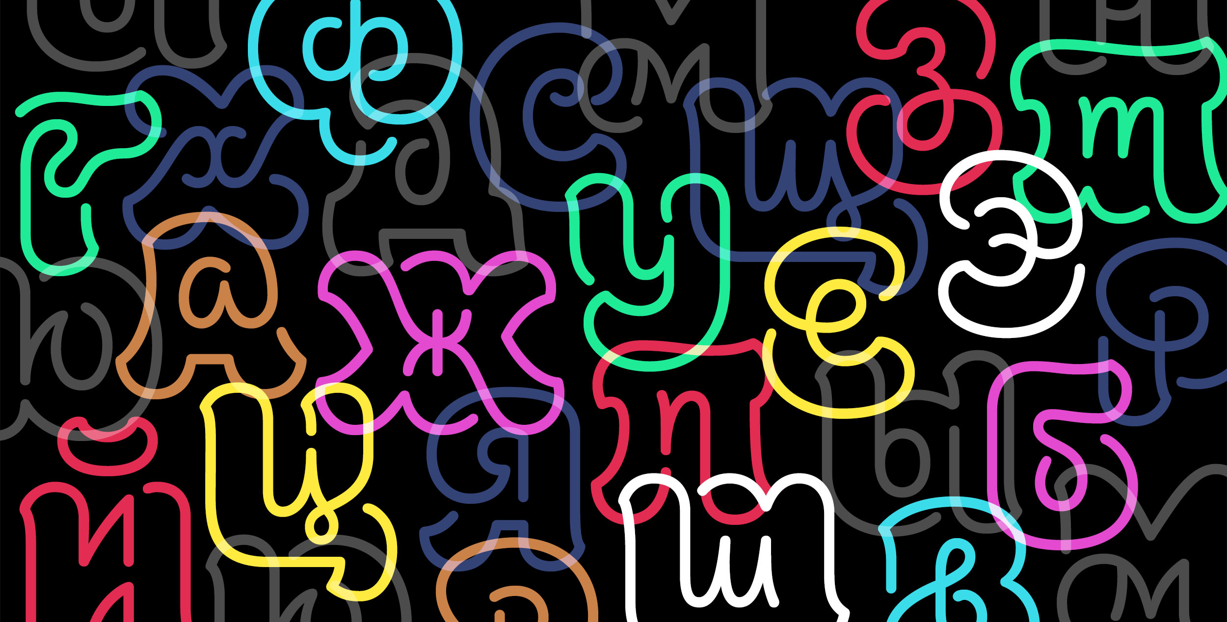
Yatra and it's latin counterpart, showing the relation and effects of reverse stress.
The process of making typography for Devanagari has always been like putting a square peg in a round hole. The structure of typography, namely its requirement that writing systems be divided into discrete parts, is antithetical to the structure of the script. In Devanagari, letters respond to each other, changing shape depending on their circumstances. Because of potential conjunct consonant formations, character counts spiral into the many thousands.
But typography never had the final say in the shape of Devanagari. Alongside a colonial typographic history, an active calligraphic and lettering tradition persisted. Metal, hot metal, and later digital type were simply not an option for many people. Because of the cost of lead and presses and the difficulty of transporting them, calligraphy was cost-effective for smaller publishers.
The typographic and calligraphic lineages run in parallel and occasionally cross-pollinate.
I want to be clear about my intentions: Yatra is not an alternative to existing typographic signage. It is more investigative than problem-solving, more a mode of inquiry than a proper revival. Without a doubt, Mumbai’s rail signs will one day stop being hand painted and become typography. That typeface will need a different, more stringent set of considerations than Yatra—choices that should be made by someone more knowledgeable than me. Yatra is display type, but perhaps not signage type.
This project took two years, and was the first complete typeface I ever made. I’m thankful to Google for investing in this project and giving me the resources to complete it. I’ve only begun to know Devanagari yet I’m completely enamored, and plan to continue making fonts for Indic scripts. The forms of a font can feel anonymous, but Yatra is an ode to a certain place: 21 million people pressed together on a land-filled archipelago with trains as its arteries, the air heavy with sandalwood and heat from the sea, and cows in jasmine garlands looking on.
Catherine Leigh Schmidt received a BFA in graphic design from the Rhode Island School of Design while studying Hindi and Sanskrit at Brown University. She did research as a Fulbright scholar in association with the Industrial Design Center (IDC) at IIT Bombay. She currently teaches graphic design at the California College of the Arts, in Oakland.
JOIN
If you like this story and others posted here from our first issue, join us! TYPE is non-profit, supported by members, sponsors . . . and advertisers. Charter Membership is now only $29 in the US ($59 outside). Your contribution makes it possible to distribute the quarterly magazine, build a new web site, and plan events all over the world.


