
Weekly Roundup: February 3
Here is the twelfth regular update by TYPE of font releases, custom type launches, and type-related events.
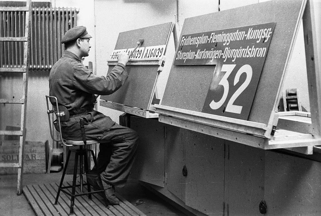
Why there isn’t a font behind every letter you see
Ralf Herrmann published an essay on the popular website typograpghy.guru explaining why not every letter comes from a font. To many designers this fact appears obvious, but Herrmann has had a different experience: “Several thousand posts have been made in [the typography.gug] font identification forum so far. It is interesting to see that in a significant number of cases users ask for a font identification, even though the provided samples weren’t made with a font to begin with.” The essay explains the typical scenarios in which the type is custom: painted signs, logos, mastheads, book covers, product lettering, and so on. Read Herrmann’s essay here.
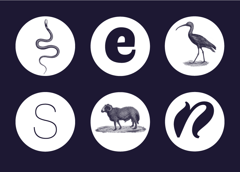
Faune
The Centre National des Arts Plastique’s in France commissioned a typeface by Alice Savoie, which they’re making available for free. The result, Faune, aims to “reinvent the notion of a typeface family,” by looking to “the diversity of animal species, teeming with morphologies, behaviours and rhythms” for inspiration. Faune’s six disparate styles—three for display and three for body text—look like distantly related animal species, creating a typographic microbiome. Learn more about Faune and download it here.
Rhododendron
David Johnathan Ross’s February Font of the Month Club typeface, Rhododendron, arrived this week. The “geometric slab with an overabundance of thick vertical serifs” descends from a “the cover of a 1952 garden calendar […] in the collection of the Mölndals Stadsmueum just outside Gothenburg, Sweden.” Join the Font of the Month Club to receive Rhododendron.
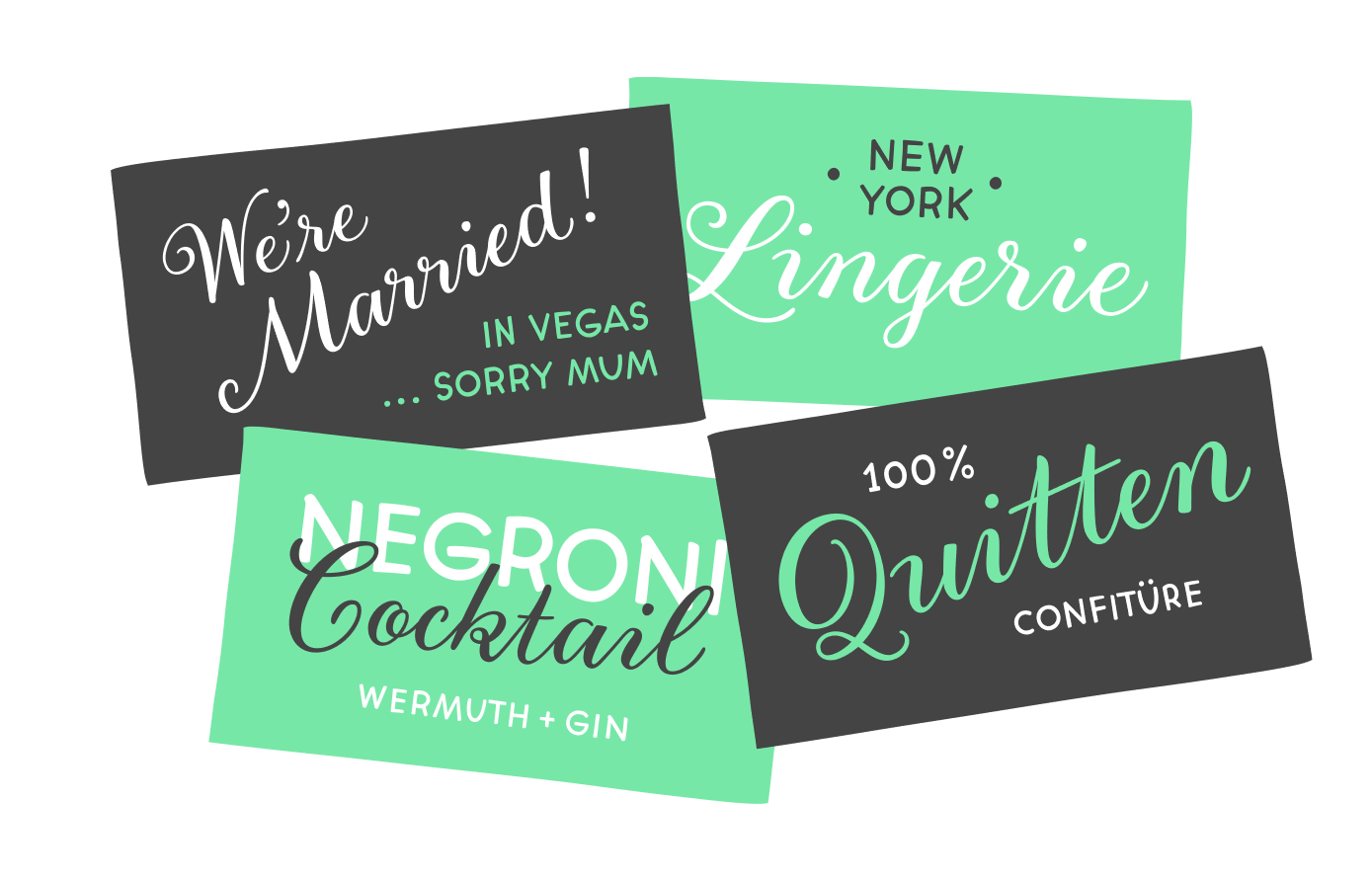
Gretel Script
Typejockeys released Gretel Script, a “lively, quirky script that has it all.” Gretel’s three styles—Grande, Caps, and Piccolo—include initial and final alternatives, intentional breaks, contextual alternatives, and more; in total, each lowercase character has a “minimum of seven different alternates, [while] uppercase have at least two.” Gretel Script is available on the Typejockeys website.
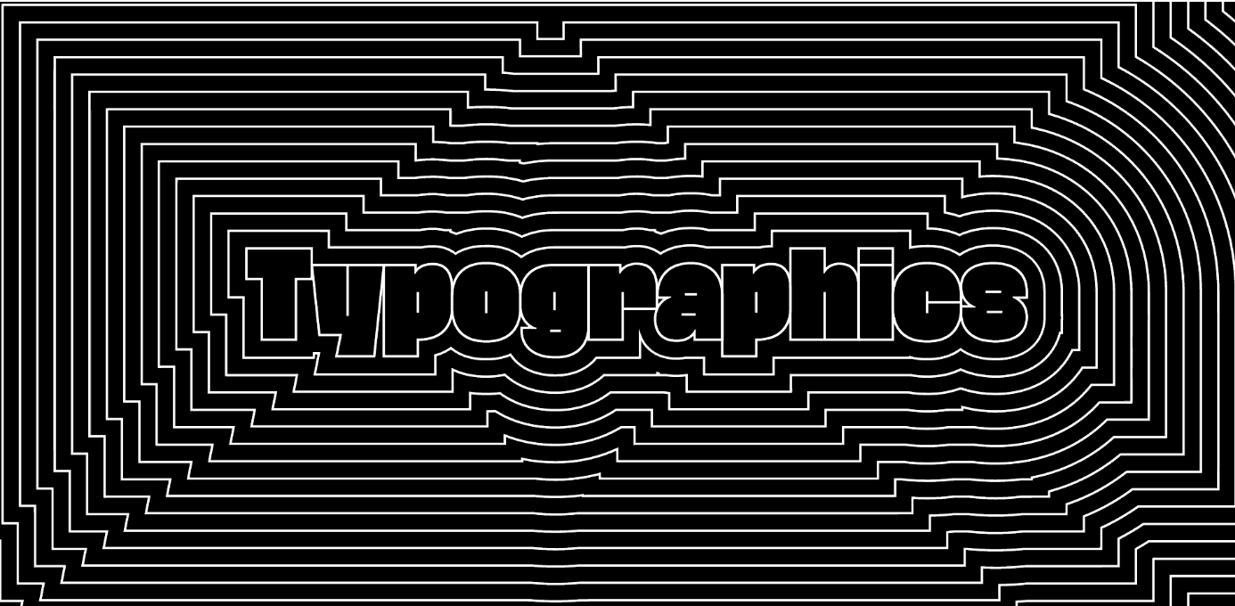
Typographics 2018
Typographics, a “design festival for people who use type” launched the website for its fourth-year event. Taking place June 11–21, Typographics includes a main conference on the 16th and 17th, workshops and tours all ten days, a book fair, and a “TypeLab,” which offers “a series of technical hands-on workshops, demos, interviews, and experiments.” You can see the new 2018 website here. You can also read our review of their 2017 conference here.
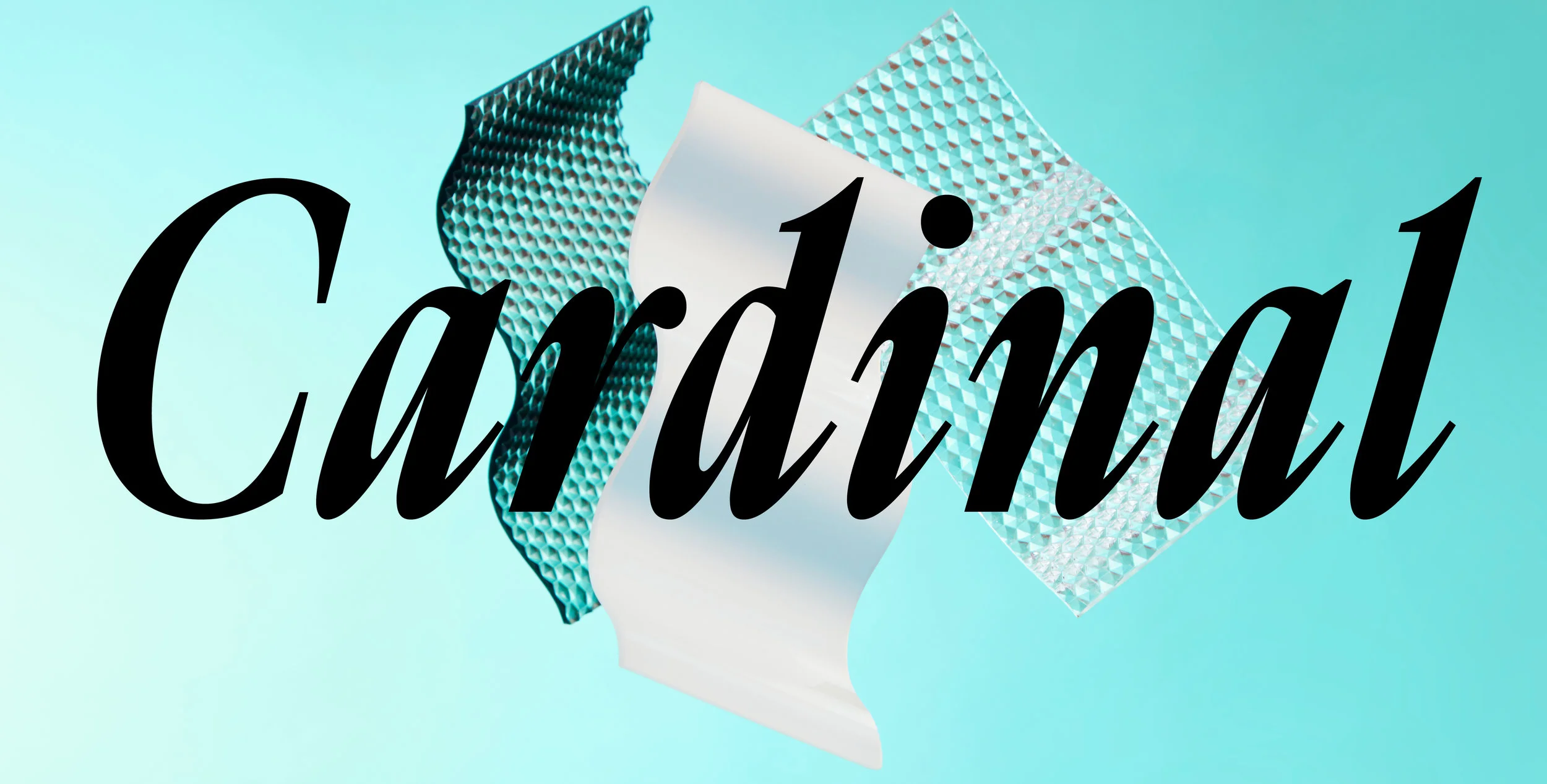
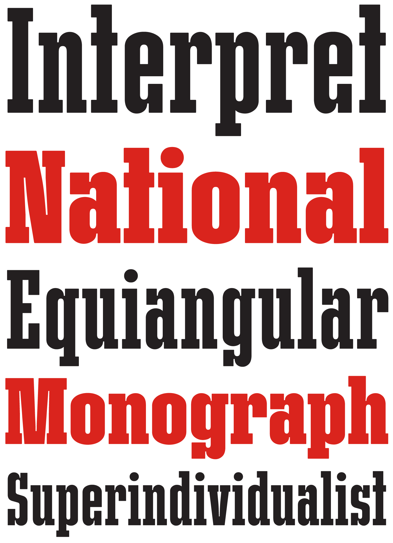
Cardinal
Production Type released its latest typeface, Cardinal, which “navigates between the organicity [sic] of classic text typefaces and the plasticity of contemporary digital type.” The idea for Cardinal comes from the “Synthetics,” Turing-test-passing robots from the Alien movie series: “Synthetics do not emit heat, smell or pheromones, and their artificial origin is thus hard to detect.” Cardinal, an accurate serif typeface, includes 32 styles across its four families: Classic Short, Classic Mid, Classic Long, and Fruit. You can purchase Cardinal on the Production Type website.
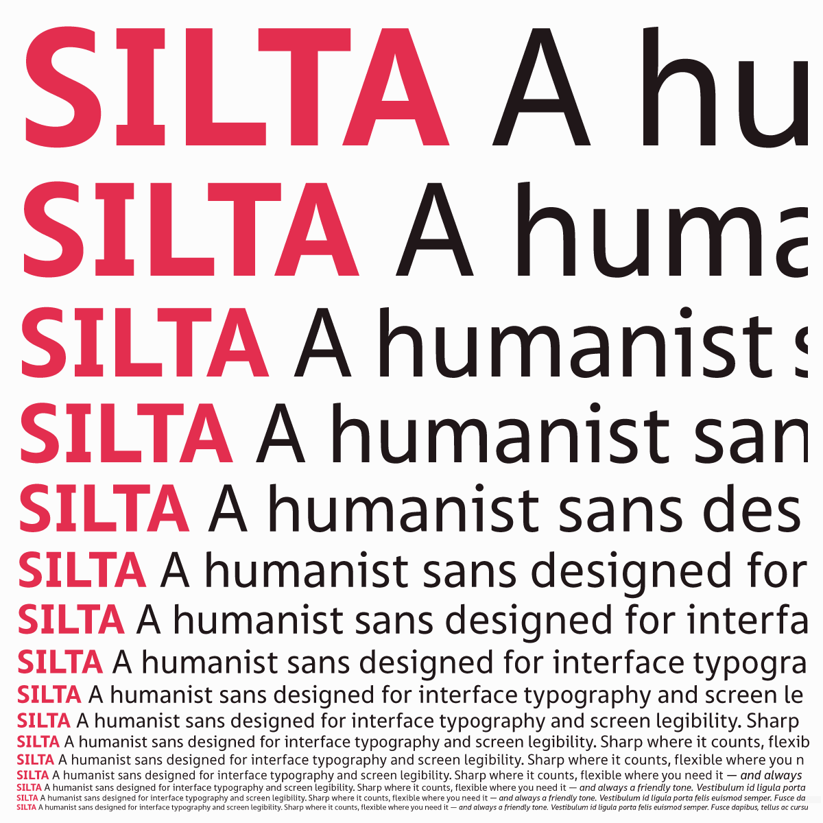
Silta
Underscore published their second typeface, Silta, this week. Designer Johannes Neumeier writes that he created Silta for “a connected and global world of screen interfaces, online reading and signage.” The typeface includes 14 styles, ranging from thin to heavy; see them on the Underscore website.
Clother
Black[Foundry]’s latest release, Clother, is a “striking series of fonts built for use in branding, corporate design, and corporate communication.” Containing nearly 1,000 glyphs across four languages, each with four weights, the geometric sans serif allows multinational companies to “deploy their messages across a good portion of the global marketplace, all while maintaining a consistent visual style.” Rather than copying directly from the ubiquitous “geometric” playbook, Clother’s characters include unique personalities, visible on lowercase f, g, y, k, w, and others. You can purchase Clother from the Black[Foundry] website.
Send your announcements and tips to TYPE’s digital editor, Lucas Czarnecki.


