Easy breezy no more
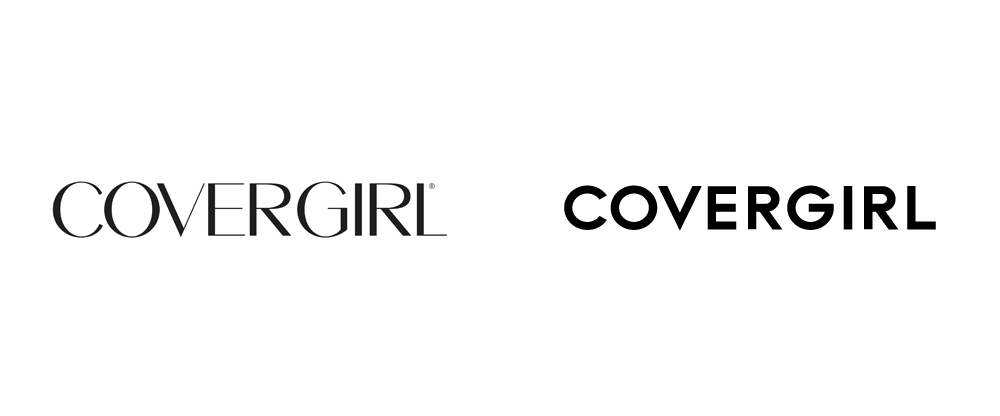
Covergirl’s old logo (left) and new logo (right)
American girl-next-door cosmetics line Covergirl has abandoned their classic 1960s logotype in favor of something more contemporary. The original logo featured the strong contrast style that high fashion loved for years, but now the elegance of the high-contrast sans strokes has been replaced by a trendy, geometric look. Reminds us of Chanel’s logo and Caslon’s Egyptian, the first sans typeface with the geometric shapes that James Mosley chronicled in his famous post “The Nymph and the Grot.”
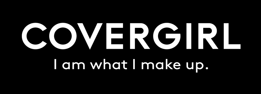
The new Covergirl logo and slogan
Also new is Covergirl’s slogan. “Easy, Breezy, Beautiful,” is now: “I am what I make up.” These changes come just one year after Covergirl was acquired by Coty, Inc., so there may be further changes on the horizon.
Read more about Covergirl’s rebranding here.


