
A classic style endures
With a bow to the WPA art program, two poster series celebrate the U.S. national parks.
BY JOSHUA FARMER
As a regular park visitor, JP Boilard learned the benefits of deep gratitude for natural wonders and basic curiosity. As a Boy Scout, Jim Walker felt the tug of nature upon his burgeoning soul. Neither of them understood how necessity and altruism would eventually drive them back to the forests and streams, this time through the lens of design.


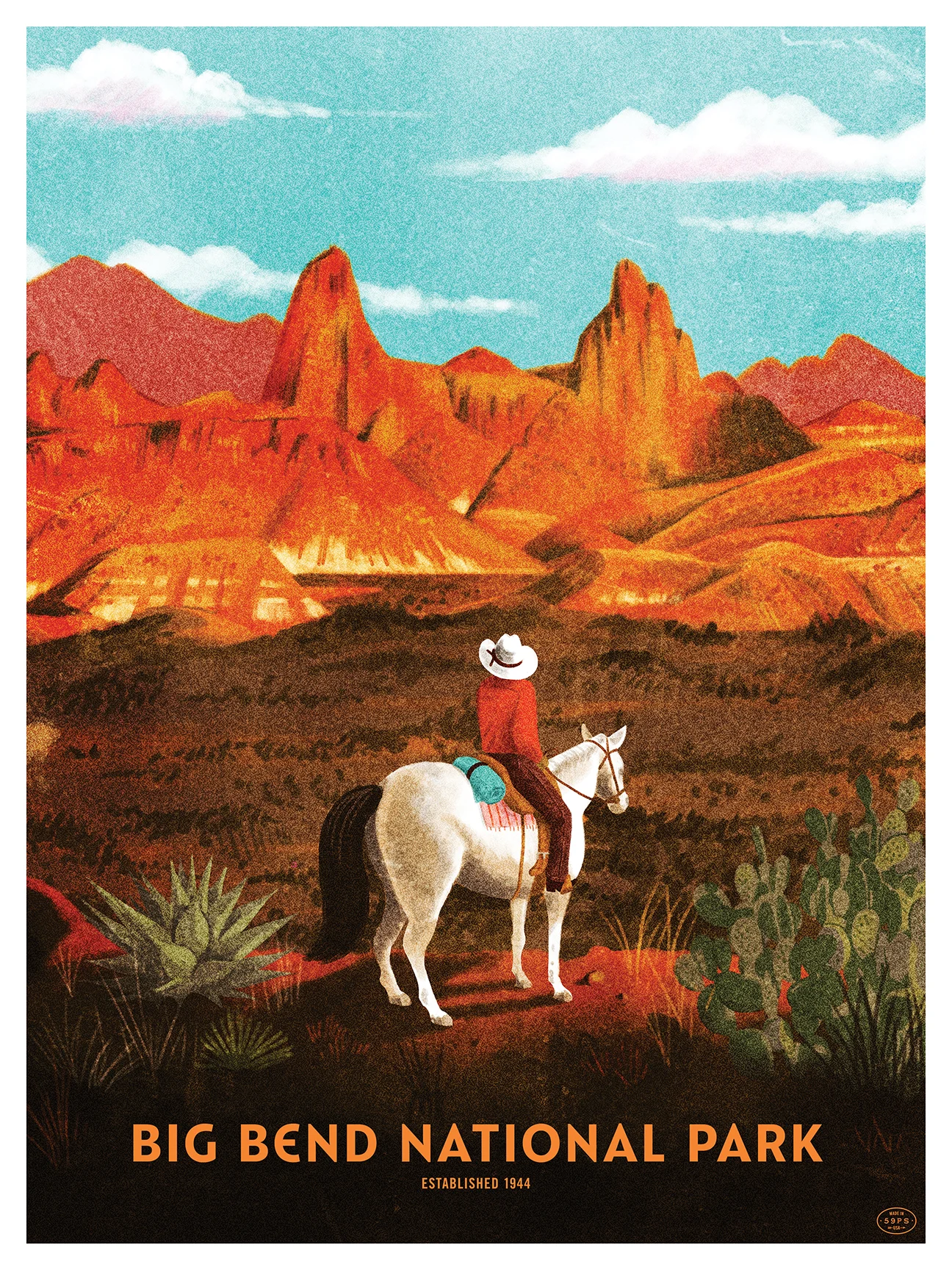
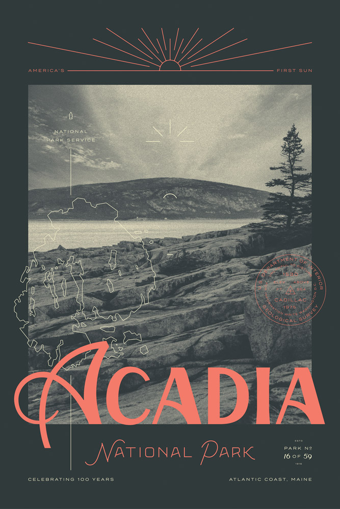
59 Parks
During his high school years in Massachusetts, Boilard played bass until his friends needed a drummer. So he played drums until bands in his community needed a place to perform. Next, he created a place to perform—The Shed, which literally was just a shed in his backyard—until he noticed that his show flyers weren't standing out enough. So he made screen printed posters as a hobby, which quickly took over his nights and weekends. Each step led to the next, usually out of necessity.
So, in 2006, Boilard and his friends curated a flyer and poster show that celebrated DIY events. The work spanned two decades worth of shows in western Massachusetts. The second incarnation of this show, The National Poster Retrospecticus turned it's focus towards hand printed gig posters and celebrated artists from all over the country. Eventually the show would go on to tour North America.
“The remarkable thing is that the poster community is less about competition and more about supporting and encouraging each other. Seeing someone else’s poster art pushes you to be better. Even though they’re competing for the same clients, the poster community is very much a family.”
Boilard vividly remembers stopping at national parks while on the road over the years because it tapped into his “What’s out there?” curiosity. “Maybe,” he somewhat quietly admits when we talked, “it was a bit of longing as well.”
Until recently, Boilard worked for IBM in Austin, Texas as a software designer for mobile apps, eventually becoming a design manager for an associate team. In February 2016, he left after only a year to create a new traveling poster show alongside his friend, Brian Buccaroni, entitled: Fifty-Nine Parks which celebrates the centennial of the National Park Service (NPS).
Over the course of the next year and of his own accord, Boilard is teaming up with 59 artists to create one poster for each of the US parks. He pays the artist and acts as art director in order to maintain a cohesive feel throughout the series. One big feature is the custom typeface Catlin Sans, designed by Riley Cran of the Lost Type Co-Op, and based on the lettering on the WPA park posters that inspired the project.
Though a MassArt grad, Boilard admits, “If it were up to me, I would’ve thrown Trade Gothic on the posters and called it done. But that wasn’t good enough. I didn’t want a throwback of any kind, but something with its own life.”
He asked Cran, a bit more than an acquaintance by that point, to create a new typeface for the posters, which he accepted immediately. It took a few months, but Boilard is delighted with how unique and service-minded Catlin Sans turned out, and how well it represents “modern nostalgia” for the parks.

For Boilard’s series, Riley Cran designed a new typeface, Catlin, as an effort to evoke the rich history of National Parks posters of the ’30s and ’40s.
Catlin evokes a straightforward American confidence that has little to do with politics and much to do with adventure. “The overall goal and execution of this poster series was to show a contemporary vision of nostalgia,” says Cran. “So that seemed to describe the typeface pretty clearly; to take these historical references and make them sing in a contemporary way that didn’t distract from the poster art itself. To represent each park name with the right balance of character and neutrality. To be historically respectful without being stale or forced.”
Boilard scans the posters, reveling in their detail and the feelings they convey. “This frickin’ piece of paper with some ink!” he says, as he searches for more words. “It’s amazing how something so simple can be so beautiful. Man, I’m glad to be alive just to see this!”


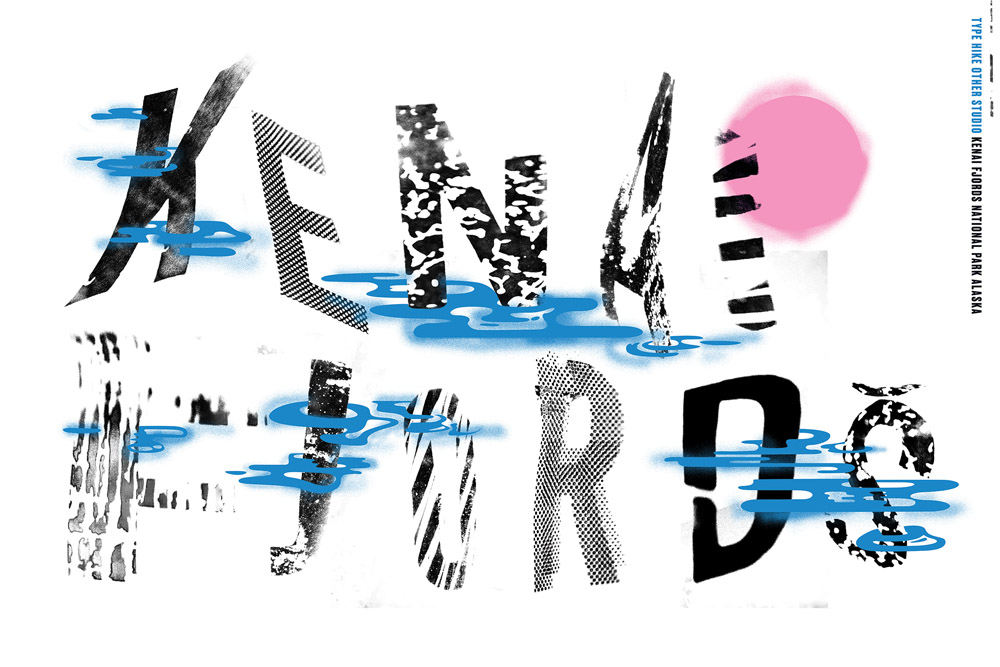

Type Hike
Jim Walker and David Rygiol run the poster website Type Hike, also inspired by the National Park Service centennial. Walker is a designer and illustrator who graduated from UT Austin, and Rygiol is a typographer and illustrator with a focus on branding and lettering, now based in St. Louis. Their homage to national parks posters approaches the series from the angle of energy rather than information.
With no art direction, except for a palette of 12 colors, Walker extended a simple invitation to a select group of designers: “Want to make a poster celebrating one of our national parks? Then choose a park you’re familiar with and use type as the primary element. Your work should be a personal reflection of the park rather than a picture of it or a series where each design looks similar to the others.”
“We wanted to challenge the status quo—the assumed aesthetic—of park posters. Everyone has a different style, so we wanted them to experiment within their own style, from minimal to boisterous and illustrative to symbolic.
Walker’s years as a Boy Scout taught him to use nature as a way to center himself through camping, hiking, and cycling. “I’m hoping this project encourages a lot of people to use nature to kind of reset themselves. In some small way, I’d like to think this project balances the negativity we see all around. Having this positive thing is really important.”
Both series are experiencing success. The Type Hike poster project displayed in the Polar stores at Laguna Beach and Portland, and other venues around the country.
The 59Parks poster project plans to keep printing as long as demand remains, providing residual income to the artists.
In the meantime, both projects hope to unite heritage with progress, nostalgia with celebration, and what is perceived with the eye with what is participated in with the hands. Both Boilard and Walker see it as a way to make poster lovers curious enough to become visitors and visitors inspired enough to collect the posters.
Joshua Farmer is a writer, editor, and graphic designer, and is currently working with TypeTogether foundry.
LINKS
Fifty-Nine Parks, JP Boilard's 59Parks website
Type Hike, Jim Walker and David Rygiol's Type Hike website
Catlin Sans, Riley Cran's Catlin Sans typeface specimen webpage

Become a TYPE Member
If you like this story and others posted here, join us!
TYPE is non-profit, supported by members, sponsors… and advertisers. Charter Membership is now only $29 in the US ($59 outside). Your contribution makes it possible to distribute the quarterly magazine, build a new web site, and plan events all over the world.


